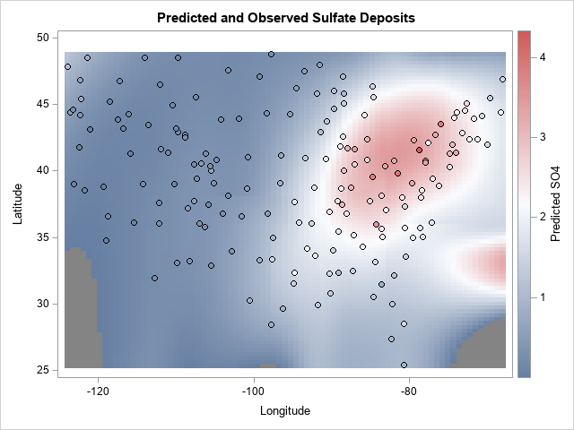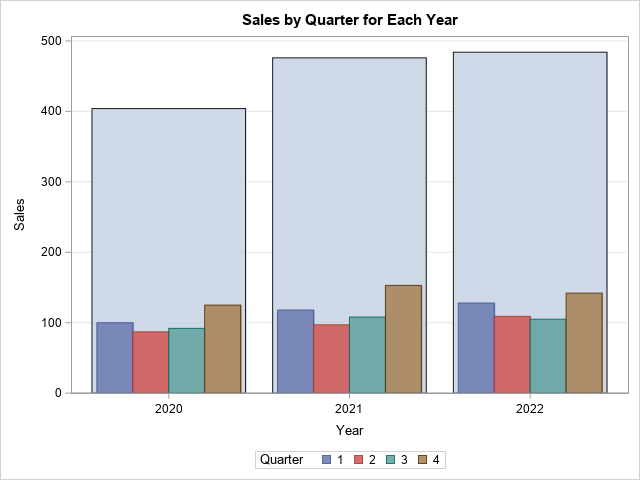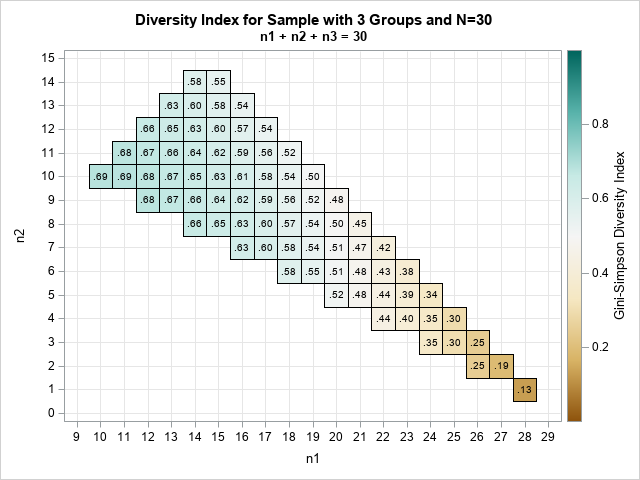
Statistical programmers and analysts often use two kinds of rectangular data sets, popularly known as wide data and long data. Some analytical procedures require that the data be in wide form; others require long form. (The "long format" is sometimes called "narrow" or "tall" data.) Fortunately, the statistical graphics procedures
Tag: Statistical Graphics
Knowing how to visualize a regression model is a valuable skill. A good visualization can help you to interpret a model and understand how its predictions depend on explanatory factors in the model. Visualization is especially important in understanding interactions between factors. Recently I read about work by Jacob A.
An analyst was using SAS to analyze some data from an experiment. He noticed that the response variable is always positive (such as volume, size, or weight), but his statistical model predicts some negative responses. He posted the data and asked if it is possible to modify the graph so
A previous article shows how to use a scatter plot to visualize the average SAT scores for all high schools in North Carolina. The schools are grouped by school districts and ranked according to the median value of the schools in the district. For the school districts that have many
Standardized tests like the SAT and ACT can cause stress for both high school students and their parents, but according to a Wall Street Journal article, the SAT and ACT "provide an invaluable measure of how students are likely to perform in college and beyond." Naturally, students wonder how their
Box plots are a great way to compare the distributions of several subpopulations of your data. For example, box plots are often used in clinical studies to visualize the response of patients in various cohorts. This article describes three techniques to visualize responses when the cohorts have a nested or
When you overlay two series in PROC SGPLOT, you can either plot both series on the same axis or you can assign one series to the main axis (Y) and another to a secondary axis (Y2). If you use the Y and Y2 axes, they are scaled independently by default,
Numbers don't lie, but sometimes they don't reveal the full story. Last week I wrote about the most popular articles from The DO Loop in 2018. The popular articles are inevitably about elementary topics in SAS programming or statistics because those topics have broad appeal. However, I also write about
Last year, I wrote more than 100 posts for The DO Loop blog. Of these, the most popular articles were about data visualization, SAS programming tips, and statistical data analysis. Here are the most popular articles from 2018 in each category. Data Visualization Visualize repetition in song lyrics: In one
I regularly see questions on a SAS discussion forum about how to visualize the predicted values for a mixed model that has at least one continuous variable, a categorical variable, and possibly an interaction term. SAS procedures such as GLM, GENMOD, and LOGISTIC can automatically produce plots of the predicted
When a graph includes several markers or line styles, it is often useful to create a legend that explains the relationship between the data and the symbols, color, and line styles in the graph. The SGPLOT procedure does a good job of automatically creating and placing a legend for most
Last week my colleague, Robert Allison, visualized data regarding immunization rates for kindergarten classes in North Carolina. One of his graphs was a scatter plot that displayed the proportion of unimmunized students versus the size of the class for 1,885 kindergarten classes in NC. This scatter plot is the basis
The SGPLOT procedure enables you to use the value of a response variable to color markers or areas in a graph. For example, you can use the COLORRESPONSE= option to define a variable whose values will be used to color markers in a scatter plot or cells in a heat
When solving optimization problems, it is harder to specify a constrained optimization than an unconstrained one. A constrained optimization requires that you specify multiple constraints. One little typo or a missing minus sign can result in an infeasible problem or a solution that is unrelated to the true problem. This
A useful feature in PROC SGPLOT is the ability to easily visualize subgroups of data. Most statements in the SGPLOT procedure support a GROUP= option that enables you to overlay plots of subgroups. When you use the GROUP= option, observations are assigned attributes (colors, line patterns, symbols, ...) that indicate
Programmers on a SAS discussion forum recently asked about the chi-square test for proportions as implemented in PROC FREQ in SAS. One person asked the basic question, "how do I test the null hypothesis that the observed proportions are equal to a set of known proportions?" Another person said that
Given a rectangular grid with unit spacing, what is the expected distance between two random vertices, where distance is measured in the L1 metric? (Here "random" means "uniformly at random.") I recently needed this answer for some small grids, such as the one to the right, which is a 7 x 6
The SGPLOT procedure in SAS makes it easy to create graphs that overlay various groups in the data. Many statements support the GROUP= option, which specifies that the graph should overlay group information. For example, you can create side-by-side bar charts and box plots, and you can overlay multiple scatter
This article shows how to score (evaluate) a quantile regression model on new data. SAS supports several procedures for quantile regression, including the QUANTREG, QUANTSELECT, and HPQUANTSELECT procedures. The first two procedures do not support any of the modern methods for scoring regression models, so you must use the "missing
Which president of the United States is ranked the greatest by presidential historians? This article visualizes the results of the 2018 Presidential Greatness Survey, which was created and administered by B. Rottinghaus and J. Vaughn. They analyzed 166 responses from experts in political science who ranked the 44 US presidents
If you use PROC SGPLOT to create ODS graphics, "ATTRS" are everywhere. ATTRS is an abbreviation of "attributes." Most options that change the attributes of a graphical element end with the ATTRS suffix. For example, the MARKERATTRS option modifies attributes of markers, the LINEATTRS option modifies attributes of lines, and
A previous article showed how to use a calibration plot to visualize the goodness-of-fit for a logistic regression model. It is common to overlay a scatter plot of the binary response on a predicted probability plot (below, left) and on a calibration plot (below, right): The SAS program that creates
This article shows how to construct a butterfly plot in SAS. A butterfly plot (also called a butterfly chart) is a comparative bar chart or histogram that displays the distribution of a variable for two subpopulations. A butterfly plot for the cholesterol readings of 5,057 patients in a medical study
In my article about how to construct calibration plots for logistic regression models in SAS, I mentioned that there are several popular variations of the calibration plot. The previous article showed how to construct a loess-based calibration curve. Austin and Steyerberg (2013) recommend the loess-based curve on the basis of
A logistic regression model is a way to predict the probability of a binary response based on values of explanatory variables. It is important to be able to assess the accuracy of a predictive model. This article shows how to construct a calibration plot in SAS. A calibration plot is
Order matters. When you create a graph that has a categorical axis (such as a bar chart), it is important to consider the order in which the categories appear. Most software defaults to alphabetical order, which typically gives no insight into how the categories relate to each other. Alphabetical order
You've probably heard about the "80-20 Rule," which describes many natural and manmade phenomena. This rule is sometimes called the "Pareto Principle" because it was discovered by Vilfredo Pareto (1848–1923) who used it to describe the unequal distribution of wealth. Specifically, in his study, 80% of the wealth was held
Simulation studies are used for many purposes, one of which is to examine how distributional assumptions affect the coverage probability of a confidence interval. This article describes the "zipper plot," which enables you to compare the coverage probability of a confidence interval when the data do or do not follow
Did you know that SAS can combine or "merge" a symbol and a line pattern into a single legend item, as shown below? This kind of legend is useful when you are overlaying a group of curves onto a scatter plot. It enables the reader to quickly associate values of
This article shows how to construct a "stacked band plot" in SAS, as shown to the right. (Click to enlarge.) You are probably familiar with a stacked bar chart in which the cumulative amount of some quantity is displayed by stacking the contributions of several groups. A canonical example is