I regularly see questions on a SAS discussion forum about how to visualize the predicted values for a mixed model that has at least one continuous variable, a categorical variable, and possibly an interaction term. SAS procedures such as GLM, GENMOD, and LOGISTIC can automatically produce plots of the predicted values versus the explanatory variables. These are called "fit plots" or "interaction plots" or "sliced fit plots." Although PROC MIXED does not automatically produce a "fit plot" for a mixed model, you can use the output from the procedure to construct a fit plot. In fact, two graphs are possible: one that incorporates the random effects for each subject in the predicted values and another that does not.
Use PROC PLM to visualize the fixed-effect model
Because the MIXED (and GLIMMIX) procedure supports the STORE statement, you can write the model to an item store and then use the EFFECTPLOT statement in PROC PLM to visualize the predicted values. The resulting graph visualizes the fixed effects. The random effects are essentially "averaged out" or shown at their expected value, which is zero.
As an example, consider the following repeated measures example from the PROC MIXED documentation. The data are measurements for 11 girls and 16 boys recorded when the children were 8, 10, 12, and 14 years old. According to Pothoff and Roy (1964), "Each measurement is the distance, in millimeters, from the centre of the pituitary to the pteryomaxillary fissure. The reason why there is an occasional instance where this distance decreases with age is that the distance represents the relative position of two points." You can use a spaghetti plot to visualize the raw data:
data pr; input Person Gender $ y1 y2 y3 y4; y=y1; Age=8; output; y=y2; Age=10; output; y=y3; Age=12; output; y=y4; Age=14; output; drop y1-y4; label y="Relative Distance (mm)"; datalines; 1 F 21.0 20.0 21.5 23.0 2 F 21.0 21.5 24.0 25.5 3 F 20.5 24.0 24.5 26.0 4 F 23.5 24.5 25.0 26.5 5 F 21.5 23.0 22.5 23.5 6 F 20.0 21.0 21.0 22.5 7 F 21.5 22.5 23.0 25.0 8 F 23.0 23.0 23.5 24.0 9 F 20.0 21.0 22.0 21.5 10 F 16.5 19.0 19.0 19.5 11 F 24.5 25.0 28.0 28.0 12 M 26.0 25.0 29.0 31.0 13 M 21.5 22.5 23.0 26.5 14 M 23.0 22.5 24.0 27.5 15 M 25.5 27.5 26.5 27.0 16 M 20.0 23.5 22.5 26.0 17 M 24.5 25.5 27.0 28.5 18 M 22.0 22.0 24.5 26.5 19 M 24.0 21.5 24.5 25.5 20 M 23.0 20.5 31.0 26.0 21 M 27.5 28.0 31.0 31.5 22 M 23.0 23.0 23.5 25.0 23 M 21.5 23.5 24.0 28.0 24 M 17.0 24.5 26.0 29.5 25 M 22.5 25.5 25.5 26.0 26 M 23.0 24.5 26.0 30.0 27 M 22.0 21.5 23.5 25.0 ; /* for information about the LEGENDITEM statement, see https://blogs.sas.com/content/iml/2018/02/12/merged-legends.html */ title "Relative Distance Between Features"; proc sgplot data=pr; series x=Age y=Y / group=Person groupLC=Gender curvelabel; /* LEGENDITEM is a SAS 9.4M5 feature. Delete the following statements in older versions of SAS */ legenditem type=line name="F" / label="Girls" lineattrs=GraphData1; legenditem type=line name="M" / label="Boys" lineattrs=GraphData2(pattern=dash); keylegend "M" "F"; run; |
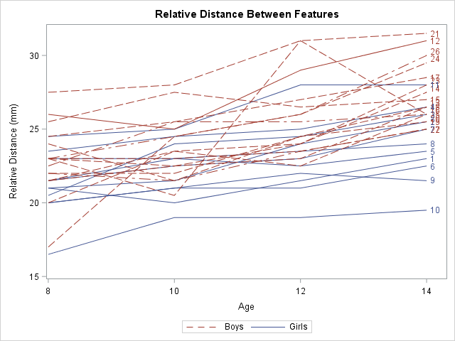
Notice that I used the LEGENDITEM statement to customize the legend. The LEGENDITEM statement is a SAS 9.4M5 feature. You can delete the LEGENDITEM and KEYLEGEND statements to obtain the default legend.
One of the stated goals of the study is to model the average growth rate of the measurement for boys and for girls. You can see from the spaghetti plot that growth rate appears to be linear and that boys tend to have larger measurements than girls of the same age. However, it is not clear whether the rate (the slope of the average line) is the same for each gender or is significantly different.
The documentation example describes several ways to model the variance structure for the repeated measures. One choice is the AR(1) structure. The following statement uses the REPEATED statement to model the repeated measures. The STORE statement writes an item store that contains information about the model, which is used by PROC PLM to create effect plots:
proc mixed data=pr method=ml; class Person Gender; model y = Gender Age Gender*Age / s; repeated / type=ar(1) sub=Person r; store out=MixedModel; /* create item store */ run; proc plm restore=MixedModel; /* use item store to create fit plots */ effectplot fit(x=Age plotby=Gender); /* panel */ effectplot slicefit(x=Age sliceby=Gender); /* overlay */ *effectplot slicefit(x=Age sliceby=Person); /* ERROR: Person is not a fixed effect */ run; |
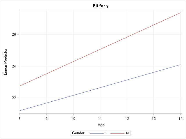
The call to PROC PLM creates a panel of plots with confidence bands (not shown) and a graph that overlays the predicted values for males and females (shown). You can see a small difference in slopes between the two average growth curves, but the "Type 3 Tests of Fixed Effects" table from PROC MIXED (not shown) indicates that the difference is not statistically significant. The graph does not display the raw observations because PROC PLM does not have access to them. However, you can obtain a graph that overlays the observation by modifying the method in the next section.
Notice that this graph displays the model for boys and girls, but not for the individual subjects. In fact, I added a comment to the program that reminds you that it is an error to try to use the PERSON variable in the EFFECTPLOT statement because PERSON is not a fixed effect in the model. If you want to model to growth curves for individuals, see the next section.
Use the OUTPRED= option visualize the random-coefficient model
The spaghetti plot seems to indicate that the growth curves for the individuals have the same slope but different intercepts. You can model this by using the RANDOM statement to add a random intercept effect to the model. The resulting graph "untangles" the spaghetti plot by plotting a line that best fits each individual's growth.
You can use the OUTPRED= option on the MODEL statement to create an output data set in which the predicted values incorporate the random intercept for each person:
/* random coefficient model */ proc mixed data=pr method=ml; class Person Gender; model y = Gender Age Gender*Age / s outpred=Pred; random int / sub=Person; run; /* BE SURE TO SORT by the X variable, before creating a SERIES plot. */ /* These data are already sorted, but the next line shows how to sort, if necessary */ proc sort data=Pred; by Gender Person Age; run; title "Predicted Individual Growth Curves"; proc sgplot data=Pred; scatter x=Age y=Y / group=Gender; series x=Age y=Pred / group=Person GroupLC=Gender curvelabel; /* LEGENDITEM is a SAS 9.4M5 feature. Delete the following statements in older versions of SAS */ legenditem type=markerline name="F" / label="Girls" lineattrs=GraphData1 markerattrs=GraphData1; legenditem type=markerline name="M" / label="Boys" lineattrs=GraphData2(pattern=dash) markerattrs=GraphData2; keylegend "M" "F"; run; |
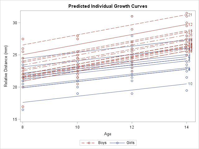
This graph shows a smoothed version of the spaghetti plot. The graph enables you to see the variation in intercepts for the subjects but the slopes are determined by the gender of each individual. In statistical terms, the predicted values in this graph "incorporate the EBLUP values." The documentation contains the formula for the predicted values.
It is worth noting that the MODEL statement in PROC MIXED also supports an OUTPREDM= option. (The 'M' stands for 'marginal' model.) The OUTPREDM= option writes a data set that contains the predictions that do not "incorporate the EBLUP values", where EBLUP is an abbreviation for the "empirical best linear unbiased prediction." These are the same predicted values that you obtain from the STORE statement and PROC PLM. However, the OUTPREDM= data set gives you complete control over how you use the predicted values. For example, you can use the OUTPREDM= data set to add the original observations to the graph of the predicted values for boys and girls.
In summary, when you include a continuous covariate (like age) in a mixed model, there are two ways to visualize the "fit plot." You can use the STORE statement and PROC PLM to obtain a graph of the predictions from the "marginal model" that contains the fixed effects. (You can also use the OUTPREDM= option for this purpose.) Alternatively, if you are fitting a model that estimates random coefficients (intercepts or slopes), the OUTPRED= data set contains the predictions that incorporate the estimates for the random intercepts and/or slopes.

15 Comments
Thank you Rick, this is a great post! Would you be able to tell when the RANDOM or REPEATED statement should be used in the PROC MIXED? What's the difference? It's pretty confusing.
Great questions. Yes, it can be confusing, and some procedures (like GLIMMIX) have only a RANDOM statement. Fortunately, there are two great papers by Tao, Kiernan, and Gibbs, which have examples and SAS code:
"Tips and Strategies for Mixed Modeling with SAS/STAT Procedures"
"Advanced Techniques for Fitting Mixed Models Using SAS/STAT Software"
Thank you, Rick. I think you have the best knowledge of mixed procedure and matrix. The repeated statement’s R option provides the estimated R matrix, but it loses the repeated effects’ labels. In this example, the effect is the age and labels are the numbers from 8 to 14? This is inevitable if the matrix becomes SAS dataset by ODS. How can I get the estimated R matrix with the labels? I’m using STAT14.1.
Hi Rick, Thanks for all your great posts on SAS and Mixed procedures.
I would very much appreciate if you could also explain how to print the data that is used to plot the effect plots into a table format. To be more specific, the predicted values and the x values that goes with it.
Thank you
You can use the ODS OUTPUT statement to obtain the values that underlie any graphic that SAS creates.
Thank you for the great tip !
Hi Thank you for the very helpful post - one question, how can this code be adjusted for a continuous moderator (so not included in the Class statement)?
I'm using proc mixed for a repeated measures design (observations nested in persons) and I have a within-person continuous moderator that I want to plot out the interaction for at +1 and -1 standard deviation.
Thank you!
Use the AT option of the EFFECTPLOT statement.
Let's say the continuous variable is M. If the mean +/- (1 standard deviation) are the values 12.34 and 56.78, then you can say
effectplot fit(x=Age plotby=Gender) / at(M=12.34 56.78);
Thank you! I think though that my issue is a bit more complicated: The interaction is between 2 continuous variables:
X = continuous
M (moderator) = continuous
And I want to plot the two lines at +/- sd for both X and M (so I have 4 values for the graph: low-low, low-high, high-low, high-high)
I wasn't sure how to do that and received various error messages.
would appreciate any further guidance,
Thank you!
You can post questions about SAS procedures at the SAS Support Communities. Post a sample of your data, your program, and describe what you hope to get.
Hi Rick!
Thank you so much for your incredible post about visualizing mixed models.
I'm wondering how to plot the "predicted values + estimated values (X*hat(Beta) + Z*hat(u))" for each person and,
then add the average growth rate for each gender to the plot.
Thanks.
You can ask SAS programming questions at the SAS Support Communities.
Hi Rick,
I have to apply the above mixed model including Visits.
We have subjects and visits.
Thanks,
Veena
Hi, just wondered if I need to plot with both category variables, for example, with x values 3, 6, 9, 12 months by gender. I tried your code, but SAS suggested I need to use continuous variable for x instead.
Thank you so much
Please post your question to the SAS Support Communities. That way you can post the SAS code you are using and the data, if necessary. Lots of SAS experts there to help you resolve your issue.