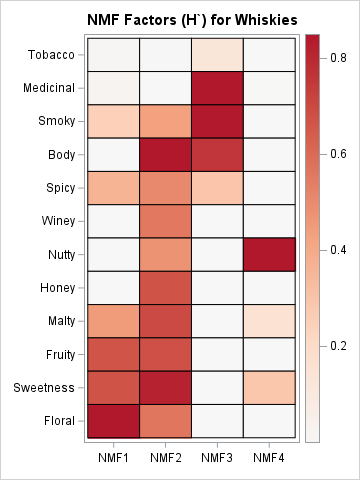
Get the right information, with visual impact, to the people who need it
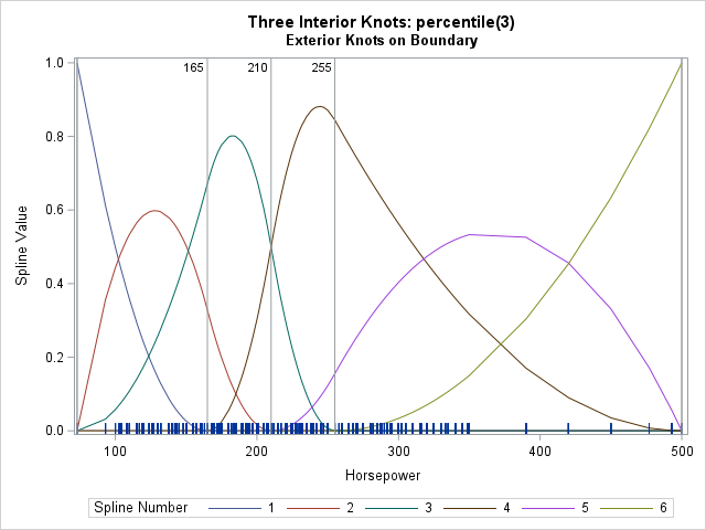
Visualize the placement of knots for regression splines

Splines are useful tools for fitting regression models to data. A spline replaces a single variable (call it X) with several other variables, which are a spline basis for X. When using a spline basis, the shape and location of the basis functions depend on the placement of knots. Knots