A SAS programmer wanted to visualize density estimate for some univariate data. The data had several groups, so he wanted to create a panel of density estimate, which you can easily do by using PROC SGPANEL in SAS. However, the programmer's boss wanted to see filled density estimates, such as shown to the right. These graphs are also known as shaded density plots. This article shows how to create a graph like this in SAS.
A previous article shows how to shade only the tails of a density plot.
Visualize densities of sample data
The first step in any visualization is to prepare data that are suitable to visualize. In my blog, I often use data sets in the SASHELP library, which includes familiar data sets such as Sashelp.Cars, Sashelp.Heart, and Sashelp.Iris. For this task, I will use Sashelp.BWeight, which includes birthweights for 50,000 live singleton births in the US, along with information about the mothers. One of the variables is MomSmoke, which is a binary (0/1) variable that records whether the mother smokes cigarettes. It is well known that babies of smoking mothers tend to weigh less than babies of non-smoking mothers.
You can use PROC SGPANEL to visualize the weight of the babies for smoking and non-smoking mothers. The following statements overlay a histogram and a kernel density estimate (KDE) for each group. To make it easier for you to use your own data, I include a few macro variables. You can specify the names of your data set and the variable whose distribution you want to visualize. You can also specify the classification (grouping) variable and the number of levels, which equals the number of rows in the panel of density estimates.
/* generalize the problem: Specify the name of the data set, the name of the response variable, and the name of the classification variable */ %let DSName = Sashelp.BWeight; /* data set name */ %let Var = Weight; /* response variable */ %let ClassVar = MomSmoke; /* classification variable */ ods graphics / width=480px height=480px; title "Panel from PROC SGPANEL"; proc sgpanel data=&DSName noautolegend; panelby &ClassVar / layout=ROWLATTICE rowheaderpos=right; histogram &Var; density &Var / type=kernel; /* or TYPE=NORMAL for a normal estimate */ rowaxis grid; colaxis grid; run; |
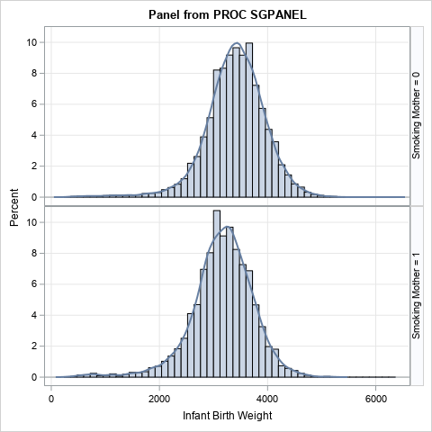
This is the graph that I recommend that you use to demonstrate the empirical difference between the weights of babies for smoking and non-smoking mothers. However, the SAS programmer wanted to display ONLY the KDE and wanted to fill the area underneath the KDE curve. Unfortunately, the DENSITY statement does not support a "FILL" option. However, the BAND statement can be used to display a curve and to fill the area beneath the curve.
I have previously shown how to use the BAND statement to display the upper or lower tail densities for a distribution. You can use the same ideas to display a panel of shaded density estimates. However, I first want to show that you can get a nice-looking panel by using only PROC UNIVARIATE.
Use PROC UNIVARIATE to create a panel
The HISTOGRAM statement supports many options and suboptions. Many people use the KERNEL option to overlay a kernel density estimate on a histogram. However, you can use the NOBARS option to hide the histogram bars, leaving only the KDE. Furthermore, you can use the KERNEL(FILL) suboption to display shaded density curves. Lastly
title "Panel of Kernel Density Estimates"; proc univariate data=&DSName; class &ClassVar; var &Var; histogram &Var / odstitle=title nocurvelegend nobars /* hide histogram */ kernel(fill) /* display KDE, or use NORMAL(FILL) */ statref=mean /* optional: display mean for each group */ ncol=1 nrow=2 /* optional: set NROW=(number of levels in ClassVar) */ ; ods select histogram; run; |
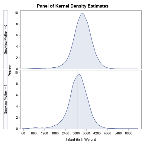
This panel of KDEs includes reference lines for the mean of each group, which can be an effective way to visualize the difference between the means of the groups. The histograms do not appear, and the KDEs are filled. If you do not like the default layout of ticks on the horizontal axes, you can use the ENDPOINTS= or MIDPOINTS= options to change the tick locations.
Use the BAND statement to visualize a density estimate
Although PROC UNIVARIATE does a good job creating a panel of shaded density estimates, PROC SGPANEL supports more ways to control colors, placement of headers, and other attributes. The HISTOGRAM statement in PROC UNIVARIATE supports the OUTKERNEL= option, which you can use to write a data set that contains the coordinates for the KDE curves of each group. You can then use PROC SGPANEL to read that data and display a panel of curves.
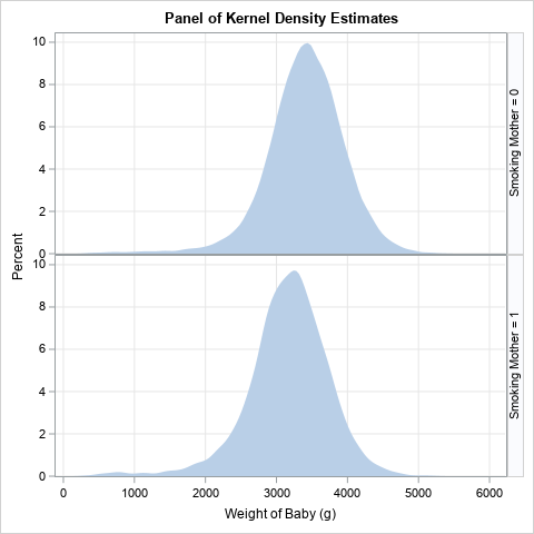
If you want to obtain shaded density estimates, use the BAND statement to specify the upper limit of a band. Use zero (0) as the lower limit. The following statements create a basic panel of shaded KDEs.
/* Write the KDEs to a data set */ proc univariate data=&DSName; class &ClassVar; var &Var; histogram &Var / odstitle=title nobars overlay kernel outkernel=OutKer; /* write kernel estimates to data set */ ods select histogram; /* ignore this graph */ run; /* Read KDE coordinates into PROC SGPLOT or PROC SGPANEL. If you use LAYOUT=ROWLATTICE, you do not need to specify the levels of the grouping variable */ proc sgpanel data=OutKer; *label _VALUE_ = "Weight of Baby (g)" _PERCENT_="Percent"; /* optional: set labels */ panelby &ClassVar / layout=ROWLATTICE rowheaderpos=right onepanel; band x=_VALUE_ upper=_Percent_ lower=0; rowaxis grid offsetmin=0; colaxis grid ; run; |
For brevity, I did not change any default attributes in this plot, other than adding grid lines. The graph at the top of this article includes small changes to the axis labels and the tick marks.
Create filled density estimates for your data
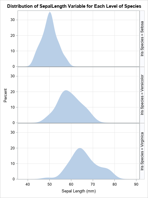
If you want to try out this idea on your own data, change the values of the macro variables and rerun only the program in the previous section. For example, here is the same code applied to the SepalLength variable in the Sashelp.Iris data, grouped by the Species variable:
/* run the program on different data */ %let DSName = Sashelp.Iris; /* data set name */ %let Var = SepalLength; /* response variable */ %let ClassVar = Species; /* classification variable */ /* Write the KDEs to a data set */ proc univariate data=&DSName; class &ClassVar; var &Var; histogram &Var / odstitle=title nobars overlay kernel outkernel=OutKer; /* write kernel estimates to data set */ ods select histogram; run; /* Read KDE coordinates into PROC SGPLOT or PROC SGPANEL. If you use LAYOUT=ROWLATTICE, you do not need to specify the levels of the grouping variable */ title "Distribution of &Var Variable for Each Level of &ClassVar"; proc sgpanel data=OutKer; label _VALUE_ = "Sepal Length (mm)" _PERCENT_="Percent"; panelby &ClassVar / layout=ROWLATTICE rowheaderpos=right onepanel; band x=_VALUE_ upper=_Percent_ lower=0; rowaxis grid offsetmin=0; colaxis grid ; run; |
Instead of hard-coding the label, you could look up the label for the response variable, copy it into a macro variable, and automatically use it on the LABEL statement. A companion article shows how to get the label of a variable into a macro variable in SAS.
Summary
This article shows how to create a panel of filled kernel density estimates for subpopulations that belong to groups. The UNIVARIATE procedure can create this panel by itself, but for more control you might want to write the density estimates to a SAS data set and use PROC SGPANEL to display the KDEs. To display filled KDEs, you need to use the BAND statement instead of the SERIES statement.

1 Comment
Thank you for the wonder teaching