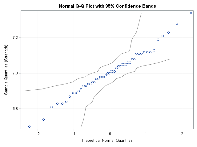
Strengthen your programming skills with tips and techniques from the experts
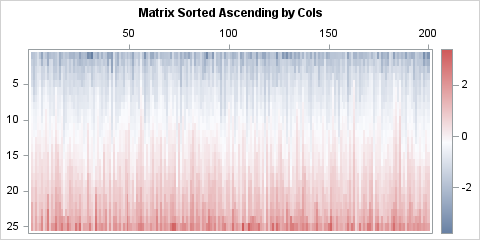
Sort the rows or columns of a matrix independently

When you have a data matrix, the rows represent observations and the columns represent variables. If you sort the matrix by one or more columns, the sorting occurs in a way that preserves the elements within rows. Although the rows of the sorted matrix are permuted by the sort, the