Modern software for statistical graphics automatically handles many details and graph defaults, such as the range of the axes and the placement of tick marks. In the days of yore, these details required tedious manual calculations. Think about what is required to place ticks on a scatter plot. On the one hand, graphic designers often suggest between 3 and 7 tick marks. On the other hand, it is also important to use a "nice" values for the tick locations, so you can't just divide the range of the data by 5 or 7 and use that value as the tick increment. Typical "nice" increments include 1, 2, 2.5, and 5. For data that spans a large range, you can multiply these increments by a power of 10; for small ranges, divide by a power of 10.
Although modern software automatically chooses an axis range and tick values based on the data, it is sometimes useful to remember the manual calculations that produce "nice" tick marks for a continuous variable. One application is to create graphs that preserve the shape of geometric figures. Warren Kuhfeld wrote a long blog post about the importance of geometry-preserving graphs, and why you should use them for statistical graphics that visualize multivariate analyses such as principal component analysis. His article include SAS macros that compute the minimum value, maximum value, and tick increment for the X and Y axis on a geometry-preserving scatter plot.
Kuhfeld shows a DATA step that implements a simple heuristic algorithm that produces "nice" tick increments. In this article, I explain how the algorithm works. I also compare it to a more sophisticated method, which is available by using the GSCALE subroutine in SAS IML software.
The heuristics of nice tick marks
I think the tick-selection algorithm in Kuhfeld's blog post is one of those "folklore" algorithms for which I do not have a citation. (If you know a reference, post a comment.) The main idea of the heuristic algorithm follows:
- Compute the range of the data and the smallest power of 10 that is greater than or equal to the range. You can use the LOG10 function to find the power of 10, which I call the magnitude of the data range. If the range is R, then the magnitude of the range is found by calculating 10k, where k = ceil(log10(R)).
- Let I = 10k be the initial estimate of the increment for tick marks.
The quantity R / I approximates the number of tick increments for the range. Perform the following adjustments:
- If R / I is too big, double I. This decreases the number of ticks.
- If R / I is too small, halve I. This increases the number of ticks.
- If R / I is still too small, halve I again.
Because we want between 3 and 7 ticks, one way to assess whether the quantity R / I is "too big" is to compare the quantity with a value close to 7, such as 7.5. Similarly, the quantity R / I is "too small" if it is less than 2.5.
A DATA Step implementation of finding "nice" ticks
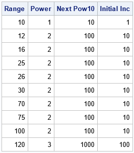
Let's implement the heuristic algorithm in the SAS DATA step. First, let's make sure we understand how to get the next power of 10 and the magnitude of the range:
/* The next power of 10 larger than the number x is k = ceil(log10(x)); https://blogs.sas.com/content/iml/2014/10/31/next-power-of-2.html We call the quantity 10**k the magnitude of x. Use magnitude/10 as initial interval between ticks. */ data Magnitude; label R="Range" k="Power" nextPow10='Next Pow10' Inc0='Initial Inc' ; input R @@; k = ceil(log10(R)); nextPow10 = 10**k; Inc0 = 10**(k-1); datalines; 10 12 16 25 26 30 70 75 100 120 ; proc print data=Magnitude label noobs; format nextPow10 Inc0 best9.; run; |

The ranges that are greater than 10 and less than or equal to 100 have magnitude 100. For these ranges, the initial estimate for an interval between tick marks is 10.
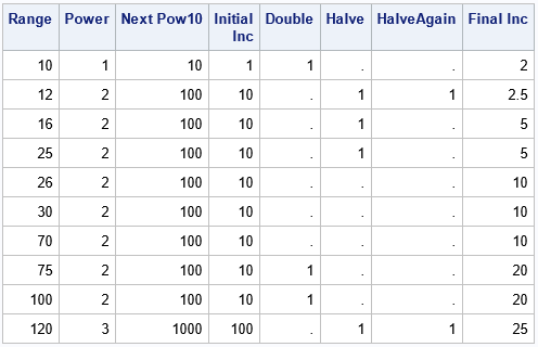
Clearly, if the range is 12 or even 25, a tick interval of 10 does not result in using three or more intervals on the axis of a graph. Similarly, if the range is 75 or 100, an interval of length 10 results in too many intervals on an axis. The next routine is adapted from Kuhfeld's blog post. It implements the process of increasing or decreasing the initial interval by doubling or halving the Inc variable. I have added binary indicator variables to make it easier to see which data ranges result in modifying the initial interval length.
/* Adapted from a macro by Warren Kuhfeld at https://blogs.sas.com/content/graphicallyspeaking/2017/07/27/advanced-ods-graphics-equated-axes-and-the-aspect-ratio/ */ data AdjustInc; set Magnitude; Double = .; Halve = .; HalveAgain = .; Inc = Inc0; /* the number of intervals is approximately R/Inc; goal: 3-7 intervals */ if R / Inc >= 7.5 then do; /* too many ticks; double increment */ Double = 1; Inc = Inc * 2; end; if R / Inc <= 2.5 then do; /* too few ticks; halve increment */ Halve = 1; Inc = Inc / 2; end; if R / Inc <= 2.5 then do; /* still too few ticks; halve increment again */ HalveAgain = 1; Inc = Inc / 2; end; run; proc print data=AdjustInc label noobs; format nextPow10 Inc best9.; label Inc='Final Inc'; run; |

The table shows the following:
- When the range is 10, 75, and 100, the algorithm doubles the size of the tick interval, which reduces the number of ticks.
- When the range is 12, 16, 25, and 120, the algorithm halves the size of the tick interval, which increases the number of ticks.
- When the range is 12 and 120, the algorithm halves the size of the tick interval again.
- The algorithm does the same operations when the range is R and when the range is 10R. Thus, it is sufficient to study the algorithm for data within one order of magnitude, such as (10, 100].
A more sophisticate algorithm for placing ticks
The previous algorithm is simple but effective. A more sophisticated algorithm was published by Lewart (Algorithm 463 of the Collected Algorithms of the ACM, 1973). Lewart's method enables you to specify the set of "nice" tick intervals, which is useful if you are dealing with time, where you might want to the ticks to be spaced by 7 days, 30 days, 60 minutes, 12 hours, and so forth. Lewart's method has been part of the SAS IML language since the 1980's. It is implemented in the GSCALE subroutine, which outputs the minimum tick mark on an axis, the maximum tick mark, and the interval between ticks.
For example, let's call the GSCALE subroutine for data in the range [0, 12]. Let's tell it that we prefer five tick intervals. (The routine might ignore our preference and return a solution that has a different number of intervals, such as 4 or 6.) You could simulate data in that range, or simply pass a sample of size 2 that consists of the observations {0, 12}:
proc iml; Range = 12; X = 0 // Range ; /* sample data */ numTicks = 5; /* provide a hint for number of ticks */ call gscale( ticks, X, numTicks ); print Range (rowvec(ticks))[c={'Min Tick' 'Max Tick' 'Inc'}]; |

For this sample, the GSCALE routine suggests putting the first tick at 0, the last tick at 12.5, and using 2.5 as the tick interval. This results in five intervals, with tick marks at 0, 2.5, 5, 7.5, 10, and 12.5. For this example, GSCALE returns the same tick interval (2.5) as the simpler algorithm.
Let's read in the ranges from the AdjustInc data set and ask GSCALE to recommend the placement of ticks for each data range. We'll also read in the tick interval recommended by the simple DATA step algorithm and compare it to the GSCALE suggestion:
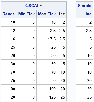
use AdjustInc; read all var {"R" "Inc"}; close; call randseed(123); GSResults = j(nrow(R), 4); GSResults[,1] = R; numTicks = 5; /* provide a hint for number of ticks */ do i = 1 to nrow(R); sampleData = 0 // R[i]; /* or simulate data in (0,R[i]) */ call gscale( ticks, sampleData, numTicks ); GSResults[i, 2:4] = rowvec(ticks); end; print GSResults[L="GSCALE" c={'Range' 'Min Tick' 'Max Tick' 'Inc'}], Inc[L='Simple' c='Inc']; |

The left table is the result of calling the GSCALE subroutine. The right table is the size of the interval between ticks for the heuristic DATA step algorithm. The tables show that the algorithms agree for some data range, but the GSCALE routine makes different suggestions when the range is 16, 26, and 30. I won't discuss each case, but notice for a range of 30, the simpler algorithm suggests Inc=10, which results in three tick intervals. In contrast, the GSCALE routine suggests Inc=5, which results in six intervals. I prefer the GSCALE suggestion.
The GSCALE routine is very useful because you can specify a hint for the number of subdivisions for the range, and a customized set of "nice" tick values.
Summary
Although modern software automatically places tick marks on a continuous axis, there are some applications (discussed in Kuhfeld's article) which require knowing how to compute tick locations and ranges manually. Kuhfeld showed a DATA set implementation of a simple algorithm that works well in practice. However, there are other algorithms, including one provided by the GSCALE routine in SAS IML software. This article explains how the simple algorithm works and compares the results to the more sophisticated GSCALE algorithm for a few data ranges.

2 Comments
Hi Rick, The reference for the Kuhfeld folklore approach is Kuhfeld (unpublished, PLOTIT SAS macro) or something like that. It is just a seat of the pants approach that I developed that seemed to work pretty well. This was during a period of the late 1980s or 1990s where procedure development was discouraged unless you were working on a high-priority project, so I wrote the PLOTIT macro for equated plots, vectors, and other things that seemed important for displaying graphs from psychometric procedures long before ODS Graphics.
Great! Thanks for the historical perspective. I suspect variations of this method were developed independently by multiple researchers. It's interesting that we are still discussing it 30-35 years later!