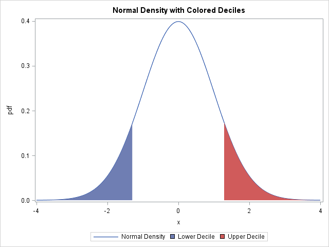
A SAS programmer wanted to plot the normal distribution and highlight the area under curve that corresponds to the tails of the distribution. For example, the following plot shows the lower decile shaded in blue and the upper decile shaded in red.
An easy way to do this in SAS is to use the BAND statement in PROC SGPLOT. The same technique enables you to shade the area under a curve between two values, such as the central 80% of a distribution or the domain of integration for an integral.
For a parametric distribution such as the standard normal distribution, you can use a DATA step to evaluate the probability density function (PDF) at evenly spaced X values. The plot of the PDF versus X is the density curve. To use the BAND statement, you need to compute two other variables. The left tail consists of the set of X and PDF values for which X is less than some cutoff. For example, the lower decile cutoff is -1.28155, which is the value xlow for which Φ(xlow) = 0.1, where Φ is the standard normal cumulative distribution function (CDF). The following DATA step uses the QUANTILE function to compute the quantile (inverse CDF) values. (To remind yourself what these probability functions do, see the article "Four essential functions for statistical programmers.")
data density; low = quantile("Normal", 0.10); /* 10th percentile = lower decile */ high = quantile("Normal", 0.90); /* 90th percentile = upper decile */ drop low high; /* if step size is dx, location of quantile can be off by dx/2 */ do x = -4 to 4 by 0.01; /* for x in [xMin, xMax] */ pdf = pdf("Normal", x); /* call PDF to get density */ if x<=low then up1 = pdf; else up1 = .; if x>=high then up2 = pdf; else up2 = .; output; end; run; title "Normal Density with Colored Deciles"; proc sgplot data=density; series x=x y=pdf / legendlabel="Normal Density"; band x=x upper=up1 lower=0 / fillattrs=GraphData1 legendlabel="Lower Decile"; band x=x upper=up2 lower=0 / fillattrs=GraphData2 legendlabel="Upper Decile"; run; |
The density curve with shaded tails was shown previously. The LOWER= option in the BAND statement sets the lower part of the colored bands to 0.
One subtlety is worth mentioning. In the DATA step, a DO loop is used to evaluate the density at points separated by 0.01. That means that the shaded regions have some inaccuracy. For example, the left tail in the image appears at x = -1.28, rather than at the exact value x = -1.28155. If more accuracy is required, you can evaluate the PDF at the exact quantile value and then sort the data set prior to graphing.
Shading quantiles of a kernel density estimate
The same technique can be used to color the tails of a nonparametric curve, such as a kernel density estimate. For example, suppose you want to compute a kernel density estimate for the Systolic variable in the Sashelp.Heart data set. The variable records the systolic blood pressures of 5,209 patients. You can use the OUTKERNEL= option in the HISTOGRAM statement of PROC UNIVARIATE writes the kernel density estimate to a data set, as follows:
proc univariate data=Sashelp.Heart; var systolic; histogram systolic / kernel outkernel=KerDensity; ods select histogram quantiles; run; |
The output from the procedure (not shown) shows that the 10th percentile of the systolic values is 112, and the 90th percentile is 168. The output data set (called KerDensity) contains six variables. The _VALUE_ variable represents the X locations for the density curve and the _DENSITY_ variable represents the Y locations. You can use the empirical estimate of quantiles to set the cutoff value and highlight the upper and lower tails as follows:
%let lowerX = 112; /* empirical 10th percentile */ %let upperX = 168; /* empirical 90th percentile */ data KerDensity; set KerDensity; if _VALUE_<&lowerX then up1 = _DENSITY_; else up1 = .; if _VALUE_>&upperX then up2 = _DENSITY_; else up2 = .; run; title "Kernel Density with Colored Deciles"; proc sgplot data=KerDensity; series x=_VALUE_ y=_DENSITY_ / legendlabel="Density"; band x=_VALUE_ upper=up1 lower=0 / fillattrs=GraphData1 legendlabel="Lower Decile"; band x=_VALUE_ upper=up2 lower=0 / fillattrs=GraphData2 legendlabel="Upper Decile"; xaxis label="Systolic Blood Pressure" minorcount=4 minor; run; |
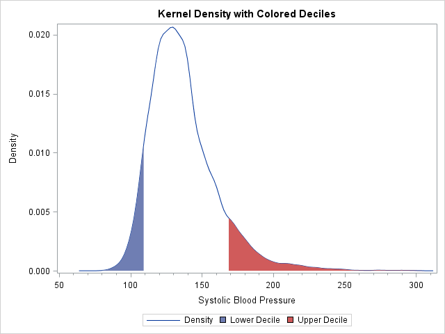
Notice that except for the names of the variables, the PROC SGPLOT statements are the same for the parametric and nonparametric densities.
Although this example uses deciles to set the cutoff values, you could also use medically relevant values. For example, you might want to use red to indicate hypertension: a systolic blood pressure that is greater than 140. On the low side, you might want to highlight hypotensive patients who have a systolic blood pressure less than 90.

5 Comments
I want to make a graph with shaded areas according to percentiles. However, when I try to apply your code (see below) I end up with white bars between different percentiles. Is there a way to make the entire graph shaded according to percentiles without any overlap?
proc univariate data=ttrdata_spline;
var ttr_mgdl;
histogram ttr_mgdl / kernel outkernel=KerDensity;
ods select histogram quantiles;
run;
%let group1 = 18.9; /* empirical 5th percentile */
%let group2 = 24.8; /* empirical 25th percentile */
%let group3 = 28.6; /* empirical 50th percentile */
data KerDensity;
set KerDensity;
if _VALUE_<&group1 then up1 = _DENSITY_; else up1 = .;
if &group1=<_VALUE_<&group2 then up2 = _DENSITY_; else up2 = .;
if &group2=<_VALUE_=&group3 then up4 = _DENSITY_; else up4 = .;
run;
title "Kernel Density with Colored Percentiles";
proc sgplot data=KerDensity;
series x=_VALUE_ y=_DENSITY_ / legendlabel="Density";
band x=_VALUE_ upper=up1 lower=0 / fillattrs=GraphData1 legendlabel="50th percentile";
xaxis label="Transthyretin (mg/dL)" LABELATTRS=(weight=BOLD);
yaxis Label="Density" LABELATTRS=(weight=BOLD);
run;
Thanks,
Anders
Don't try to use the data to set the lower bounds of each band. Just use the upper bounds and define each group as the set of data values less than or equal to the percentile. When you overlay the bands, the bands for the smaller percentiles will obscure the bands for the larger percentiles:
If you have further questions about graphics, please post them to the SAS Graphics Support Community.
how to deal with the shading for the overlapping? if there are two overlapping density curves
I suggest using semi-transparent colors. For a similar example, see this article.
Pingback: Filled density plots in SAS - The DO Loop