Get the right information, with visual impact, to the people who need it
Nine ways to visualize a continuous univariate distribution in SAS - Part 2

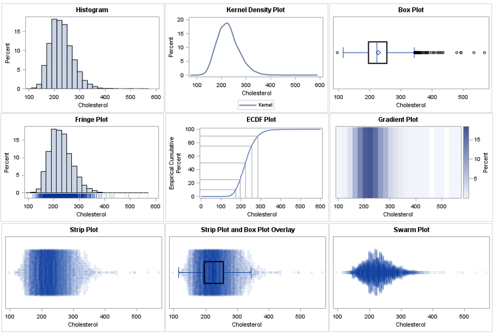
There are many ways to visualize the distribution of univariate data. A previous article presents an overview and shows how to use SAS to create histograms, kernel density estimates, box plots, and cumulative distribution plots. This article continues the visualization journey, with an emphasis on dot plots and heat maps.