In an article about how to visualize missing data in a heat map, I noted that the SAS SG procedures (such as PROC SGPLOT) use the GraphMissing style element to color a bar or tile that represents a missing value. In the HTMLBlue ODS style, the color for missing values is gray. This article shows how to override the GraphMissing color by using a range attribute map in SAS. The appendix of this article includes links to articles that discuss range attribute maps in more detail.
A range attribute map is usually used to define a color model (also called a color ramp) and to associate each color with a value for a variable. However, a range attribute map also supports assigning the color of the missing category, as shown in this article.
Creating a range attribute map enables you to specify the missing-value color for any graph that uses the map. A future article shows how to override the GraphMissing color by modifying an ODS style. Modifying an ODS style enables you to change the missing-value color for all graphs.
Example Data
The following data and heat map are from a previous article. The data are for five patients in a clinical study. After the initial baseline measurement (Week=0), the patients were supposed to be measured weekly for 10 weeks. Only one patient kept all 10 appointments. The remaining patients missed at least two appointments. The following heat map (sometimes called a lasagna plot) shows the clinical measurement for each patient and for each week of the study.
data Clinical; input patientID @; do Week = 0 to 10; input Value @; output; end; /* ID Wk1 Wk2 Wk3 Wk4 ... Wk10*/ datalines; 1001 12.0 13.0 13.0 . . . 13.0 14.0 14.5 15.0 13.5 1002 11.5 12.5 . 11.0 . . . . . 9.5 8.0 1003 12.0 . . 11.0 . 10.5 11.0 . . 10.5 9.0 1004 11.0 11.0 11.0 . 7.5 6.5 . 7.0 7.5 5.5 4.0 1005 10.0 10.5 11.0 9.0 7.0 7.5 7.0 7.5 4.0 6.5 5.5 ; %let WhiteYeOrRed = (CXFFFFFF CXFFFFB2 CXFECC5C CXFD8D3C CXE31A1C); title "Missing Values Displayed in GraphMissing Color"; proc sgplot data=Clinical; heatmapparm x=Week y=PatientID colorresponse=Value / outline outlineattrs=(color=gray) colormodel=&WhiteYeOrRed; gradlegend; refline (1000.5 to 1005.5) / axis=Y lineattrs=(color=black thickness=2); xaxis integer values=(0 to 10) valueshint; legenditem type=fill name='missItem' / fillattrs=GraphMissing label="Missing Data"; keylegend 'missItem'; run; |
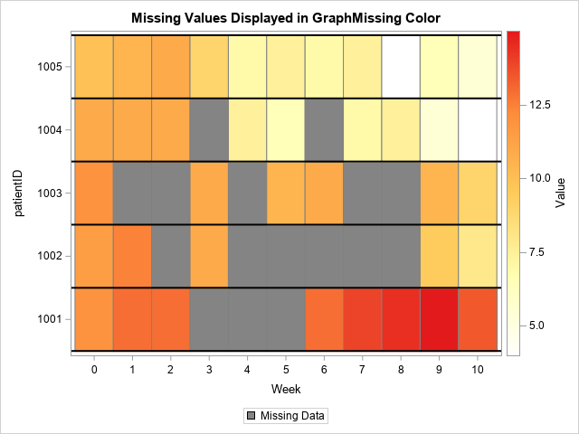
The value of the clinical measurement is indicated by using a white-yellow-orange-red color model. Missed appointments are displayed in gray, which is the color of the GraphMissing style element in the ODS style that I am using. Suppose you want to use a color other than gray. You can override the color used in the ODS style, which will affect all graphs, or you can create a range attribute map and use it for only this one graph. The next section shows how to define a range attribute map.
Define a range attribute map
The references in the appendix provide details, but the primary purpose of a range attribute map is to map a set of continuous values onto a spectrum of colors. In short, a range attribute map is a special SAS data set that enables you to define the colors in a custom color ramp and the values that the ramp represents.
The data set must contain variables named MIN and MAX, which you use to associate a range of values to colors. But there are special values that you can use in the MIN or MAX columns:
- MIN = _MIN_ specifies the smallest data value in a variable.
- MAX = _MAX_ specifies the largest data value in a variable.
- MIN = _MISSING_ specifies how to assign attributes to missing values for the variable.
To make sure we can clearly see the missing values, let's choose a bright and obnoxious color, such as cyan (bright blue). I wouldn't choose this color for serious work, but it will make it easy to see the missing values in this example.
/* create a range attribute data set */ data MyRangeAttrs; retain ID "MapMissing"; length min $10 max $10 color altcolor colormodel1 colormodel2 colormodel3 colormodel4 colormodel5 $15; input min max color altcolor colormodel1 colormodel2 colormodel3 colormodel4 colormodel5; datalines; _MISSING_ . CYAN CYAN . . . . . _MIN_ _MAX_ . . CXFFFFFF CXFFFFB2 CXFECC5C CXFD8D3C CXE31A1C ; |
The variables in the data set must have certain names, as specified in the the documentation. The first observation specifies the colors for the missing values (MIN=_MISSING_). The COLOR variable specifies the color for areas and bars. The ALTCOLOR variable specifies the color for markers and lines. The second observation specifies a color model to use for nonmissing observations. For this example, I've used the same white-yellow-orange-red color model.
To use the range attribute map, specify the name of the data set by using the RATTRMAP= option on the PROC SGPLOT statement. A data set can include many different mappings, each defined by a unique ID. In this case, the data set contains only one mapping, and the ID value is 'MapMissing.' Use the RATTRID=MapMissing option to specify the ID value for the map. The following statements use the range attribute data set to assign colors to the heat map tiles. I also had to modify the LEGENDITEM statement so that a cyan-colored swatch appears in the legend.
title "Missing Values Displayed in Custom Color"; proc sgplot data=Clinical RATTRMAP=MyRangeAttrs; /* <== HERE */ heatmapparm x=Week y=PatientID colorresponse=Value / outline outlineattrs=(color=gray) RATTRID=MapMissing; /* <== AND HERE */ gradlegend; refline (1000.5 to 1005.5) / axis=Y lineattrs=(color=black thickness=2); xaxis integer values=(0 to 10) valueshint; /* if you use FILLATTRS=GraphMissing, you will get gray */ legenditem type=fill name='missItem' / fillattrs=(color=CYAN) label="Missing Data"; keylegend 'missItem'; run; |
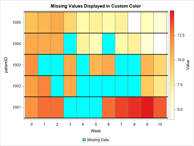
Success! The missed appointments are now displayed by using the (very bright!) cyan color. By using the range attribute map, I have complete control over the colors of the tiles, including the tiles that show missing values.
Summary
In summary, this article shows how to create a range attribute map for a heat map. The primary purpose of a range attribute map is to map a set of continuous values onto a spectrum of colors. However, by using the special keyword "_MISSING_" as a value for the MIN variable, you can control the color that is used to display missing values.
Further reading
- SAS documentation: The documentation for the range attribute map data set.
- Rick shows how to define and use a range attribute map in GTL.
- Sanjay Matange's introduction to using a range attribute maps in SGPLOT.
- Warren Kuhfeld's advanced treatment of range attribute maps in SGPLOT.

2 Comments
Excellent explanation for visualization.
Pingback: Automate the creation of a range attribute map in SAS - The DO Loop