Last week I discussed how to create spaghetti plots in SAS. A spaghetti plot is a type of line plot that contains many lines. Spaghetti plots are used in longitudinal studies to show trends among individual subjects, which can be patients, hospitals, companies, states, or countries. I showed ways to ease overplotting in spaghetti plots, but ultimately the plots live up to their names: When you display many individual curves the plot becomes a tangled heap of noodles that is hard to digest.
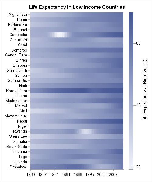
An alternative is to use a heat map instead of a line plot, as shown to the left. (This graph is created later in this article.) Each row of the heat map represents a subject. Each column represents a time point. Heat maps are useful when a response variable is recorded for every individual at the same set of uniformly spaced time points, such as daily, monthly, or yearly.
In a cleverly titled paper, Swihart et al. (2010) proposed the name "lasagna plot" to denote a heat map that visualizes longitudinal data. Whereas the spaghetti plot allows "noodles" (the individual curves) to cross, a lasagna plot layers the noodles horizontally, one on top of another. A related visualization is a calendar chart (Mintz, Fitz-Simons, and Wayland (1997); Allison and Zdeb (2005)), which also uses colored tiles to convey information about a response variable as a function of time.
This article shows how to create lasagna plots in SAS. To create a lasagna plot in SAS you can:
- Use a SAS macro that calls SAS/GRAPH procedures (Gao, et al., 2012).
- In SAS 9.3, use the HEATMAPPARM statement in the Graph Template Language (GTL).
- In SAS 9.40M3, use the HEATMAP statement in PROC SGPLOT.
- In SAS/IML 13.1 (released with SAS 9.4m1), use the HEATMAPCONT subroutine in PROC IML.
You can download the SAS program used to create all the graphs in this article.
Create a lasagna plot in #SAS, because sometimes spaghetti plots don't satisfy. #DataViz Share on XCreate a basic lasagna plot in SAS
In a previous article I showed how to download the World Bank data for the average life expectancy in more than 200 countries during the years 1960–2014. After downloading the data, the data are transformed from "wide form" into "long form." The following call to PROC SGPLOT creates a spaghetti plot of the "Low Income" countries.
ods graphics / imagemap=ON; /* enable data tips */ title "Life Expectancy at Birth"; title2 "Low-Income Countries"; proc sgplot data=LE; /* create conventional spaghetti plot */ where income=5; /* extract the "low income" companies */ format Country_Name $10.; /* truncate country names */ series x=Year y=Expected / group=Country_name break curvelabel lineattrs=(pattern=solid) tip=(Country_Name Region Year Expected); run; |
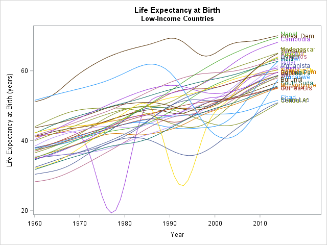
This spaghetti plot is not very enlightening. There are 31 curves in the graph, although discovering that number from the graph is not easy. The labels that identify the curves overlap and are impossible to read. You can see some trends, such as the fact that life expectancy has, on average, increased for these countries. You can also see some interesting features. Cambodia (a reddish color) experienced a dip in the 1970s. Rwanda (purple) and Sierra Leone (gold) experienced dips in the 1990s. Zimbabwe (light blue) experienced a big decline in the 2000s.
A lasagna plot visualizes these data more effectively. The following statements use the HEATMAP statement in PROC SGPLOT, which requires SAS 9.40M3:
title "Life Expectancy in Low Income Countries"; /* 1. Unsorted list of low-income countries */ ods graphics/ width=500px height=600px discretemax=10000; proc sgplot data=LE; where Income=5; /* extract the "low income" companies */ format Country_Name $10.; /* truncate country names */ heatmap x=Year y=Country_Name/ colorresponse=Expected discretex colormodel=TwoColorRamp; yaxis display=(nolabel) labelattrs=(size=6pt) reverse; xaxis display=(nolabel) labelattrs=(size=8pt) fitpolicy=thin; run; |
The graph is shown at the top of this article. Each row is a country; each column is a year. The default two-color color ramp encodes the value of the response variable, which is the average life expectancy. There are 31 x 55 = 1705 tiles, so the image displays a lot of information without any overplotting. You can use the COLORMODEL= option on the HEATMAP statement to specify a custom color ramp.
Many rows have a light shade on the left and a darker shade to the right, which confirms the general upward trend of the response variable. Countries that experienced a period of decline in life expectancy (Cambodia, Rwanda, and Zimbabwe) have a region of white or light blue in the middle of the row. In some countries the life expectancy has been consistently low (Chad and Guinea-Bissau); in others, it has been consistently high (Dem. People's Republic of Korea).
The lasagna plot is not perfect. Because the graph avoids overplotting, you need a lot of space to display the rows. This lasagna plot uses 600 vertical pixels to display 31 countries. That's about 16 pixels for each row after you subtract the space above and below the heat map. If you use a smaller font, you can reduce that to 10 or 12 pixels per row. However, even at 12 pixels per row, you would need about 2500 pixels in the vertical direction to display all 207 countries in the data set. In contrast, the spaghetti plot displays an arbitrary number of (possibly undecipherable) lines in a smaller area.
Sorting rows of a lasagna plot
Alphabetical ordering is often not the most informative way to display the levels of a categorical variable. You can sort the countries in various ways: by the mean life expectancy, by the average rate of increase (slope), by geographical region, and so forth.
To demonstrate sorting, the following program uses the HEATMAPCONT subroutine in the SAS/IML language. The following statements read in data for 51 lower-middle income countries into a SAS/IML matrix. The statements read the original "wide" data whereas PROC SGPLOT required "long" data. Use the PALETTE function to create a custom color ramp for the heat map.
ods graphics / width=500px height=650px; proc iml; varName = "Y1960":"Y2014"; use LL2 where (Income=4); /* read "lower-middle income" countries */ read all var varName into X[rowname=Country_Name]; /* X = "wide" data matrix */ close LL2; Names = putc(Country_Name, "$15."); /* truncate names */ palette = "CXFFFFFF" || palette("YLORRD", 4); /* palette from colorbrewer.org */ /* 2. Order rows by average life expectancy from 1960-2014 */ mean = X[,:]; /* compute mean for each row */ call sortndx(idx, mean, 1, 1); /* sort by first column, descending */ Sort1 = X[idx,]; /* use sorted data */ Names1 = Names[idx,]; /* and sorted names */ call heatmapcont(Sort1) xvalues=1960:2014 yvalues=Names1 displayoutlines=0 colorramp=palette title="Life Expectancy Sorted by Average"; |
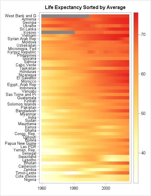
The lasagna plot show the life expectancy for 51 countries. The countries are sorted according to mean life expectancy over the 55 years in the data.
The sorted visualization is superior to the unsorted version. You can easily pick out the countries that have the top life expectancy, such as former Soviet Union countries. you can easily see that the countries at the bottom of the list are mainly in Western and Southern Africa.
The countries that experienced dips in life expectancy contain a patch of white or pale yellow in the middle of the row. Zambia, Kenya, and Lesotho stand out. Countries that have dramatically improved their life expectancy are also evident. For example, the rows for Bhutan and Timor-Leste are white or yellow on the left and dark orange on the right, which indicates that life expectancy has greatly improved in the past 55 years for these countries.
In this heat map, missing values are assigned a gray color. Only two countries (West Bank and Gaza, Kosovo) have missing values for life expectancy.
Other ways to sort lasagna plots
Swihart et al (2010) discuss other sorting techniques. One alternate display is to sort each column independently. This is similar to displaying a sequence of box plots, one for each year, because it shows the distribution of the response variable for each year, aggregated over all countries. This display is accomplished by using the following SAS/IML statements to sort each column in the data matrix:
/* 3. Order each year to see distribution of life expectancy for each year */ Sort2 = X; /* copy original data */ do i = 1 to ncol(X); v = X[,i]; /* extract i_th column */ call sort(v, 1, 1); /* sort i_th column descending */ Sort2[,i] = v; /* put sorted column into matrix */ end; call heatmapcont(Sort2) xvalues=1960:2014 displayoutlines=0 colorramp=palette title="Life Expectancy Sorted for each Year"; |
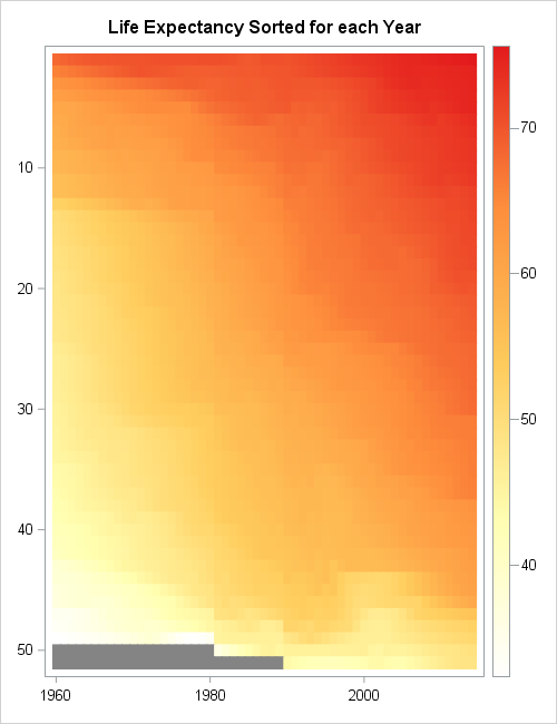
In this graph, each tile still represents a country, but you don't know which country. The purpose of the graph is to show how the distribution of the response variable has changed over time. You can see that in 1960 most countries had a life expectancy of 55 years or less, as shown by the vertical strip of mostly yellow tiles for 1960. Only one country in 1960 had an average life expectancy that approached 70 years (red).
Decades later, the vertical strips contain fewer yellow tiles and more orange and red tiles. The strip for 1990 contains mainly orange or dark orange tiles, which indicates that most countries have an average life expectancy of 55 years or greater. For 2014, more than half of the vertical strip is dark orange or red, which indicates that most countries have an average life expectancy of 65 years or greater.
Summary
A "lasagna plot" is a heat map in which each row represents a subject such as a country, a patient, or a company. The columns usually represent time, and the colors for each tile indicate the value of a response variable. The lasagna plot is useful when the response is measured for all subjects at the same set of uniformly spaced time points.
In contrast to spaghetti plots, there is no overplotting in a lasagna plot. However, each subject requires some minimal number of vertical pixels (usually 10 or more) so lasagna plots are not suitable for visualizing thousands of subjects. Lasagna plots are most effective when you sort the subjects by some characteristic, such as the mean response value.
Much more can be said about lasagna plots. I recommend the paper "A Method for Visualizing Multivariate Time Series Data," (Peng, JSS, 2008), which discusses techniques for standardizing the data, smoothing the data, and discretizing the response variable. Peng's article includes panel displays, which can be created in SAS by using the GTL and PROC SGRENDER.

18 Comments
Love these "pasta" plots. Thank you for bringing them up.
Although I would call this complementary to spaghetti heat map a "noodle plot" as I see no association with lasagna.
Also, it seems that the color gradient legend would be better positioned under the horizontal axis to be aligned with the noodles direction.
Pingback: Create spaghetti plots in SAS - The DO Loop
Very compelling graph! I have two questions about creating this type of graph by using Proc IML.
1)How to determine(show) the year interval(e.g. 20 in this case)?
2)Instead of using 'year', can I use 'month'(e.g Jun16) with format in Proc IML or is there better way to handle that?
Thanks1
Thanks for writing. These are great questions. As stated in the SAS/IML documentation, the SAS/IML graphical function are intended for creating quick-and-dirty exploratory graphs. They are created by calling PROC SGPLOT or the GTL and PROC RENDER. As such, the SAS/IML subroutines have limitations in terms of the number of options that they support. However, you can use the technique earlier in the article (the HEATMAP statement in SGPLOT) to have more control over the values that appear on the axes, or use the GTL for even greater control. For example, the XAXIS statement in PROC SGPLOT supports the VALUES=, the VALUESDISPLAY=, and the VALUESFORMAT= option, and I think these will accomplish everything that you want.
Rick,
It would look better if you use PROC SGPANEL + Heat Map.
We developed a version of the lasagne plot for visualising change in categorical variables in longitudinal studies. The paper is here http://bmcmedresmethodol.biomedcentral.com/articles/10.1186/1471-2288-14-32 and includes SAS code for producing the plots.
Thanks for sharing. I look forward to reading it.
Pingback: Overlay plots on a box plot in SAS: Continuous X axis - The DO Loop
Would you mind flipping one of those upside down so I can shout "My lasagna!!!!!"?
Sorry, I couldn't help myself.
Nice plots though.
Hi Dr. Wicklin, I'm a new SAS user. Thank you very much for proving this interesting topic. For your first graph about "life expectancy in low income countries", I wonder how to change the scale from "20 to 60 by 20" to, say, "20 to 60 by 10"? I use SAS 9.4 and use heatmapparm statement in PROC SGPLOT to construct a similar graph (here you use heat map in 9.4), but I have no idea how to change the scale when referring to the heatmapparm manual. I'm really appreciated for your kind help!
Welcome to SAS. You ask a good question. I do not know of a way to change the default number of ticks on the continuous legend from PROC SGPLOT. I think you might have to write the underlying template and then edit it to use the VALUECOUNTHINT option in the CONTINUOUSLEGENT statement in the GTL.
I suggest you ask your question at the the SAS Graphics Support Community. In general, that is a great place to ask and learn from the experts. Example data and code will help them to quickly mock up some code that works like you want.
Hi Rick,
This is very useful. I am wondering whether we could change the legend. For example, if there are only 4 categories, could we should legend for each with text?
Richard provided one paper for that but I wonder whether proc IML could do this?
Lasagna plots visualize a continuous response variable. If you want to visualize categories (or bin the response into categories), you can use the HeatmapDisc function in SAS/IML. For an example of a heatmap that bins the response variable, see "Assign colors in heat maps."
Great post, Rick! One question for you - I am attempting to recreate a similar graphic and then output it within VA using a stored process. When I embed the proc sgplot approach in between my %stpbegin and %stpend, it displays as expected. However, when I replace the sgplot approach with the proc IML/heatmapcont approach (in order to apply custom sorting of the y-axis), I get a blank screen returned. I have tested that the IML approach does produce the expected image within Enterprise Guide, but for some reason the STP doesn't seem to be passing the image via ODS to VA.
Any guidance on how to get IML or SGRENDER images to display via an STP?
Hi William, jumping in for Rick here. You might need to debug the STP in the web app to see what's happening in the log. Make sure SAS/IML is on the SAS / VA instance you're using. You might need to do more to package the ODS results and image path so that the graphic is streamed to the VA web application. (EG creates some of that ODS wrapper for you, which might explain why it works there.)
Thanks for the quick response, Chris. I'm not terribly familiar with inner workings of ODS but I can poke around. As an aside, do you happen to know if it's possible to force the sgplot approach to plot the left side of the y-axis in a specific ordering (say alphabetically by country name, in this example)? I have presorted my data in the order I want it displayed but the sgplot approach seems to be reordering the y-axis based on the average value of each series (I want it to instead be chronological).
Pingback: 10 tips for creating effective statistical graphics - The DO Loop
Pingback: Use a lasagna plot to visualize US gas prices - The DO Loop