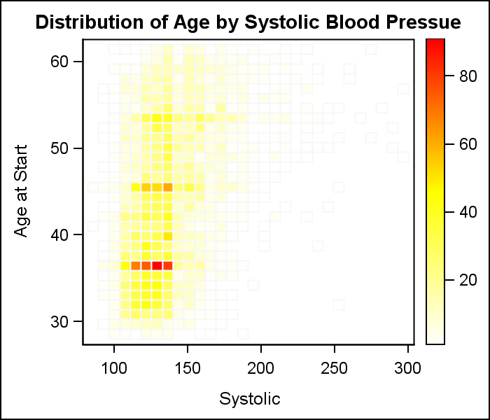
Heat maps are a great way to visualize the bi-variate distribution of data. Traditionally, a heat may may have two numeric variables, placed along the X and Y dimension.
 Each variable range is sub divided into equal size bins to create a rectangular grid of bins. The number of observations that fall into each bin is computed, and the grid is displayed by coloring each bin with a shade of color computed from a color gradient as shown on the right. Click on the graph to see a higher resolution image.
GTL supports a HeatMapParm statement, which can draw a heat map if provided the X-Y grid of bins, along with a count of observations in each bin. Actually, the value can be count, or anything else. So, it comes down to computing the values in each bin.
For the above graph, I used the KDE procedure to compute the frequency of observations in each grid using the "BIVAR" statement for two interval variables. The binned data is written out th the KDEData data set using the ODS Output statement.
ods output bivariatehistogram=KDEData; proc kde data=sashelp.heart; bivar systolic ageatstart / plots=all ng=100; run; |
Once the data is extracted, I keep the non-missing observations and feed the X, Y and Count data to the HeatMapParm statement using the GTL code shown below.
proc template; define statgraph HeatMapNumNum; dynamic _x _y _n; begingraph; entrytitle 'Distribution of Age by Systolic Blood Pressue'; layout overlay; heatmapparm x=_x y=_y colorresponse=_n / colormodel=(white yellow red) display=(fill outline) outlineattrs=(color=cxf7f7f7) xbinaxis=false ybinaxis=false name='h'; continuouslegend 'h'; endlayout; endgraph; end; run; proc sgrender data=KDEData template=HeatMapNumNum; dynamic _x='binx' _y='biny' _n='bincount'; run; |
Each bin is drawn using a fill color whose shade is computed from the three color map I have specified in the GTL code and also a light gray outline. It can be seen from the outlines that all bins are drawn and the KDE procedure computes bins with zero frequencies.
Another way to compute the bins is to use the SURVEYREG procedure, as shown in the code below for two interval variables. This procedure can plot heat maps directly, but for our purposes, we will get the data to draw our own heat map.
ods output fitplot=SurveyRegData; proc surveyreg data=sashelp.heart plot=fit(shape=rec nbins=30); model AgeAtStart = Systolic; run; |
 We can use the data written out by this procedure to draw our heat map just as before. Note, the SurveyReg procedure allows us to set the number of bins in each direction. So, here we have used 30 bins in each direction to get a fine grained heat map.
If you click on the graph on the right, you will notice that the map does not have all bins drawn. This means that the SurveyReg procedure only defines bins that contain non zero counts. Bins with zero counts are not generated at all, resulting in the empty bins (no outline).
In many cases, we may want to create a Heatmap for a combination of one discrete variable and one interval variable. The HeatmapParm GTL statement can take either discrete or interval variables, but now can we compute the bins in this case?
One easy way is using the new GTL or SGPLOT Histogram statement with the GROUP option released with SAS 9.4. Using the GROUP option, the Histogram statement computed a set number of bins for the interval variable for each unique value of the discrete variable. The histogram does the work to make the interval bins the same for all the discrete levels, giving us exactly what we want.
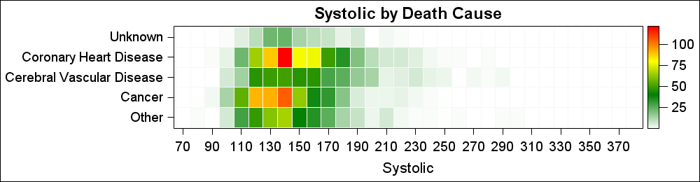 Now, we can take this data, and use the HeatMapParm GTL statement with one discrete and one interval variable as shown on the right. I used a four color ramp just for some variety. The code is shown below.
proc template; define statgraph HeatMapCatNum; dynamic _title _x _y _n; begingraph; entrytitle _title; layout overlay / yaxisopts=(display=(ticks tickvalues)); heatmapparm x=_x y=_y colorresponse=_n / colormodel=(white green yellow red) display=(fill outline) outlineattrs=(color=cxf7f7f7) name='h' ; continuouslegend 'h'; endlayout; endgraph; end; run; |
One can also draw a Heatmap with two discrete variables. The data is easily computed using the MEANS or FREQ procedures. The value for each bin can be a response value as shown in this article.
Full SAS 9.4 GTL Code: HeatMap


4 Comments
Your readers might also be interested in these articles about creating heat maps in SAS:
1) Creating a basic heat map in SAS
2) Creating heat maps in SAS/IML
3) How to choose colors for maps and heat maps
4) How to create a hexagonal heat map in SAS
Many thanks for sharing this interesting code.
I am trying to use this code in SAS but after the define statement (in proc template) every other statement is marked in red (!) as if there is an error somewhere.
Any advice how to overcome that?
Many thanks,
A
It is hard to say without any code. I suggest you post your questions to the Communities page for SAS/Graph and ODS Graphics (with full code and data). There are many experts that can suggest solutions.
https://communities.sas.com/community/support-communities/sas_graph_and_ods_graphics
Pingback: Lasagna plots in SAS: When spaghetti plots don't suffice - The DO Loop