The parable of beer and diapers is often related when teaching data mining techniques. Whether fact or fiction, a Heat Map is useful to view the claimed associations. A co-worker recently enquired about possible ways to display associations or dependency between variables. One option is to show the dependency as a node link diagram. But, he soon settled on the Heat Map as the preferred means, one reason may be its compact display.
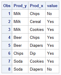
In the examples below, we show a few different ways we can display such data. The data shown below is totally made up just for the purposes of illustration. You may actually have a response value for each crossing, and we will look at that use case later.
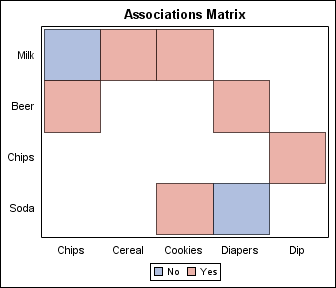
Showing both positive and negative associations, the resulting map is like this:
Code snippet:
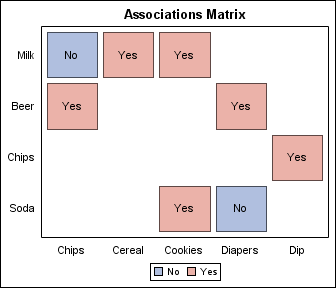
/*--Group Heat Map--*/ proc template; define statgraph dep_grp; dynamic _showvalues _gap _offset; begingraph; entrytitle 'Associations Matrix'; layout overlay / yaxisopts=(reverse=true display=(tickvalues) offsetmin=_offset offsetmax=_offset) xaxisopts=(display=(tickvalues) offsetmin=_offset offsetmax=_offset); heatmapparm x=prod_x y=prod_y colorgroup=value / name='a' display=(fill outline) xgap=_gap ygap=_gap datatransparency=0.4; if(_showvalues eq 'yes') scatterplot x=prod_x y=prod_y / markercharacter=value markercharattrs=(size=9); endif; discretelegend 'a'; endlayout; endgraph; end; run; /*--Heat Dependency Map with Groups, Labels and Gaps--*/ ods graphics / reset width=3.5in height=3in imagename='Dependency_Group_Labels_Gap'; proc sgrender data=dep_grp_2 template=dep_grp; dynamic _showvalues='yes' _gap='3'; run; |
Significant features of the graph are as follows:
- A HeatMapParm with ColorGroup role is used.
- Dynamics are used for _offset, _gap and _showValue.
- These dynamics are set in the SGRENDER step.
- An overlaid ScatterPlot is used to draw the value labels on the cells.
The group value that is seen first gets the first GraphData style element. In this case, GraphData1 has the blue color, and GraphData2 has the red color. We have used some transparency to fade the color intensity.
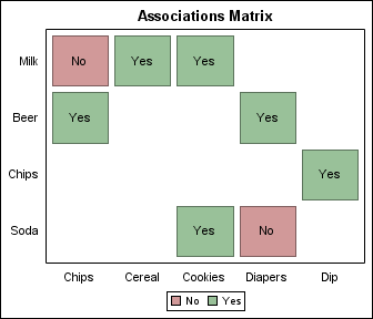
DiscreteAttrMap: Often it is necessary to have reliable color assignment for the cells based on the value of the group variable. We do that using the DiscreteAttrMap feature in SAS 9.3. A DiscreteAttrMap works pretty much like a User Defined Format. Each formatted value for the variable can be assigned specific visual attributes, which are then used regardless of the order or presence of the values in the data:
Code Snippet:
/*--Group Heat Map with Discrete Attr Map--*/ proc template; define statgraph dep_grp_map; dynamic _showvalues _gap _offset; begingraph; entrytitle 'Associations Matrix'; /*--Define the discrete attributes map--*/ discreteattrmap name='map'; value "Yes" / fillattrs=(color=darkgreen); value "No" / fillattrs=(color=darkred); enddiscreteattrmap; /*--Associate the attributes map with the variable--*/ discreteattrvar attrvar=value var=value attrmap="map"; layout overlay / yaxisopts=(reverse=true display=(tickvalues) offsetmin=_offset offsetmax=_offset) xaxisopts=(display=(tickvalues) offsetmin=_offset offsetmax=_offset); heatmapparm x=prod_x y=prod_y colorgroup=value / name='a' display=(fill outline) xgap=_gap ygap=_gap datatransparency=0.6; if(_showvalues eq 'yes') scatterplot x=prod_x y=prod_y / markercharacter=value markercharattrs=(size=9); endif; discretelegend 'a'; endlayout; endgraph; end; run; /*--Heat Dependency Map with Groups, Labels, Gaps and Custom colors--*/ ods graphics / reset width=3.5in height=3in imagename='Dependency_Group_Map'; proc sgrender data=dep_grp_2 template=dep_grp_map; dynamic _showvalues='yes' _gap='3'; run; |
Full SAS 9.3 code: Full SAS 93 Code
If the association has an interval response value, we can display the heat map with a ColorResponse rather than ColorGroup. An example of this is the Calender Heatmap posted earlier in this blog by Pratik Phadke.


4 Comments
I LOVE IT 😉
THE POWER TO KNOW!
Raúl
Pingback: The book writing business: Sanjay Matange explains how becoming an author helped his career - The SAS Bookshelf
Pingback: HeatMap with Numeric and Discrete Variables - Graphically Speaking
Pingback: Big Data Visualization - Graphically Speaking