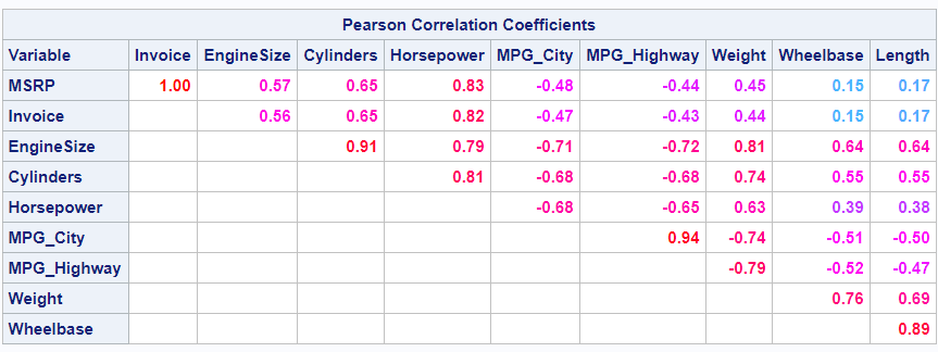
Tag: Heatmap

Data Visualization
Sanjay Matange 0
Beer, diapers and heat map

The parable of beer and diapers is often related when teaching data mining techniques.  Whether fact or fiction, a Heat Map is useful to view the claimed associations.  A co-worker recently enquired about possible ways to display associations or dependency between variables.  One option is to show the dependency as a node

Data Visualization
Pratik Phadke 0
Calendar Heatmaps in GTL

Calendar Heatmaps are an interesting alternative view of time-series data. The measured value is displayed as color mapped cells in a calendar. Calendar Heatmaps can be easily created with SAS 9.3 using just the HEATMAPPARM, SERIESPLOT and BLOCKPLOT statements in GTL and some simple data manipulation. The example below shows