The heatmap is a graphical representation of a table where colors are used to represent the values in the table. This is an effective graphic for finding the minimum and maximum values across the table and may surface patterns in the data.
With the addition of the HEATMAPPARM statement to the GTL syntax in 9.3, heatmaps can be created with just a few lines of code as shown below:
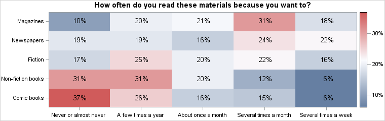
proc template; define statgraph heatmap; begingraph; entrytitle 'How often do you read these materials because you want to?'; layout overlay /* see complete code listing for details */ heatmapparm x=frequency y=type colorresponse=percent / name="heatmap"; scatterplot x=frequency y=type / markercharacter=percent markercharacterattrs=(size=10); continuouslegend "heatmap" / valueattrs=(size=8); endlayout; endgraph; end; run; proc sgrender data=reading template=heatmap; run; |
In the example above, the COLORRESPONSE option specifies that the colors are computed for the crossings using a linear mapping of the values to a color gradient. The actual values for each crossing are shown by overlaying a SCATTERPLOT statement and using its MARKERCHARACTER option.
The X= and Y= options on the HEATMAPPARM statement support either character or numeric data. If numeric data is provided the bins are assumed to be at equal intervals. Users can specify variable sized bins by using the XBOUNDARIES or YBOUNDARIES options. Note that the HEATMAPPARM statement assumes that the data is already aggregated for each crossing.
In the example below, the different age groups are specified by listing the start values for each group in the XBOUNDARIES option. The color scale has been bound to 0 at the lower end to provide an equitable mapping of color in this context.
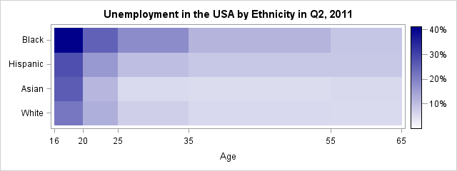
proc template; define statgraph heatmap; begingraph; entrytitle 'Unemployment in the USA by Ethnicity in Q2, 2011'; rangeattrmap name="rmap"; range 0 - max / rangecolormodel=(white darkblue); endrangeattrmap; rangeattrvar attrmap="rmap" var=unemployment_rate attrvar=pColor; layout overlay / yaxisopts=(display=(ticks tickvalues line)); heatmapparm x=Age y=Ethnicity colorresponse=pColor / xboundaries=(16 20 25 35 55 65) xvalues=leftpoints xendlabels=true name="heatmap"; continuouslegend "heatmap"; endlayout; endgraph; end; run; proc sgrender data=unemployment template=heatmap; run; |


2 Comments
Finally SAS has the heatmapparm statement. So cool!
-- Hope it can be ported into SGPLOT soon.
Hi Pratik,
How can I make a color block a square? In your example, color blocks are oblong shape.
Thanks