Some say that opposites attract. Others say that birds of a feather flock together. Which is it? Phillip N. Cohen, a professor of sociology at the University of Maryland, recently posted an interesting visualization that indicates that married couples who are college graduates tend to be birds of a feather. This article discusses Cohen's data and demonstrates some SAS techniques for assigning colors to a heat map, namely how to log-transform the response and how to bin the response variable by quantiles.
Cohen's data and heat map
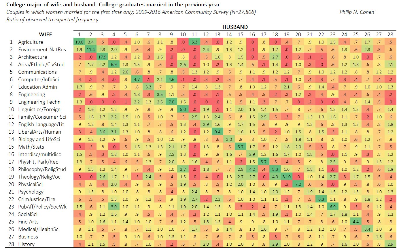
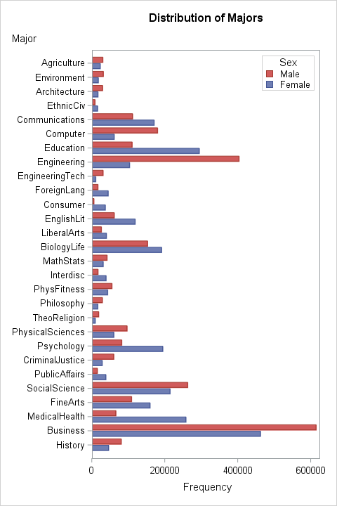
Cohen cross-tabulated the college majors of 27,806 married couples from 2009–2016. The majors are classified into 28 disciplines such as Architecture, Business, Computer Science, Engineering, and so forth. The data are counts in a 28 x 28 table. If the (i,j)th cell in the table has the value C[i,j], then there are C[i,j] married couples in the data for which the wife had the i_th major and the husband has the j_th major.
Cohen used a heat map (shown to the right) to visualize associations among the wife's and husband's majors. This heat map shows the ratio of observed counts to expected counts, where the expected counts are computed by assuming the wife's major and the husband's major are independent. In this heat map, the woman's major is listed on the vertical axis; the man's major is on the horizontal axis. Green indicates more marriages than expected for that combination of majors, yellow indicates about as many marriages as expected, and red indicates fewer marriages than expected. The prevalence of green along the diagonal cells in the heat map indicates that many college-educated women marry a man who studied a closely related discipline. The couples are birds of a feather.
Cohen's heat map displays ratios. A ratio of 1 means that the observed number of married couples equals the expected number. For these data, the ratio ranges from 0 (no observed married couples) to 31. The highest ratio was observed for women and men who both majored in Theology and Religious Studies. The observed number of couples is 31 times more than expected under independence. (See the 19th element along the diagonal.)
A heat map of relative differences
You might wonder why Cohen used the ratio instead of the difference between observed and expected. One reason to form a ratio is that it adjusts for the unequal popularity of majors. Business, engineering, and education are popular majors. Many fewer people major in religion and ethnic studies. If you don't account for the differences in popularity, you will see only the size of the majors, not the size of the differences.
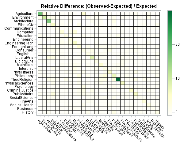
A different way to view the data is to visualize the relative difference: (Observed – Expected) / Expected. The relative differences range from -1 (no observed couples) to 30 (for Theology majors). In percentage terms, this range is from -100% to 3000%. If you create a heat map of the relative difference and linearly associate colors to the relative differences, only the very largest differences are visible, as shown in the heat map to the right.
This heat map is clearly not useful, but it illustrates a very common problem that occurs when you use a linear scale to assign colors to heat maps and choropleth maps. Often the data vary by several orders of magnitude, which means that a linear scale is not going to reveal subtle features in the data. As shown in this example, you typically see a small number of cells that have large values and the remaining cell values are indistinguishable.
There are two common ways to handle this situation:
- If your audience is mathematically savvy, use a nonlinear transformation to map the values into a linear color ramp. A logarithmic transformation is the most common way to accomplish this.
- Otherwise, bin the data into a small number of discrete categories and use a discrete color ramp to assign colors to each of the binned values. For widely varying data, quantiles are often an effective binning strategy.
Log transformation of counts
A logarithmic transform (base 10) is often the simplest way to visualize data that span several orders of magnitudes. When the data contain both positive and negative values (such as the relative differences), you can use the log-modulus transform to transform the data. The log-modulus transform is the transformation x → sign(x) * log10(|x| + 1). It preserves the sign of the data while logarithmically scaling it. The following heat map shows the marriage data where the colors are proportional to the log-modulus transform of the relative difference between the observed and expected values.
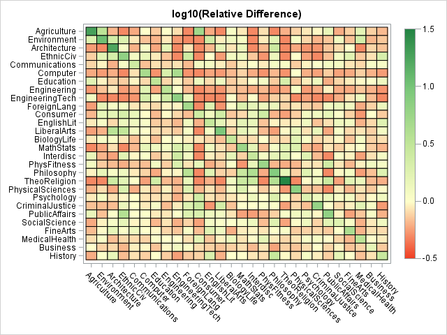
As in Cohen's heat map of the ratios, mapping a continuous color ramp onto the log-transformed values divides the married couples into three visual categories: The reddish-orange cells indicate fewer marriages than expected, the cream-colored cells indicate about as many marriages as expected, and the light green and dark green cells indicate many more marriages than expected. The drawback of the log transformation is that the scale of the gradient color ramp is not easy to understand. I like to add tooltips to the HTML version of the heat map so that the user can hover the mouse pointer over a cell to see the underlying values.
Analysis of the marriage data
What can we learn about homophily (the tendency for similar individuals to associate) from studying this heat map? Here are a few observations. Feel free to add your own ideas in the comments:
- The strongest homophily is along the diagonal elements. In particular, Theology/Religion majors are highly likely to marry each other, as are agriculture, environment, and architecture majors.
- Female engineers, computer scientists, and mathematicians tend to marry like-minded men. Notice the large number of red cells in those rows for the non-mathematical disciplines.
- Women in medical/health field or business are eclectic. Those rows do not have many dark-shaded cells, which indicates a general willingness to associate with men inside and outside of their subject area.
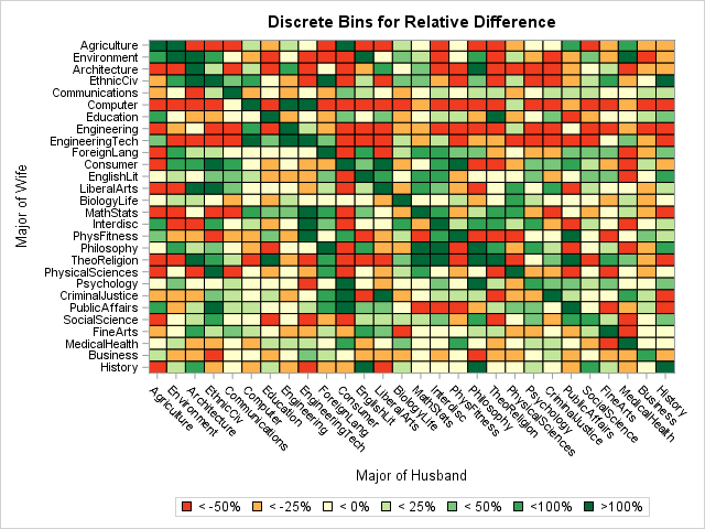
Discrete heat map by quantiles
It is easiest to interpret a heat map when the colors correspond to the actual counts or simple statistics such as the relative difference. The simplest way to assign colors to the cells in the heat map is to bin the data. This results in a discrete set of colors rather than the continuous color ramp in the previous example. You can bin the data by using five to seven quantiles. Alternatively, you can use domain-specific or clinical ranges. (For example, you could use clinical "cut points" to bin blood pressure data into "normal," "elevated," and "hypertensive" categories. In SAS, you can use PROC FORMAT to create a customized format for the response variable and color according to the formatted values.
The following heat map uses cut points to bin the data according to the relative difference between observed and expected values. As before, red and orange cells indicate observed differences that are negative. The cream and light green cells indicate relative differences that are close to zero. The darker greens indicate observed differences that are a substantial fraction of the expected values. The darkest green indicates cells for which the difference is more than 100% greater than the expected value.
When you use a discrete color ramp, all values within a specified interval are mapped to the same color. In this heat map, most cells on the diagonal have the same color; you cannot use the heat map to determine which cell has the largest relative difference.
Summary
There is much more to say about these data and about ways to use heat maps to discover features in the data. However, I'll stop here. The main ideas of this article are:
- The data are interesting. In general, the married couples in this study tended to have similar college majors. The strength of that relationship varied according to the discipline and also by gender (the heat map is not symmetric). For more about the data, see Professor Cohen's web page for this study.
- When the response variable varies over several orders of magnitude, a linear mapping of colors to values is not adequate. One way to accommodate widely varying data is to log-transform the response. If the response has both positive and negative values, you can use the log-modulus transform.
- For a less sophisticated audience, you can assign colors by binning the data and using a discrete color ramp.
You can download the SAS program that I used to create these heat maps.

4 Comments
I'd also be curious to see how the conclusion holds up if you add in the variable of whether they met in college or not. Your pool of people is much more controlled if you go to a University that is more technical than liberal arts and vice versa - it's harder to meet an engineering student at Carolina for example. I guess you can say the same about once you get out into a place of employment - it's harder to meet an engineer if you are a doctor in a hospital. But I do think it would be interesting.
Rick,
I think another way is using standardize via proc stdize .
Do theology and agriculture students tend to go to colleges specialising in those subjects? My impression, based on no more than general awareness, is that colleges for these two specific subjects exist. I haven't heard so often of other specialisms. Is it preference or opportunity? More research is needed!
That is certainly true for theological studies. I think many Ag schools are part of a large land-grant state university. But even at large universities, there tend to be colleges (arts and sciences, engineering, business, etc) and "tracts" that cause students to interact with small communities of like-minded peers. My son is in an engineering program, and I don't think he knows ANY religious studies majors!