These are a few of my favorite things.
—Maria in The Sound of Music
For my annual Christmas-themed post, I decided to forgo fractal Christmas trees and animated greeting cards and instead present a compilation of some of my favorite data visualization tips for advanced SAS users. Hopefully, this is a gift that you will enjoy all year long.
There are many guides to making clear and effective data visualizations. Some articles describe the basic chart types (histogram, scatter plots, line plots,...) and when to use them. Other articles focus on design principles such as labeling axes, adding titles, choosing colors, and overlaying grid lines. For an excellent introduction, I recommend the books by Tufte (The Visual Display of Quantitative Information, 1983), Cleveland (Visualizing Data, 1993), and Wainer (Graphic Discovery, 1997).
These articles and books are essential reading, especially if you are new to data visualization. However, practical tips for the advanced practitioner are harder to find. Throughout my professional career, I have created many advanced graphics and visualizations. My goal is always to use best practices and create a compelling graph that enables the reader to understand the underlying data or analysis. This article lists some of my favorite tips for creating effective statistical graphics. Each tip links to a full article that discusses the issue in more detail and includes a SAS program that shows how to create the graph.
Data visualization versus statistical graphics
Although data visualization and statistical graphics are closely related, they are not the same. A data visualization focuses on presenting the data so that the reader can draw his or her own conclusions. In effect, a good data visualization allows the data to tell their own story. Histograms and scatter plots are examples of data visualizations.
A statistical graphic typically shows the result of a statistical model or analysis. If you overlay a kernel density estimate on a histogram, it becomes a statistical graphic. Similarly, adding a regression curve and confidence bands on a scatter plot turns it into a statistical graphic.
Most of the following tips apply both to data visualizations and to statistical graphics.
Tip 1: Simpler is better
The old Shaker hymn reminds us, "'Tis a gift to be simple." Long-time readers might have noticed that I do not use esoteric plots such as Chernoff faces. Of course, "simple" depends on your audience, so another name for this Tip might be "Consider your audience." Here are a few articles in which I advocate simplicity:
- In 2015, I published a short article in Significance magazine in which I argue that simple visualizations should be preferred over complex infographics.
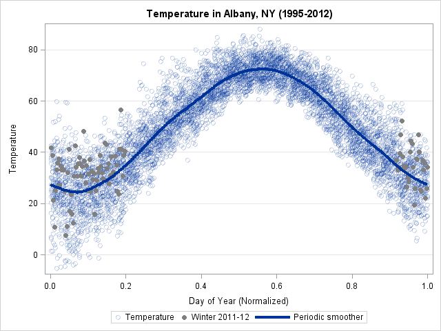
- Radar plots can often be replaced by a simpler bar chart. Similarly, polar plots can be replaced by scatter plots with periodic boundaries.
- Even a box plot might not be the best choice for a non-statistical audience. Sometimes a simple dot plot with error bars is more understandable. Or you can use a set of strip plots.
Tip 2: Use well-designed color palettes
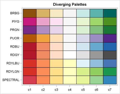
You can use colors to visualize a continuous response variable in a scatter plot, a heat map, or a choropleth map. Depending on the response, you might want to use a sequential (unidirectional) or a diverging (bidirectional) color ramp. SAS provides the COLORMODEL= option in many graphical statements, which you can use to specify several two-color and three-color color ramps. You can also create your own color ramp, and this is where a potential problem lurks. I'm sure you've seen someone present a poorly designed graph that uses bright garish colors. Don't be that person!
Human perception of color is complex, and it is important to choose a palette of hues that have similar visual impact. To avoid that mistake, choose your palettes from a set of scientifically constructed palettes, known as the ColorBrewer system of palettes. You should also consider whether the palette you choose is colorblind-safe, since 8% of men have a color-vision deficiency.
Tip 3: Use small multiples
Tufte (1983) championed the use of "small multiples," which means displaying a panel of graphs in which each cell shows data from a subset of a larger data set. Panels are useful for comparing differences and similarities among states, countries, demographic groups, and more. In SAS, you can use several tools to create panels of graphs:
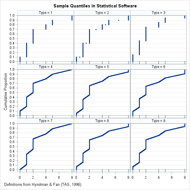
- The SGPANEL procedure is the main tool for creating panels of graphs. You specify the appearance of the graph in each cell and the variables(s) that determine each cell, and PROC SGPANEL displays the graphs in a column, row, or grid. For example, you can use PROC SGPANEL to display a panel of histograms. Or, you can create a panel that shows the effect of different data transformations or different definitions of sample quantiles.
- You can use the ODS LAYOUT GRIDDED statement to display multiple graphs in a grid.
- You can combine the ODS LAYOUT GRIDDED statement with BY-group processing to automate the construction of panels of graphs.
Tip 4: Use a horizontal display for a categorical variable
Tips 4–6 often go together. The first tip is that horizontal is better than vertical when you are plotting data for a categorical variable that has many levels or long labels. The advantages are clear when you compare a horizontal bar chart to a vertical bar chart. The same ideas apply to box plots and dot plots.
Tip 5: Order categories by using a statistic
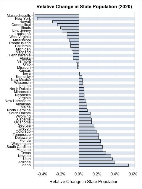
Howard Wainer often reminded his readers that "we are almost never interested in seeing Alabama first" (Wainer (2005), Graphic Discovery, p. 72). His comment is a reminder that when we plot data for a large number of categories (states, countries, school districts,...), it usually better to order the categories according to some statistic of interest. Often the statistic is a count, a mean, or a rate. A graph that orders the categories by the statistic is more informative than a graph that relies on the default alphabetical ordering.
Tip 6: Plot rates, not counts
As a continuation of Tip 5, remember that often categories differ in size. If you are visualizing quantities such as population change, mortality, or students who pass standardized tests, you should standardize the quantities and visualize a rate rather than a raw count. This enables the viewer to see how all categories compare on a relative basis. If you plot the raw counts, your graph is almost always dominated by the largest units (states, countries, school districts, ...) and it is impossible to understand the trends for the smallest units.
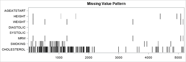
Tip 7: Visualize missing values
It may sound like an oxymoron, but you can visualize missing values in your data. There are a few ways to do this:- You can use graphics to visualize the location of missing values in your data.
- You can display the patterns of missing values by tabulating the number of rows for which one variable, two variables, and so forth are jointly missing.
- You can turn the previous table into a bar chart to visualize the pattern of missing values.
Tip 8: Prefer lasagna charts over spaghetti charts
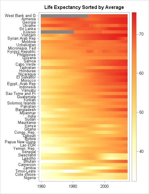
If you plot a time series for many subjects, you obtain a spaghetti plot. A spaghetti plot is aptly named because it often resembles a tangled mess that is hard to digest. You can use a lasagna plot to obtain an informative visualization of the time series that are associated with many subjects. A lasagna plot is a heat map for which each row represents a subject, each column represents a time, and the color represents a response variable. One reason that a lasagna plot is so powerful is that it enables you to use Tips 2-5 to make the visualization maximally effective.
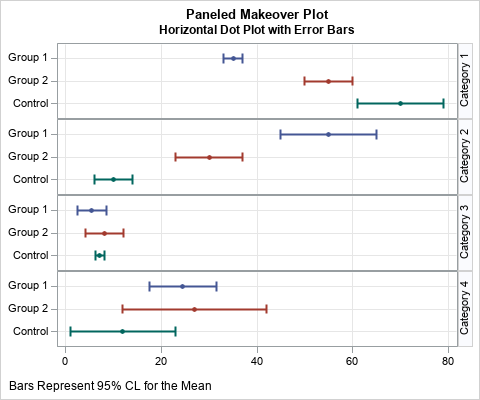
Tip 9: Prefer dot plots over dynamite plots
Most experts agree that the baseline value for a bar chart must be zero, and the baseline value must be shown. Sometimes business analysts use a bar chart to display a mean and add a line segment at the top to visualize the uncertainty in the estimate. This is called a dynamite chart. If you want to display a mean and uncertainty estimates, then use a dot plot. A dot plot does not have to show the zero baseline so the graph can display more details about how the mean varies among groups. And if you display an error bar, please be clear about which measure of uncertainty you are using!
Tip 10: Use a log-scale if the data span several orders of magnitude
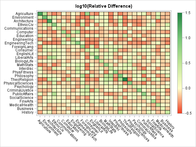
Does your intended audience know how to interpret a graph that uses a log scale? If so, you can use a log scale to display data that range over several orders of magnitude. The same transformation can be useful when you are using a response variable to add color to a graph. If the response variable varies of several orders of magnitude, you can use a log-transform of the response to assign colors.
A log transformation applies only to positive values, but you can use associated transformation (called the log-modulus transformation) to transform positive and negative values that span several orders of magnitude. However, only use this for audiences that are mathematically sophisticated.Summary
Many introductory articles describe basic design principles that apply to all graphs. This article shares 10 intermediate and advanced tips that apply to statistical graphics. By following these tips, you can create effective statistical graphics that clearly visualize data and the statistical measures that analyze them. Each tip links to articles that use SAS software to analyze the data and to create statistical graphics.

1 Comment
Pingback: Nested bar charts in SAS - The DO Loop