A SAS programmer wanted to create a panel that contained two of the graphs side-by-side. The graphs were created by using calls to two different SAS procedures. This article shows how to select the graphs and arrange them side-by-side by using the ODS LAYOUT GRIDDED statement. The end of the article discusses how to panel graphs for other situations.
Create two graphs
The two (or more) graphs can come from any source: two runs of the same procedure, output from different procedures, or even graphs that you create by using PROC SGPLOT. The ODS system doesn't care where the objects come from. It is the job of the ODS system to arrange the graphs on the printed page or the screen regardless of the source.
As an example, let's create two graphs that show the fit of two different regression models. The data are 500 patients in a heart study. The first model predicts a patient's cholesterol level by using the patient's weight. The second model predicts cholesterol by using the patient's body-mass index. (The MRW variable is the Metropolitan Relative Weight, which is an older version of today's BMI.) The following SAS statements generate that data and display the fit plots for each model.
ods graphics / width=400px height=250; /* for demonstration, use small graphs */ data Have; set sashelp.Heart(obs=500); keep Weight MRW Cholesterol; run; ods select FitPlot(persist); /* show only the fit plot until we say otherwise */ proc glm data=Have plots(only)=FitPlot; model Cholesterol = weight / CLPARM solution; quit; proc glm data=Have plots(only)=FitPlot; model Cholesterol = MRW / CLPARM solution; quit; ods select all; /* restore the ODS SELECT list */ |
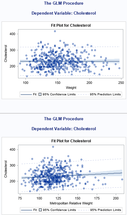
By default, the ODS system in SAS places the second graph after the first. In the first graph, the regression line is very flat, which indicates that weight is not a good predictor of cholesterol. The second graph tells a different story. The MRW index is used to identify underweight, normal weight, overweight, and obese patients. Cholesterol tends to be related to the body-mass index. Because the vertical axes of these graphs are the same, you might want to display the graphs side-by-side.
Use ODS LAYOUT GRIDDED to arrange graphs
You can use the ODS LAYOUT GRIDDED statement to display the two graphs side-by-side. Chris Hemedinger shows how to use the ODS LAYOUT GRIDDED statement to arrange graphs in a panel. He explicitly opens and closes an ODS destination. He uses the ODS REGION statement to tell ODS when to advance to the next cell in the panel.
A slightly easier approach is to use the ADVANCE= option to automatically fill the cells of the panel. The following statements set up a panel that contains two columns. Each table or graph will automatically be placed in the next available cell of the panel. The following example creates only two graphs, so the result is a 1 x 2 panel. However, the same layout can create a panel that has two columns and arbitrarily many rows. The example also uses the ODS NOPROCTITLE statement to remove the procedure titles such as "The GLM Procedure" and label "Dependent Variable: Cholesterol."
/* use ODS LAYOUT GRIDDED to create a two-column panel of graphs */ /* https://blogs.sas.com/content/iml/2015/12/02/matrices-graphs-gridded-layout.html */ ods layout gridded columns=2 advance=table; ods noproctitle; /* suppress procedure titles */ ods select FitPlot(persist); /* show only the fit plot until we say otherwise */ proc glm data=Have plots(only)=FitPlot; model Cholesterol = weight / CLPARM solution; quit; proc glm data=Have plots(only)=FitPlot; model Cholesterol = MRW / CLPARM solution; quit; ods select all; /* restore the ODS SELECT list */ ods proctitle; /* (optional) turn on procedure titles */ ods layout end; |
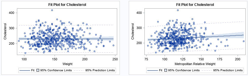
The graphs now appear side-by-side and the procedure titles are not displayed.
Panel graphs and tables
It is worth noting that this technique also applies to combining graphs and table. For example, the following statements create a graph that contains multiple horizontal box plots. The ODS LAYOUT GRIDDED statement is used to display the graph side-by-side with a table of relevant statistics that are produced by using PROC MEANS:
ods layout gridded columns=2 advance=table; ods noproctitle; /* suppress procedure titles */ title "Average Weight of Vehicles for Each Type"; proc sgplot data=sashelp.cars; hbox Weight / category=Type; xaxis values=(1000 to 7000 by 1000) grid; run; proc means data=sashelp.cars P25 Mean Median P75 ndec=0; class Type; var weight; run; ods proctitle; /* (optional) turn on procedure titles */ ods layout end; |

Other ways to panel graphs in SAS
I can think of a few other ways to panel graphs in SAS.
- If the graphs are all the same type (for example, scatter plots), then you can arrange the data in "long form" and use PROC SGPANEL to create the panel of graphs. I have used this technique many times. For example, you can create a panel of series plots or you can create a panel of bar charts. This is most useful when you are creating the graphs yourself rather than paneling graphs that are created by using SAS procedures.
- In some cases, you might want to arrange the graphs in a different order than the order in which they are created by SAS procedures. There is an advanced ODS technique in which you can store the output and then use PROC DOCUMENT to replay the output in any order you wish.
Summary
You can use the ODS LAYOUT GRIDDED statement to arrange graphs in a panel. In fact, the same technique works for tables, too! The technique is most useful when you want to create a series of side-by-side graphs that are created by using SAS procedures. You can combine the technique with PROC DOCUMENT to display graphs in any order.
I primarily use this technique when arranging ODS graphics that are created by using SAS statistical procedures. If you have access to the data and are creating the data yourself, use the SGPANEL procedure, which provides more control over how the graphs are displayed.
