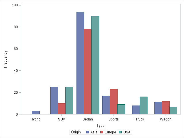
When I was at the Joint Statistical Meetings (JSM) last week, a SAS customer asked me whether it was possible to use the SGPLOT procedure to produce side-by-side bar charts. The answer is "yes" in SAS 9.3, thanks to the new GROUPDISPLAY= option on the VBAR and HBAR statements. For example, the following SAS code creates side-by-side bar charts that enable you to compare the relative frequencies for Asian, European, and American vehicles across several different types of vehicles:
/* SAS 9.3 supports side-by-side plots */ proc sgplot data=sashelp.cars; vbar type /group=Origin groupdisplay=cluster; run; |
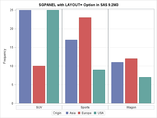
You can't get quite the same look from SAS 9.2, although you can panel the data to get the general appearance:
/* SAS 9.2 doesn't support side-by-side charts, but you can panel the data */ proc sgpanel data=sashelp.cars; panelby type; vbar Origin / group=Origin; run; |

The GROUP= option is optional, but results in the bar being colored according to the levels of the Origin variable.
If you have SAS 9.2M3, my colleague, Sajay Matange, told me about an option that almost enables you to get side-by-side bar charts. You can use the LAYOUT= option to tell the SGPANEL procedure to use only one row for the panel. If you have only a few categories (in this case, types of vehicles), this trick works, but if you have too many categories, the procedure "helpfully" makes additional rows of plots:
/* If you have SAS 9.22 (=9.2M3) try this, which only works for about 3 groups (after that the panel makes a new row) */ proc sgpanel data=sashelp.cars; where type="SUV" | type="Sports" | type="Wagon"; panelby type / layout=columnlattice colheaderpos=bottom rows=1 novarname; vbar Origin / group=Origin; colaxis display=none; rowaxis grid; run; |
Because of helpful comments like that, I'm sure to pre-order Sanjay's forthcoming book, Statistical Graphics Procedures by Example: Effective Graphs Using SAS.

26 Comments
The GROUPDISPLAY=CLUSTER was quickly added at SAS 9.3, but since the release was long way off, we needed an interim solution. So, we provided a few special options at SAS 9.2(TS2M3) to get a close facsimile.
Three options were added. These are LAYOUT=COLUMNLATTICE, ONEPANEL and NOBORDER. With use of these options on the PANELBY statement, you can get a reasonable close cluster Bar Chart. The added benefit is that if you do have a large number of groups, you can get a grid if you wish. If you look closely, you will see small breaks in the horizontal gridlines aligned with the cell header (bottom) borders.
Here is Rick's code with these options added to acheive the results. The resulting graph can be viewed at: https://sites.google.com/site/smatange/ods-graphics/cluster-group-bar-chart-sas-9-2m3
SAS 9.2 (TS2M3) code:
proc sgpanel data=sashelp.cars;
panelby type / layout=columnlattice onepanel
colheaderpos=bottom rows=1 novarname noborder;
vbar Origin / group=Origin;
colaxis display=none;
rowaxis grid;
run;
This is great information, thanks for sharing.
I remember reading somewhere that SGPLOT will include the ability to do a side-by-side barchart like the ones you have here, but with an overlaid line (or lines?). We use these charts for showing rates of change on a secondary vertical axis. Up till now we've had to utilize Excel for these types of graphs, but I'm hopeful that we'll be able to avoid Excel and stick to SAS 9.3 and still be able to create our grouped side-by-side barcharts with lines on a secondary vertical axis. For example, the horizontal axis is often dates for us, while the left vertical axis might be in dollar net losses and the right vertical axis might be the percentage rate of losses.
Is this possible using SGPLOT in 9.3, and what does the syntax and results look like?
Thanks in advance!
Yes, this is possible. You can add a VLINE statement and use the Y2AXIS option. For example:
vline type / y2axis response=mpg_city stat=mean group=Origin groupdisplay=cluster;
It looks just like a line plot overlaid on a bar chart.
Thanks for sharing your examples and code. Very helpful
New question: I'm running into some issues with my unique problem--which I don't anticipate will be that unusual for yourself and others. Basically, what I'm trying to do with the side-by-side barchart with overlaid line is graph the portfolio size of the bank I work for versus the portfolio size of our peer group and both versus unemployment. I want these side-by-side bars by quarter, with an overlaid line representing unemployment.
The difficulty I'm running into is that no matter how I shape my data I'm getting goofy results. The use of "grouping" with a grouping variable results in two lines for unemployment--and two unemployment entries in the legend: one for the peer group and one for my bank. This is clearly because when I add on the unemployment data I do so by merging by date (in quarterly format) which causes values to be duplicated because there are two portfolio balanace entries for each date (one for my bank, one for our peer group) . However, my other solution doesn't work any better. Essentially, I tried just appending the unemployment data (using the set statement method), and creating a grouping variable of unemployment (to differentiate from Peer and Bancorp). This led to empty unemployment columns for Peer and Bancorp, and empty portfolio balance columns for Unemployment...which looks funky, but should be fine...except when I graph it I see in the legend four occurences of Unemployment. One occurence is apparently a bar (of zero height); one occurence is a dashed line; the other two occurences are straight red lines which don't show up in the graph (I'm guessing because they representing the "missing" unemployment data associated with the two groups: Peer and Bancorp.
Oh, and so on the XAXIS I put date (in quarterly format); on the primary vertical axis I put portfolio balance, and on the secondary vertical axis I put unemployment rate.
I'm at a loss; I'm not sure how to overlay my line which represents an essentially ungrouped series (unemployment) over a grouped barchart. Any advice you can provide is much appreciated.
That's an interesting problem. I'm currently on vacation, but to get a quick response to graphics questions you can post your question to the SAS graphics forum at
http://communities.sas.com/community/sas_graph_and_ods_graphics
My guess is that you'll need to use the ODS Graphics Designer (submit "sgdesign();" in the Program Window) or the Graph Template language to create a series plot above or below the bar chart.
Cool deal. Will do. Thanks for replying even when you're on vacation!
The following doesn't seem to run in sas 9 for me
/* SAS 9.3 supports side-by-side plots */
proc sgplot data=sashelp.cars;
vbar type /group=Origin groupdisplay=cluster;
run;
As the blog title and code comments say, this requires 9.3. Run this code
%put &SysVer;
to see what version of SAS you are running.
I would like to show percentage for y-axis. I only find options for sum, mean or frequency. Is there any way to do it by using sgplot? Thanks,
@Eric,
I found that I wanted the x-axis to provide a percentage instead of a frequency as well. I've found that you have to create an alternate data set with a percentage variable (I did this by outputting proc freq) and then indicating in the options that you want response=percent.
An Example is given below:
proc sort data = sashelp.cars out = cars;
by type;
run;
proc freq data = cars noprint;
by type;
tables Origin / out = carsfreq;
run;
proc sgplot data=carsfreq;
vbar type /group=Origin groupdisplay=cluster response = percent;
run;
Good question. For the answer and example code, see my article "Show percentages for bar charts with PROC SGPLOT"
Anyone know how I can have multiple charts side by side with different variables? ie I want the average for var1 next to the average for var2, for var3, etc. Any way to show this on one plot?
Convert the data from "wide format" to "long format," then use the advice in this article. If you don't know what that means, post your question on SAS/GRAPH and ODS Graphics Support Community
Anyone know how to do this with a custom dependent variable on my y-axis that is not frequency?
Thank you.
Use the RESPONSE= option on the VBAR statement to specify the name of your variable.
I'm working with SAS 9.2 and trying to do side-by-side barplots. That's the reason why I found this post. Basically I'm happy with the solution with proc sgpanel as mentioned above. But I still have one big problem: How can I change the colors of the bars? (To be more specific for the example with the cars: The colors should be still grouped by the Origin of the cars.) I tried a lot of things but nothing worked...
Thanks in advance.
SAS 9.2 was released in 2008. There have been many improvements since then for controlling the color of bars, such as attribute maps in SAS 9.3 and the STYLEATTRS statement in SAS 9.4. I no longer remember which techniques were available in 9.2, but I think your best bet is to look into ODS styles. Perhaps the %MODSTYLE macro will work for you. You can also ask your question at the ODS Graphics Support Community.
Do you know how to order the groups on the x-axis so that it is not alphabetical?
Thanks in advance!
Sort the data in the order you want and use the GROUPORDER=DATA option on the VBAR statement.
Hi, thanks for these tools I didn't know about...
But in my case, I would like to represent the column percents (not the row ones), as to say visualize a proc freq with /nocol nopercent options in a VBAR, you see ?
Because I want to show specifically the difference in proportions between different groups, not globally.
As you don't mention it in your article, I wonder if this is possible with sgplot. Or is there a way to exploit the results of a previous proc freq (with /nocol nopercent options) in a VBAR plot ?
I tried to do that, but couldn't figure it out...
Thanks in advance for your help !
That should be doable. PROC FREQ produces a lot of graphs automatically. Try using PLOTS=ALL on the TABLES statement and see if any of those suit you. If not, post some data and a description of what you want to the SAS/GRAPH and ODS Graphics Support Community. Go to the SAS Support Communities to post a question.
Thaks for your quick answer ! The problem comes from the VBAR statement computes statistics automatically. It seems impossible to make it graph stats that would have been already produced.
I managed to do this in R, as in fact the barplot function doesn't compute the stats itself and accepts whatever table you put in... as for example my expected "column percent" table ! It worked very fine this way.
But I'll check this TABLE statement you proposed ! Thanks again for the support !
You are using the wrong statement. For pre-summarized data, use the VBARPARM statement, as shown in the second section of the article "Creating bar charts with confidence limits."
Worked fine, thanks alot ! I could use it with both category and response arguments and group option.
Thanks for your quick and efficient support !