Many characteristics of a graph are determined by the underlying data at run time. A familiar example is when you use colors to indicate different groups in the data. If the data have three groups, you see three colors. If the data have four groups, you see four colors. The data analyst does not need to know in advance how many groups are in the data. The marker colors are an example of a "data-driven" attribute that is determined at run time.
In contrast, some features of the graph are typically specified before the graph is created. For example, in SAS, the TITLE and FOOTNOTE statements are usually hard-coded strings. (But I will show a technique that enables you to generate titles and footnotes dynamically from data!)
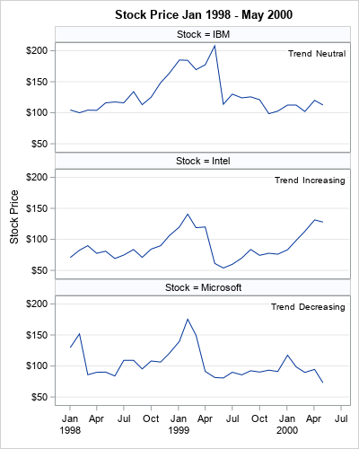
Recently, a SAS programmer at the SAS Support Communities wanted to construct titles dynamically. Specifically, he was interested in visualizing the price of many stocks over time, such as the time series shown in the panel to the right. For each stock, he wanted to display the name of the stock and whether it had gained in value, lost value, or remained about the same during a given time period. A helpful macro programmer showed how you can use SAS macro to accomplish this task. However, in many cases, you can use PROC SGPANEL or PROC SGPLOT to display the same information, and the code is much easier to write. This article shows a few tricks for displaying information on a graph in a data-driven manner. So that the article is not too long, this article discusses the SGPANEL procedure. A second article discusses how to use the BY statement in PROC SGPLOT.
Visualizing data in each group
A common task in data analysis is to visualize the data according to subgroups. One or more discrete variables (called grouping variables) are used to determine the observations that belong to each subgroup. For example, a data set might contain a variable named Stock whose values are strings such as "IBM", "Intel", and "Microsoft". These strings determine which observations belong to each group.
This article shows how to use PROC SGPANEL to create a panel of k plots. The header for each plot indicates the grouping value. Optionally, you can use the TEXT statement or the INSET statement to display information (often labels or statistics) that are specific to each group.
The data for this article is a subset of the Sashelp.Stocks data. The STOCK variable contains the name of three stocks: IBM, Intel, and Microsoft. The OPEN variable contains the opening stock price for these companies for each month. Although the example only has three stocks, the techniques in this article are applicable to an arbitrary number of stocks. The following DATA step restricts the data to the time period Jan 1998 – May 2000. It also creates a label for each subgroup that indicates whether the stock price increased or decreased during the time period. In practice, this label would be determined by a separate analysis (maybe a linear regression or a DATA step computation), but I am hard-coding it for simplicity.
data Have; set Sashelp.Stocks; where '01Jan1998'd <= Date <= '30May2000'd; /* prepare data to display information */ if Stock='IBM' then Trend='Neutral '; else if Stock='Intel' then Trend='Increasing'; else if Stock='Microsoft' then Trend='Decreasing'; Label = catx(": ", Stock, Trend); /* example "IBM: Neutral" */ run; /* NOTE: The Sashelp.Stock data set is already sorted by Stock and by Date. Be sure to sort your data if you want to use the BY statement. proc sort data=Have; by Stock Date; run; */ |
The example data are already sorted by the STOCK variable, which is the grouping variable. Within each stock, the data are sorted by the DATE variable. You do not need to sort the data if you are using PROC SGPANEL, but you sort if you intend to do BY-group processing.
A panel of stocks with headers
If you want to create the same plot for many sub-groups, you should start with the SGPANEL procedure, which was created for exactly this purpose! The following call to PROC SGPANEL is short and easy to read. It creates a panel that contains three line plots and labels each according to the value of the PANELBY variable.
title "Stock Price Jan 1998 - May 2000"; proc sgpanel data=Have; panelby Stock / columns=1; /* vertical stack of panels */ series x=Date y=Open; inset Trend / opaque; rowaxis grid label="Stock Price"; colaxis display=(nolabel); run; |
The output is shown at the top of this article. Each panel has a row header (a "title" of sorts) that identifies the subgroups. An INSET statement displays information about the data. In this example, the data set contains a variable (Trend) that indicates the performance of the stock over the specified time period. It could also display statistics.
There are three advantages to using PROC SGPANEL to visualize and compare subgroups of the data:
- You can use the UNISCALE= option on the PANELBY statement to specify whether each plot in the panel should use a common axis or whether the axes should reflect the data range in each subgroup. In this example, all vertical axes use the range [50,210]. The minimum value is determined by the lowest Intel price whereas the maximum value is determined by the highest IBM price. This automatic scaling is invaluable for comparing data across groups.
- You can use options on the PANELBY statement to arrange the plots in a panel. This example uses the COLUMNS=1 option to stack the plots vertically. However, you could also use ROWS=1 to arrange the plots horizontally. You can use both options together to arrange the plots in a lattice.
- You can control the placement and attributes of the headers. An example is shown in the next section.
Individual graphs of stocks
I prefer to put related plots in a panel because it is a great way to organize the output and to compare the data across subgroups. However, the SAS programmer wanted individual graphs for each subgroup, not a panel of plots. No problem, PROC SGPANEL can do that, too! You can make PROC SGPANEL create individual graphs by telling it that each panel should contain only one graph. You can also control the attributes of the row headers so that they look like the titles that are generated by using the TITLE or TITLE2 statements in SAS.
The following call to PROC SGPANEL is similar to the first call, except the options COLUMNS=1 ROWS=1 force each panel to contain only one plot. The options NOHEADERBORDER and HEADERBACKCOLOR=WHITE make the row headers look more like a title. Lastly, instead of displaying the stock names in the headers, I display a label that identifies the stock and its performance. Notice that the label starts with the PANELBY value and then provide additional information.
ods graphics / width=300px height=200px; title; footnote J=L "Stock Price Jan 1998 - May 2000"; proc sgpanel data=Have; panelby Label / columns=1 rows=1 /* a "panel" that contains one graph */ headerattrs=GraphTitleText novarname noheaderborder headerbackcolor=White; /* make headers look like TITLE */ series x=Date y=Open; rowaxis grid label="Stock Price"; colaxis display=(nolabel); run; |
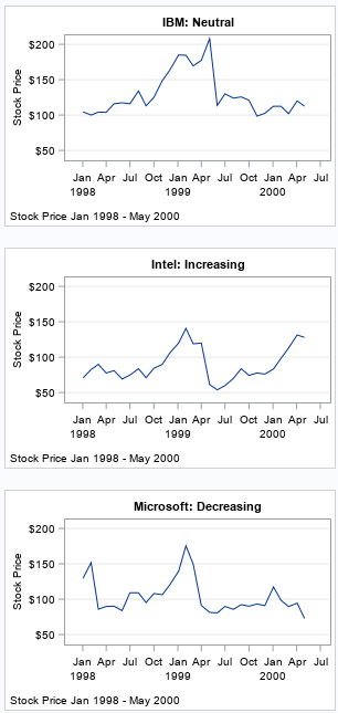
These statements put one plot in each "panel" and use the row headers to simulate a title. Even though the plots are no longer part of a panel, they can still share a common axis range, as in this example. As mentioned earlier, the UNISCALE= option enables you to specify which axes are shared.
There are two limitations to using PROC SGPANEL in this way:
- The headers are not really titles. If you use the TITLE, TITLE2, and TITLE3 statements, you can have titles and multiple subtitles.
- The values of the PANELBY variable must be unique for each stock. Notice that the PANELBY variable in this example is the name of the stock followed by a string that has additional information about the performance of the stock. This ensures that each panel shows data for exactly one stock. You cannot, for example, use the TREND variable (which has values 'Neutral', 'Increasing', and 'Decreasing') on the PANELBY statement because that would create a panel that has at most three cells. All 'Increasing' stocks would be overlaid in a single cell, and the same for the 'Decreasing' and 'Neutral' stocks.
Summary
The SGPANEL procedure creates a panel of plots. There is one plot for every subgroup of a grouping variable. (Note: You can specify two grouping variables to get a lattice of plots.) By default, the SGPANEL procedure uses the values of the grouping variable as headers. However, as shown in this article, you can display any string as a header. In particular, you can pre-process the data to generate a label that depends on the data. In this way, you can create labels that indicate features in the data, such as whether a stock gained or lost value in a time interval.
Although I prefer using PROC SGPANEL for constructing plots of subgroups, an alternative is to use the BY statement in PROC SGPLOT. The next article presents the pros and cons of using BY-group processing and shows how to construct titles for the plots that depend on the data in the plots.

1 Comment
Pingback: How to use the #BYVAR and #BYVAL keywords to customize graph titles in SAS - The DO Loop