In a previous article, I mentioned that the VLINE statement in PROC SGPLOT is an easy way to graph the mean response at a set of discrete time points. I mentioned that you can choose three options for the length of the "error bars": the standard deviation of the data, the standard error of the mean, or a confidence interval for the mean. This article explains and compares these three options. Which one you choose depends on what information you want to convey to your audience. As I will show, some of the statistics are easier to interpret than others. At the end of this article, I tell you which statistic I recommend.
Sample data
The following DATA step simulates data at four time points. The data at each time point are normally distributed, but the mean, standard deviation, and sample size of the data vary for each time point.
data Sim; label t = "Time"; array mu[4] _temporary_ (80 78 78 79); /* mean */ array sigma[4] _temporary_ ( 1 2 2 3); /* std dev */ array N[4] _temporary_ (36 32 28 25); /* sample size */ call streaminit(12345); do t = 1 to dim(mu); do i = 1 to N[t]; y = rand("Normal", mu[t], sigma[t]); /* Y ~ N(mu[i], sigma[i]) */ output; end; end; run; title "Response by Time"; ods graphics / width=400px height=250px; proc sgplot data=Sim; vbox y / category=t connect=mean; run; |
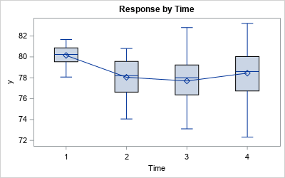
The box plot shows the schematic distribution of the data at each time point. The boxes use the interquartile range and whiskers to indicate the spread of the data. A line connects the means of the responses at each time point.
A box plot might not be appropriate if your audience is not statistically savvy. A simpler display is a plot of the mean for each time point and error bars that indicate the variation in the data. But what statistic should you use for the heights of the error bars? What is the best way to show the variation in the response variable?
Relationships between sample standard deviation, SEM, and CLM
Before I show how to plot and interpret the various error bars, I want to review the relationships between the sample standard deviation, the standard error of the mean (SEM), and the (half) width of the confidence interval for the mean (CLM). These statistics are all based on the sample standard deviation (SD). The SEM and width of the CLM are multiples of the standard deviation, where the multiplier depends on the sample size:
- The SEM equals SD / sqrt(N). That is, the standard error of the mean is the standard deviation divided by the square root of the sample size.
- The width of CLM is a multiple of the SEM. For large samples, the multiple for a 95% confidence interval is approximately 1.96. In general, suppose the significance level is α and you are interested in 100(1-α)% confidence limits. Then the multiplier is a quantile of the t distribution with N-1 degrees of freedom, often denoted by t*1-α/2, N-1.
You can use PROC MEANS and a short DATA step to display the relevant statistics that show how these three statistics are related:
/* Optional: Compute SD, SEM, and half-width of CLM (not needed for plotting) */ proc means data=Sim noprint; class t; var y; output out=MeanOut N=N stderr=SEM stddev=SD lclm=LCLM uclm=UCLM; run; data Summary; set MeanOut(where=(t^=.)); CLMWidth = (UCLM-LCLM)/2; /* half-width of CLM interval */ run; proc print data=Summary noobs label; format SD SEM CLMWidth 6.3; var T SD N SEM CLMWidth; run; |
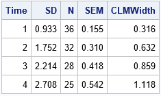
The table shows the standard deviation (SD) and the sample size (N) for each time point. The SEM column is equal to SD / sqrt(N). The CLMWidth value is a little more than twice the SEM value. (The multiplier depends on N; For these data, it ranges from 2.03 to 2.06.)
As shown in the next section, the values in the SD, SEM, and CLMWidth columns are the lengths of the error bars when you use the STDDEV, STDERR, and CLM options (respectively) to the LIMITSTAT= option on the VLINE statement in PROC SGPLOT.
Visualize and interpret the choices of error bars
Let's plot all three options for the error bars on the same scale, then discuss how to interpret each graph. Several interpretations use the 68-95-99.7 rule for normally distributed data. The following statements create the three line plots with error bars:
%macro PlotMeanAndVariation(limitstat=, label=); title "VLINE Statement: LIMITSTAT = &limitstat"; proc sgplot data=Sim noautolegend; vline t / response=y stat=mean limitstat=&limitstat markers; yaxis label="&label" values=(75 to 82) grid; run; %mend; title "Mean Response by Time Point"; %PlotMeanAndVariation(limitstat=STDDEV, label=Mean +/- Std Dev); %PlotMeanAndVariation(limitstat=STDERR, label=Mean +/- SEM); %PlotMeanAndVariation(limitstat=CLM, label=Mean and CLM); |
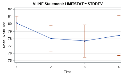
Use the standard deviations for the error bars
In the first graph, the length of the error bars is the standard deviation at each time point. This is the easiest graph to explain because the standard deviation is directly related to the data. The standard deviation is a measure of the variation in the data. If the data at each time point are normally distributed, then (1) about 64% of the data have values within the extent of the error bars, and (2) almost all the data lie within three times the extent of the error bars.
The main advantage of this graph is that a "standard deviation" is a term that is familiar to a lay audience. The disadvantage is that the graph does not display the accuracy of the mean computation. For that, you need one of the other statistics.
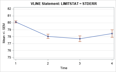
Use the standard error for the error bars
In the second graph, the length of the error bars is the standard error of the mean (SEM). This is harder to explain to a lay audience because it in an inferential statistic. A qualitative explanation is that the SEM shows the accuracy of the mean computation. Small SEMs imply better accuracy than larger SEMs.
A quantitative explanation requires using advanced concepts such as "the sampling distribution of the statistic" and "repeating the experiment many times." For the record, the SEM is an estimate of the standard deviation of the sampling distribution of the mean. Recall that the sampling distribution of the mean can be understood in terms of repeatedly drawing random samples from the population and computing the mean for each sample. The standard error is defined as the standard deviation of the distribution of the sample means.
The exact meaning of the SEM might be difficult to explain to a lay audience, but the qualitative explanation is often sufficient.
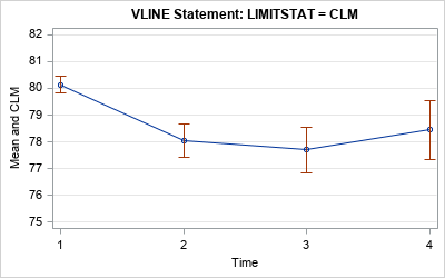
Use a confidence interval of the mean for the error bars
In the third graph, the length of the error bars is a 95% confidence interval for the mean. This graph also displays the accuracy of the mean, but these intervals are about twice as long as the intervals for the SEM.
The confidence interval for the mean is hard to explain to a lay audience. Many people incorrectly think that "there is a 95% chance that the population mean is in this interval." That statement is wrong: either the population mean is in the interval or it isn't. There is no probability involved! The words "95% confidence" refer to repeating the experiment many times on random samples and computing a confidence interval for each sample. The true population mean will be in about 95% of the confidence intervals.
Conclusions
In summary, there are three common statistics that are used to overlay error bars on a line plot of the mean: the standard deviation of the data, the standard error of the mean, and a 95% confidence interval for the mean. The error bars convey the variation in the data and the accuracy of the mean estimate. Which one you use depends on the sophistication of your audience and the message that you are trying to convey.
My recommendation? Despite the fact that confidence intervals can be misinterpreted, I think that the CLM is the best choice for the size of the error bars (the third graph). If I am presenting to a statistical audience, the audience understands the CLMs. For a less sophisticated audience, I do not dwell on the probabilistic interpretation of the CLM but merely say that the error bars "indicate the accuracy of the mean."
As explained previously, each choice has advantages and disadvantages. What choice do you make and why? You can share your thoughts by leaving a comment.
WANT MORE GREAT INSIGHTS MONTHLY? | SUBSCRIBE TO THE SAS TECH REPORT

9 Comments
Given a choice, I agree with your choice.
What I really object to (and see a lot when I review articles) is error bars with no indication of what they are - SD, SEM or CI.
If I were doing an analysis where I was interested in the means, I would probably use CLM. But in my work, we're often interested in the distribution of values behind each mean. I've become a big fan of the box plot, since it provides so much more information. I don't think it's too intimidating for non-statistical audiences. People can focus on just the mean if they want, and the box and whiskers can just be interpreted as giving a sense of "spread."
Rick,
For the audience understand better of 'The SEM equals SD / sqrt(N). '.
I think could write it as
STD(MEAN)=sqrt( VAR(MEAN) )
= sqrt( VAR( (x1+x2+...xn)/n ) )
= sqrt( VAR(x1+x2+...xn)/n^2 ) )
= sqrt( n*VAR(x)/n^2 ) )
= sqrt( VAR(x)/n ) )
= sqrt( VAR(x) ) / sqrt(N)
= SD / sqrt(N)
I use the CLM. I warn the audience not to interpret non-overlapping as non-significant difference. This is essential as people always want to compare the means and some need the drug of significance.
.
A handy addition is to display outliers as pale points. This is half-way to a box plot but is using the results of the analysis model rather than within-group statistics as in a box plot.
Did you mean significant difference (in the first sentence)?
Is there any way to get labels on this for the points? I am only aware of datalabel. But I am trying to make a figure that could possibly label the N, mean, and SD for each data point on the figure. Or is this not possible to do?
Sure, it is possible. I would use the XAXISTABLE statement. For an example, look at the last section of the article about how to graph the mean versus time. You could also use the TEXT Statement. You can post your data and program to the SAS Support Communities if you get stuck or need more hints.
Pingback: Remaking a panel of dynamite plots - The DO Loop
Pingback: 10 tips for creating effective statistical graphics - The DO Loop