It is always great to read an old paper or blog post and think, "This task is so much easier in SAS 9.4!" I had that thought recently when I stumbled on a 2007 paper by Wei Cheng titled "Graphical Representation of Mean Measurement over Time." A substantial portion of the eight-page paper is SAS code to creating a graph of the mean responses over time for patients in two arms of a clinical trial. (An arm is a group of participants who receive an intervention or who receive no intervention, such as an experimental group and the control group.)
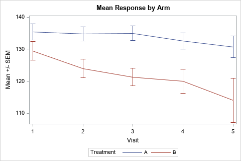
The graph to the right is a modern version of one graph that Cheng created. This graph is created by using PROC SGPLOT. This article shows how to create this and other graphs that visualize the mean response by time for groups in a clinical trial.
This article assumes that the data are measured at discrete time points. If time is a continuous variable, you can model the mean response by using a regression model, and you can use the EFFECTPLOT statement to graph the predicted mean response versus time.
Sample clinical data
Cheng did not include his sample data, but the following DATA step defines fake data for 11 patients, five in one arm and six in the other. The data produce graphs that are similar to the graphs in Cheng's paper.
data study; input Armcd $ SubjID $ y1-y5; /* read data in wide form */ label VisitNum = 'Visit' Armcd = "Treatment"; VisitNum=1; y=y1; output; /* immediately transform data to long form */ VisitNum=2; y=y2; output; VisitNum=3; y=y3; output; VisitNum=4; y=y4; output; VisitNum=5; y=y5; output; drop y1-y5; datalines; A 001 135 138 135 134 . A 002 142 140 141 139 138 A 003 140 137 136 135 133 A 004 131 131 130 131 130 A 005 128 125 . 121 121 B 006 125 120 115 110 105 B 007 139 134 128 128 122 B 008 136 129 126 120 111 B 009 128 125 127 133 136 B 010 120 114 112 110 96 B 011 129 122 120 119 . ; |
Use the VLINE statement for mean and variation
The VLINE statement in PROC SGPLOT can summarize data across groups. When you use the RESPONSE= and STAT= option, it can display the mean, median, count, or percentage of a response variable. You can add "error bars" to the graph by using the LIMITSTAT= option. Following Cheng, the error bars indicate the standard error of the mean (SEM). the following statements create the line plot shown at the top of this article:
/* simplest way to visualize means over time for each group */ title "Mean Response by Arm"; proc sgplot data=study; vline VisitNum / response=y group=Armcd stat=mean limitstat=stderr; yaxis label='Mean +/- SEM'; run; |
That was easy! Notice that the VLINE statement computes the mean and standard error for Y for each value of VisitNum and Armcd variables.
This graph shows the standard error of the mean, but you could also show confidence limits for the mean (LIMITSTAT=CLM) or indicate the extent of one or more standard deviations (LIMITSTAT=STDDEV and use the NUMSTD= option).
An alternative plot: Box plots by time
Cheng's graph is appropriate when the intended audience for the graph includes people who might not be experts in statistics. For a more sophisticated audience, you could create a series of box plots and connect the means of the box plots. In this plot, the CATEGORY= option is used to specify the time-like variable and the GROUP= option is used to specify the arms of the study. (Learn about the difference between categories and groups in box plots.)
/* box plots connected by means */ title "Response by Arm"; proc sgplot data=study; vbox y / category=VisitNum group=Armcd groupdisplay=cluster connect=mean clusterwidth=0.35; run; |
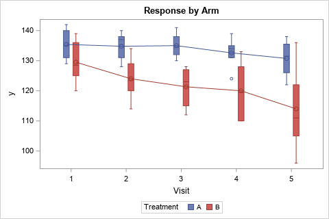
Whereas the first graph emphasizes the mean value of the responses, the box plot emphasizes the individual responses. The mean responses are connected by lines. The boxes show the interquartile range (Q1 and Q3) as well as the median response. Whiskers and outliers indicate the spread of the data.
Graph summarized statistics
In the previous sections, the VLINE and VBOX statements automatically summarized the data for each time point and for each arm of the study. This is very convenient, but the SGPLOT statements support only a limited number of statistics such as the mean and median. For more control over the statistics, you can use PROC MEANS or PROC UNIVARIATE to summarize the data and then use the SERIES statement to plot the statistics and (optionally) use the SCATTER statement to plot error bars for the statistic.
PROC MEANS supports dozens of descriptive statistics, but, for easy comparison, I will show how to create the same graph by using summarized data. The following call to PROC MEANS creates an output data set that contains statistics for each visit/arm combination.
proc means data=study N mean stderr stddev lclm uclm NDEC=2; class Armcd VisitNum; var y; output out=MeanOut N=N mean=Mean stderr=SEM stddev=SD lclm=LCLM uclm=UCLM; run; |
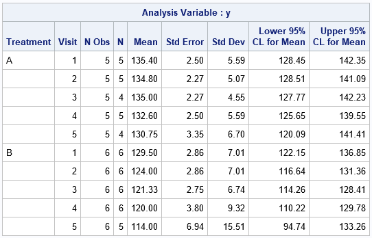
The output data set (MeanOut) contains all the information in the table, plus additional "marginal" information that summarizes the means across all arms (for each visit), across all visits (for each arm), and for the entire study. When you use the MeanOut data set, you should use a WHERE clause to specify which information you want to analyze. For this example, we want only the information for the Armcd/VisitNum combinations. You can run a simple DATA step to subset the output and to create variables for the values Mean +/- SEM, as follows:
/* compute lower/upper bounds as Mean +/- SEM */ data Summary; set MeanOut(where=(Armcd^=" " & VisitNum^=.)); LowerSEM = Mean - SEM; UpperSEM = Mean + SEM; run; /* create a graph of summary statistics that is similar to the VLINE graph */ title2 "Presummarized Data"; proc sgplot data=Summary; series x=VisitNum y=Mean / group=Armcd; scatter x=VisitNum y=Mean / group=Armcd yerrorlower=LowerSEM yerrorupper=UpperSEM; run; |
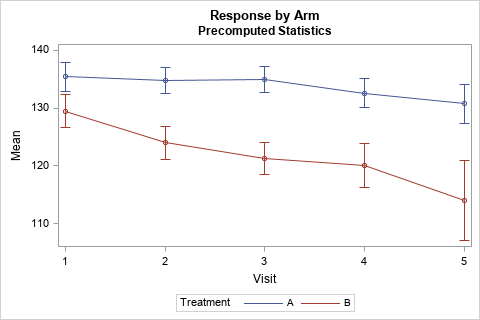
You can use this technique to create graphs of other statistics versus time.
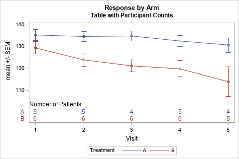
Adding tabular information to a mean-versus-time graph
You can augment a mean-versus-time graph by adding additional information about the study at each time point. In Cheng's paper, much of the code was devoted to adding information about the number of patients that were measured at each time point.
In SAS 9.4, you can use the XAXISTABLE statement to add one or more rows of information to a graph. The output from PROC MEANS includes a variable named N, which gives the number of nonmissing measurements at each time. The following statements add information about the number of patients. The CLASS= option subsets the counts by the arm, and the COLORGROUP= option displays the text in the group colors.
title2 "Table with Participant Counts"; proc sgplot data=Summary; series x=VisitNum y=Mean / group=Armcd; scatter x=VisitNum y=Mean / group=Armcd yerrorlower=LowerSEM yerrorupper=UpperSEM; xaxistable N / location=inside class=Armcd colorgroup=Armcd title="Number of Patients" valueattrs=(size=10) labelattrs=(size=10); yaxis label='mean +/- SEM'; run; |
In summary, SAS 9.4 makes it is easy to graph the mean response versus time for various arms of a clinical study. Cheng wrote his paper in 2007 using SAS 9.1.3, but there have been TONS of additions to the ODS Statistical Graphics system since then. This article shows that you can let PROC SGPLOT summarize the data and plot it by using the VLINE statement or the VBOX statement. Or you can summarize the data yourself and plot it by using the SERIES and SCATTER statements. For the summarized data, you can overlay tables of statistics such as the number of patients at each time point. Whichever method you choose, the SGPLOT procedure makes it easy to create the graphs of statistics versus time.

11 Comments
Very cool! I didn't know about VLINE or CLUSTERWIDTH
Another option with small N is to plot every point (sometimes called a strip plot, I think)
Pingback: What statistic should you use to display error bars for a mean? - The DO Loop
Pingback: Longitudinal data: The response-profile model - The DO Loop
Hello,
Thank you for this helpful code, it worked for me. The only other thing I would like to add is the overall mean or combined mean over time for both groups to be displayed as a third line in the plot.
How would I do this, is this something that needs to be added in the "where" argument? Could you please explain further the "where" argument and what the ^ stand for, I am not understanding it.
Thank you!
Yes, ^ means "NOT EQUAL". So the current WHERE clause gets observations where neither variable is missing.
It sounds like you want to add the average, which is
set MeanOut(where=(Armcd=" " & VisitNum^=.));
So the new code is
If you can't figure it out, post to the SAS Support Community and link to this article so people know what you are trying to do.
Love this thanks rick.
Rick if I apply this code below to a study with fixed visits all the means and 95% CI all overlap. Is there a way to Jitter them or offset them in some way.
proc sgplot data=graphs;
title "Mean ELF Score Change From Baseline";
vline visit2 / response=elf_ch stat=mean limitstat=clm markers group=tx lineattrs=(thickness=2px);
styleattrs datasymbols=(SquareFilled TriangleFilled CircleFilled)
datalinepatterns=(Solid ShortDash LongDash) datacontrastcolors=(black black black);
xaxis label="Weeks";
run;
Use the "cluster" technique shown in the second example. Add
groupdisplay=cluster clusterwidth=0.3
to your VLINE statement.
Thank you, Rick!
I succeeded plotting the mean of the two group means but am back with another question. I have searched and tried to figure it out on my own but not quite there yet.
Especially useful for longitudinal analysis is the option to include the Table of Participant Count underneath the graph, it looks really nice from a visual point of view too!
However, to better peak into the trend, I was wondering how I could stratify the different group's trend per dropout time. For instance, I would do these in two panels.
Each panel or window will show the placebo vs therapy group. On each graph, you will be able to see the mean of participants that dropped out at each stage.
Ex. If the graph turns out to show a group mean lower for early study dropouts vs the later ones, then I can already get an idea if the model's estimates are biased.
For info, I am trying to incorporate the dropout differential analysis into a longitudinal analysis using proc mixed. I have tried using lsmeans and slice but no luck.
If you have any tips on how to stratify each group by dropout x time measurement point, building upon the previous means plot, I would greatly appreciated it.
The best way to ask questions about SAS is to post your question, some data, and your SAS code to the SAS Support Communities.
Hi Rick,
To this example, how we can add a bidirectional arrow in y-axis to show improvement and worsening of any score ?
Thanks,
V
You can post your question, some data, and your SAS code to the SAS Support Communities. There is a community for Graphics Programming.