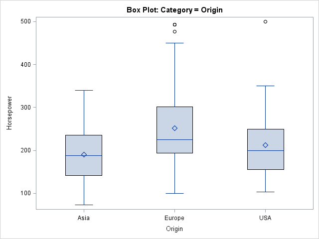
The other day I was using PROC SGPLOT to create a box plot and I ran a program that was similar to the following:
proc sgplot data=sashelp.cars; title "Box Plot: Category = Origin"; vbox Horsepower / category=origin; run; |
An hour or so later I had a need for another box plot. Instead of copying the previous statements, I retyped in the PROC SGPLOT code. However, I wasn't paying attention and I typed GROUP= instead of CATEGORY= as the option to the VBOX statement:
proc sgplot data=sashelp.cars ; title "Box Plot: Group = Origin"; vbox Horsepower / group=Origin; run; |
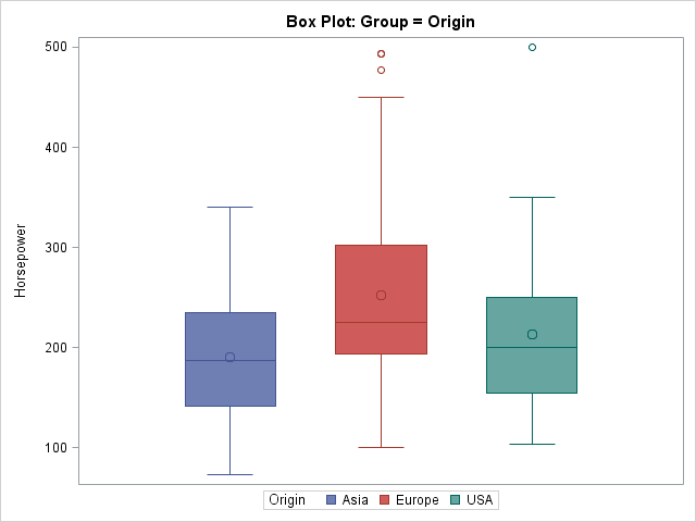
When I saw the second graph, I noticed that it is more colorful and also has a legend instead of an axis with tick marks and labels. I wondered, "What is the difference between the CATEGORY= option and the GROUP= option?" I started making a set of notes, which I share in this article.
The CATEGORY= option defines a categorical variable
The CATEGORY= syntax defines the discrete variable for the plot. As such, the values of the categorical variable appear as tick marks on an axis. All graphical elements have the same graphical styles, such as color, line pattern, marker shapes, and so forth.
The values of the categorical variable appear in alphabetical or numerical order, although some graphs support option for sorting the categories. For example, to order the categories in a bar chart in ascending or descending order, use the CATEGORYORDER= option in the VBAR statement.
For the box plot, specifying a categorical variable is optional and therefore the CATEGORY= option is specified after the slash (/). For most other plots (for example, the bar chart), the categorical variable is NOT optional, so the variable is specified before the slash.
As of SAS 9.3, the CATEGORY= variable can be numeric, which means that you can create box plots that are arranged on a continuous axis, as follows:proc sgplot data=sashelp.cars; title "Box Plot: Category = Cylinders, Linear Scale"; vbox horsepower / category=cylinders; /* SAS 9.3 example */ xaxis type=linear; run; |
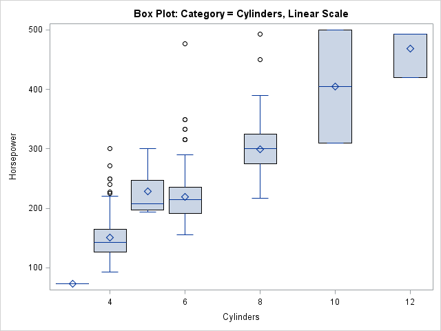
In this graph, the XAXIS statement is used to specify that the number of cylinders should not be treated as a discrete (nominal) variable, but should be spaced according to their values on a continuous scale. (Notice the presence of vehicles with three and five cylinders in the data.) This can be a useful feature. For example, I use it to visualize the performance of algorithms. The X axis might be the number of variables in an analysis, and the box plot might represent the distribution of times for 10 runs of the algorithm.
The syntax for this "continuous variable box plot" is a bit contradictory: The CATEGORY= option specifies the X variable (which, from the syntax, you expect to be categorical!) and the TYPE=LINEAR option specifies that the X variable is continuous. However, this is a powerful syntax. It very useful for clinical trials data in which you plot the distribution of the response variable versus time for patients in experimental and control groups.
The GROUP= option defines an auxiliary variable
The GROUP= option defines an auxiliary classification variable. I like to think of the GROUP= variable as defining an overlay of various "mini plots." In most cases, you get k mini plots for every one that you have without the GROUP= option, where k is the number of levels in the grouping variable. For example, in the line plot you get k overlaid lines, one for each group.
The main difference between the CATEGORY= and GROUP= options is that the GROUP= option results in graphical elements that have varying attributes. By default, each unique value of the grouping variable is drawn in a separate style element GraphData1 through GraphDatak. The association between graphical styles and the groups are shown in a legend.
The SGPLOT procedure supports many options that control the appearance of the grouped data. You can use the GROUPDISPLAY= option to specify that the grouped elements be clustered, overlaid, or (for bar charts) stacked. You can use the GROUPORDER= option to specify how you want the group elements to be ordered.
Combining the two options
You can combine the two options to visualize a group variable nested within a categorical variable. The following statements create a graph that contains box plots for several types of vehicles, nested within the Origin variable:
proc sgplot data=sashelp.cars; where Type in ('SUV' 'Truck' 'Sedan'); title "Box Plot: Category = Origin, Group = Type"; vbox horsepower / category=Origin Group=Type; run; |
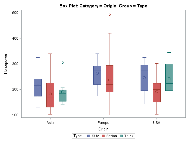
The plot shows that the data set does not contain any trucks that are made in Europe. It also shows that sedans tend to have lower horsepower than SUVs, when you account for the Origin variable.
In summary, the VBOX (and HBOX) statements in the SGPLOT procedure support several options that arrange the boxes. The CATEGORY= option defines the variable to use for the X axis, whereas the GROUP= option defines an auxiliary discrete variable whose values and graphical attributes are displayed in a legend. You can use the options to visualize the distribution of one response variable with respect to one or two other variables.

10 Comments
"Mistakes are the portals of discovery." -- James Joyce
For more examples of Grouped Box Plots on discrete and interval axes using SAS, see: http://blogs.sas.com/content/graphicallyspeaking/2012/04/23/sas-global-forum-monday-update/
I can not get SAS to recognize the "Group=" option in SGPLOT, vbox. I also don't see it as an option on the SAS documentation page, only "Category". I am using SAS version 9.2. Can someone please tell me if I am missing something?
You are not missing anything. SAS 9.2 is from 2008. The GROUP= optiopn was added to VBOX in SAS 9.3. SAS 9.4 (the current release) added additional useful features, so you might want to upgrade your SAS system to a more recent release.
Thank you for your quick reply!
Thanks for this information which I found useful. I was looking for ways to order the CATEGORY for a VBOX which isn't mentioned here explicitly, but if anyone else is looking for this...all you need to do is use the VALUES= option in the XAXIS statement...doh!
Hi,
I want to create grouped box plot using SAS version 9.2. There are 4 boxplots per group and there are 4 such groups in a single plot. I need to create 3-4 such plots on single page. Also on each boxplot, I want to represent it with a label.
Your help is very much appreciated.
Thanks
Regards,
Dhaval
There have been eight releases of SAS software since SAS 9.2, and unfortunately I do not remember what features were or were not in PROC SGPLOT way back in 2008. You can try to ask your question at the SAS/GRAPH and ODS Graphics Support Community.
Pingback: Overlay plots on a box plot in SAS: Discrete X axis - The DO Loop
Pingback: 3 ways to create nested box plots in SAS - The DO Loop