Box plots summarize the distribution of a continuous variable. You can display multiple box plots in a single graph by specifying a categorical variable. The resulting graph shows the distribution of subpopulations, such as different experimental groups. In the SGPLOT procedure, you can use the CATEGORY= option on the VBOX statement to generate box plots for each level of a categorical variable.
Sometimes you need to overlay additional points or lines on box plots. SAS 9.4M1 and beyond supports overlaying "basic plots" and box plots. There are many different basic plot types, including the scatter plot and the series (line) plot.
This article shows examples in which the X axis is discrete. In a subsequent article, I will discuss the case of a continuous X axis.
How to overlay box plots and other plots that share a common discrete X variable. #SAStip #DataViz Share on XConnect features of adjacent box plots
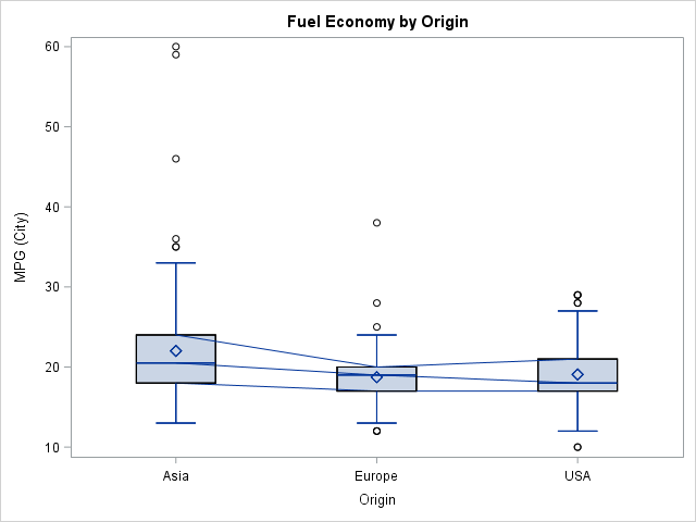
The simplest way to overlay features on a set of box plots is to use the CONNECT= option on the VBOX statement. The CONNECT= option (which also requires SAS 9.4M1) enables you to overlay line segments that connect the means or selected quantiles (max, min, or quartiles) of adjacent box plots. The article by Sanjay Matange provides details about how to use the CONNECT= option. The CONNECT= option is useful when you want to visually emphasize how the mean (or quartiles) change between levels of a classification variable.
You can use a trick to add multiple CONNECT= options. For example, if you want to connect the first, second, and third quartile values, you can repeat the VBOX statement multiple times, but use the NOFILL and NOOUTLIERS options on all but the first statement. The following statement provides an example. Notice that the NOCYCLEATTRS option prevents the plot from using different colors for the different VBOX statements:
title "Fuel Efficiency by Origin"; proc sgplot data=sashelp.cars noautolegend nocycleattrs; /* suppress cycling attributes */ vbox mpg_city / category=origin connect=median; /* draw box and connect medians */ vbox mpg_city / category=origin nofill nooutliers connect=Q1; /* connect Q1 */ vbox mpg_city / category=origin nofill nooutliers connect=Q3; /* connect Q3 */ run; |
Overlay arbitrary line segments and points on box plots
In the same article, Sanjay shows how to overlay line segments that connect any precomputed quantities. For example, you can use PROC MEANS to compute statistics for each category and then use one or more SERIES statements to display line segments that connect the statistics.
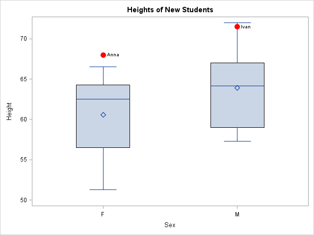
In a similar way, you can overlay markers that represent special observations or reference values. For example, suppose the Sashelp.Class data set contains data about the heights and weights of a teacher's current students. When two new foreign exchange students (Ivan and Anna) are assigned to her class, she notices that these students are exceptionally tall compared to her current students. She decides to overlay the new student's heights on box plots (one for each gender) that show the height distributions of her current students. One way to do this is to create a box plot of the original data and then overlay a scatter plot of the new observations.
The following SAS program
- Creates a data set with the new data.
- Concatenates the original and the new data. To overlay the plots they should have a common X axis. In this case, the new data can share the Name, Sex, and Age variables of the original data, but you should create NEW variables that describe the heights and weights of the new students. In this way, only the original observations are used to construct the box plots and only the new observations are used to overlay the scatter plot.
- Uses the SGPLOT procedure to overlay the box plots and the scatter plot. Use the VBOX statement with CATEGORY=Sex to create the box plot and use the SCATTER statement with X=Sex to overlay the scatter plot.
data NewStudents; length Name $8 Sex $1; input Name Sex Age Height Weight; datalines; Ivan M 14 71.5 110 Anna F 13 68 105 ; data All; /* concatenate: use same X variable but different Y variables */ set sashelp.class NewStudents(rename=(Height=NewHeight Weight=NewWeight)); run; proc sgplot data=All noautolegend; vbox height / category=sex; scatter x=sex y=NewHeight / datalabel=Name markerattrs=(color=red symbol=CircleFilled size=12); run; |
Overlay multiple plots on box plots
It is just as easy to overlay multiple plots. Recall that plots are rendered in the order that they appear in the SGPLOT procedure. This means that plots that change the background (such as a BLOCK plot) should be specified first, and plots that use markers should be specified last. Another option is to use the TRANSPARENCY= option judiciously so that features in earlier plots are visible even though other plots are overlaid on top.
The following example demonstrates overlaying three plots. The plot shows the distribution of the fuel economy (measured as miles per gallon) for different kinds of vehicles. A block plot in the background emphasizes that hybrid vehicles have the best fuel economy. The box plot then shows the distribution of the fuel economy for six types of vehicles. The BOXWIDTH= option is used to control the width of the box plots. Lastly, the graph displays a scatter plot of the response variable for each model of vehicle. The JITTER option is used to reduce overplotting.
data cars / view=cars; set Sashelp.Cars; if type="Hybrid" then FuelType = "Hybrid "; else FuelType = "Conventional"; run; proc sgplot data=cars noautolegend; block x=type block=FuelType / filltype=alternate fillattrs=(color=LightGray)altfillattrs=(color=white); vbox mpg_city / category=type boxwidth=0.8 nooutliers; scatter x=type y=mpg_city / jitter transparency=0.6 markerattrs=(color=red symbol=CircleFilled); yaxis offsetmax=0.1; run; |
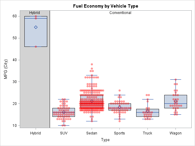
The resulting graph looks complicated but is created by using only a few statements. Again, the key is that each of the three plot types shares a common, discrete, X variable.
This article provides several examples of overlaying a box plot with other plots that share a discrete X axis. My next post shows how to use box plots to summarize conditional distributions when the X axis is continuous.

3 Comments
Great post Rick; everyone loves a fancy graph!
Pingback: Overlay plots on a box plot in SAS: Continuous X axis - The DO Loop
Pingback: Remaking a panel of dynamite plots - The DO Loop