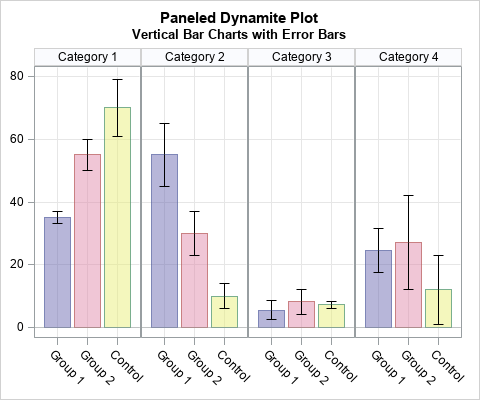
A colleague spent a lot of time creating a panel of graphs to summarize some data. She did not use SAS software to create the graph, but I used SAS to create a simplified version of her graph, which is shown to the right. (The colors are from her graph.) The graph displays a panel of bar charts with uncertainty intervals. The height of the bar is the mean value of the response. I don't know which statistic she used for the "error bars." It could be one of three common statistics that visualize uncertainty: the standard deviation of the data, the standard error of the mean, or a 95% confidence interval for the mean.
Each cell in the panel shows a set of "dynamite plots," which is a common name for those bar charts with error bars. Data visualization experts generally agree that dynamite plots are not the best way to summarize a data distribution. Alternatives that show the distribution of the data include box plots, strip plots, and violin plots.
Even if you choose to present summarized data instead of the raw data, the dynamite plot is not the best choice. If you adhere to Tufte's advice to maximize the data-to-ink ratio, a simple dot plot with error bars conveys the same information with less ink.
This article discusses a makeover of the panel. In particular, here are some best practices for remaking this graph:
- Replace the dynamite plots with a simple dot plot.
- Exchange the axes so that the group labels can be written horizontally and the response variable is plotted along the X axis.
- Do the colors improve or detract from the visualization? Try plotting the data with and without using colored bars.
Moving from bar charts to dot plots
Bar charts are best for representing frequencies and percentages. A dot plot is a better way to display the means and error bars for data. In the SGPLOT procedure in SAS, the DOT statement will summarize the data and visualize the summary statistics. However, I do not have access to the raw data, so I will use a SCATTER statement to create a panel of dot plots.
The following data step creates some data that are similar to the results that my colleague presented. I use PROC FORMAT to create a SAS format for the categories and groups. This enable readers to reuse my code for their own visualizations, and it keeps my colleague's data private:
proc format; value CatFmt 1 = "Category 1" 2 = "Category 2" 3 = "Category 3" 4 = "Category 4"; value GroupFmt 1 = "Group 1" 2 = "Group 2" 3 = "Control"; run; data Have; format Category CatFmt. Group GroupFmt.; input Category Group Mean W; Lower = Mean - W; Upper = Mean + W; datalines; 1 1 35 2 1 2 55 5 1 3 70 9 2 1 55 10 2 2 30 7 2 3 10 4 3 1 5.5 3 3 2 8.2 4 3 3 7.2 1 4 1 24.5 7 4 2 27 15 4 3 12 11 ; |
The following makeover uses the following features of SAS graphics:
- You can use PROC SGPANEL to create the panel of plots. The PANELBY statement specifies the categorical variable to use for the cells. You can use options on this statement to control the layout for the cells and the appearance of the cell headers.
- The SCATTER statement plots the mean within each category. Use the GROUP= option to offset the means for each group. Use the XERRORLOWER= and XERRORUPPER= options to plot error bars. This plot uses the default colors for distinguishing groups. The colors are determined by the current ODS style. For the HTMLBlue style, the colors are dark shades of blue, red, and green. According to my colleague, she chose the purple-pink-yellow palette of colors "for aesthetic reasons." In a subsequent section, I show how to override the default colors for groups.
- The COLAXIS and ROWAXIS statements are equivalent to the XAXIS and YAXIS statements in PROC SGPLOT. They enable you to add grid lines, control labels and tick marks, and modify axis-related properties.
The following call to PROC SGPANEL shows one way to remake my colleague's graph as a panel of dot plots:
ods graphics / width=480px height=400px; title "Paneled Makeover Plot"; title2 "Horizontal Dot Plot with Error Bars"; footnote J=L "Without Colored Bands"; proc sgpanel data=Have noautolegend; panelby Category / novarname layout=rowlattice rows=4; scatter x=Mean y=Group / xerrorlower=Lower xerrorupper=Upper errorbarattrs=(thickness=2) errorcapscale=0.5 markerattrs=(symbol=CircleFilled) group=Group; colaxis grid display=(nolabel); rowaxis grid display=(nolabel) type=discrete REVERSE offsetmin=0.2 offsetmax=0.2; run; |
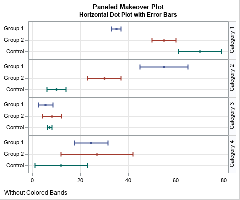
If you turn your head sideways, you can see that this graph displays exactly the same information as the original graph. However, it is easier to compare the means and intervals within and across categories. The group labels are displayed horizontally, which means that this same layout will support longer group labels without needing to rotate the text.
Furthermore, you can use the row-based layout even if there are additional categories or groups. The graph will be longer, but it will be the same width. That means that the graph will fit on one sheet of paper for many groups or categories. In contrast, the original layout gets wider as more categories are added, which might make it hard to fit the panel on a printed page in portrait mode.
Adding colored bands to a dot plot
In the previous graph, colors are used to distinguish the markers and lines for each group. This enables you to easily track the same group across different categories. The author of the original graph chose light colors for the bars, but light colors are not good choices for lines and markers. However, if those colors are important to the story that you want to tell, you can add colored bands to the background of the graph.
You can use the STYLEATTRS statement to tell the procedure what colors to use for groups. You can use the HIGHLOW statement to create colored bands, which is a tip I learned from my colleague Sanjay Matange. To use the HIGHLOW statement, you need to add new variables to the data to indicate the minimum and maximum values for the bands. The following statements create an alternative visualization:
/* set minimum and maximum values for colored bars */ data Want / view=Want; set Have; xmin=0; xmax=80; run; footnote J=L "With Colored Bands"; proc sgpanel data=Want noautolegend; styleattrs datacolors=(Lavender Salmon LightYellow); panelby Category / novarname layout=rowlattice rows=4; /* plot colored bands in the background */ highlow y=Group low=xmin high=xmax / group=Group type=bar groupdisplay=cluster barwidth=1.0 clusterwidth=0.9 transparency=0.5 fill nooutline; scatter x=Mean y=Group / xerrorlower=Lower xerrorupper=Upper markerattrs=(symbol=CircleFilled color=Black) errorbarattrs=(thickness=2 color=Black) errorcapscale=0.5; colaxis grid display=(nolabel); rowaxis grid display=(nolabel) type=discrete REVERSE offsetmin=0.2 offsetmax=0.2; run; |
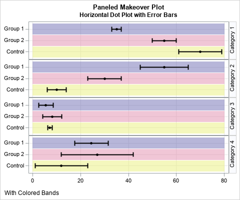
Since the colored bands identify the groups, I used black to display the means and error bars. The information in this graph is the same as for the previous graph, but this graph emphasizes the colors more. In general, I prefer the graph without the color bands, but there might be situations in which colors enhance the presentation of the data.
Summary
In summary, this article shows how to remake a panel of dynamite plots, which are bar charts with error bars. The article shows that you can display the same information by using a dot plot with error bars. Furthermore, it is often helpful to rotate the plot so the response variable is plotted horizontally instead of vertically. This redesign can support many groups and categories because adding more categories makes the graph grow taller, not wider. Lastly, the article shows how to add colored bands in the background of a dot plot.
Appendix: Create the original graph
For completeness, the following SAS code creates the panel that is shown at the top of this article:
title "Paneled Dynamite Plot"; title2 "Vertical Bar Charts with Error Bars"; footnote; proc sgpanel data=Have noautolegend; styleattrs datacolors=(CX6f6db2 CXe18dac CXe9ef7a); /* colors of original graph */ panelby Category / novarname layout=columnlattice columns=4; vbarbasic Group / response=Mean transparency=0.5 group=Group; scatter x=Group y=Mean / yerrorlower=Lower yerrorupper=Upper markerattrs=(size=0) errorbarattrs=(color=Black); colaxis grid display=(nolabel) fitpolicy=rotate; rowaxis grid display=(nolabel); run; |

5 Comments
Rick,
"ds graphics / width=480px height=400px;"
Should be
"ods graphics / width=480px height=400px;"
And VBARPARM also could do the same thing:
proc sgpanel data=Have noautolegend;
styleattrs datacolors=(CX6f6db2 CXe18dac CXe9ef7a) datacontrastcolors=(CX6f6db2 CXe18dac CXe9ef7a); /* colors of original graph */
panelby Category / novarname layout=columnlattice columns=4;
vbarparm category= Group response=Mean /transparency=0.5 group=Group groupdisplay=cluster
limitlower=lower limitupper=upper limitattrs=(color=black);
colaxis grid display=(nolabel) fitpolicy=rotate;
rowaxis grid display=(nolabel);
run;
Thanks. But no matter how you create that bar chart, the other plots visualize the information better.
I agree that the graphs you present show the data better than the bar chart/dynamite plot. Thanks for the ideas and code!
Pingback: Why you should visualize distributions instead of report means - The DO Loop
Pingback: 10 tips for creating effective statistical graphics - The DO Loop