Over the past month or more, I have been in a conversation with SAS user James Marcus, on creation of some new displays for visual communication of uncertainty. These include display of densities using a "Violin" plot, "Density Strips" and more. With his permission, I can share some of the results over the next few articles.
At the onset, I should state that my interest is from a graphical perspective, with a desire to see how these graphs can be created using ODS Graphics. I do not claim knowledge of the statistical aspects. The code to determine the density values by category was provided by James Marcus.
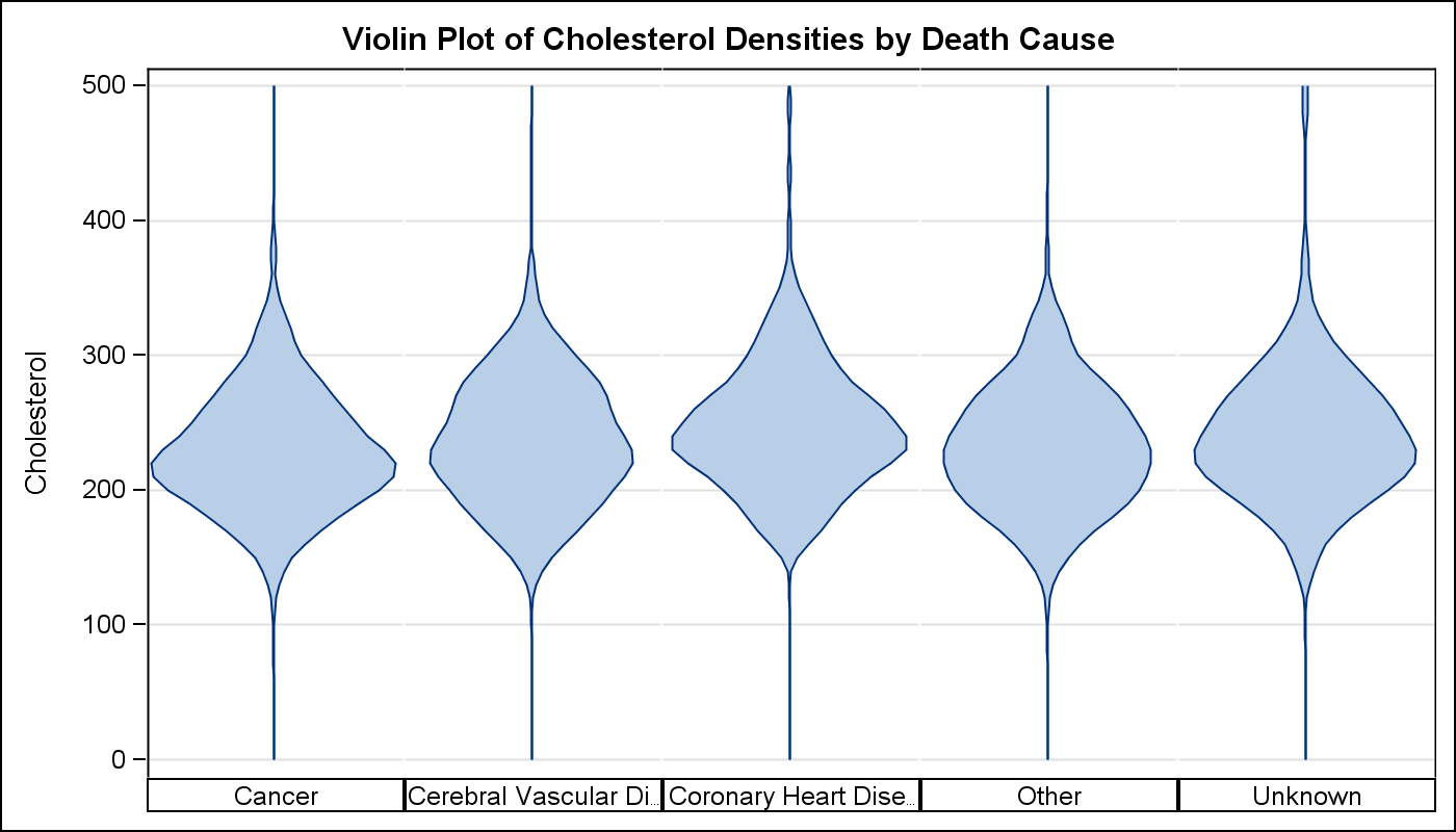
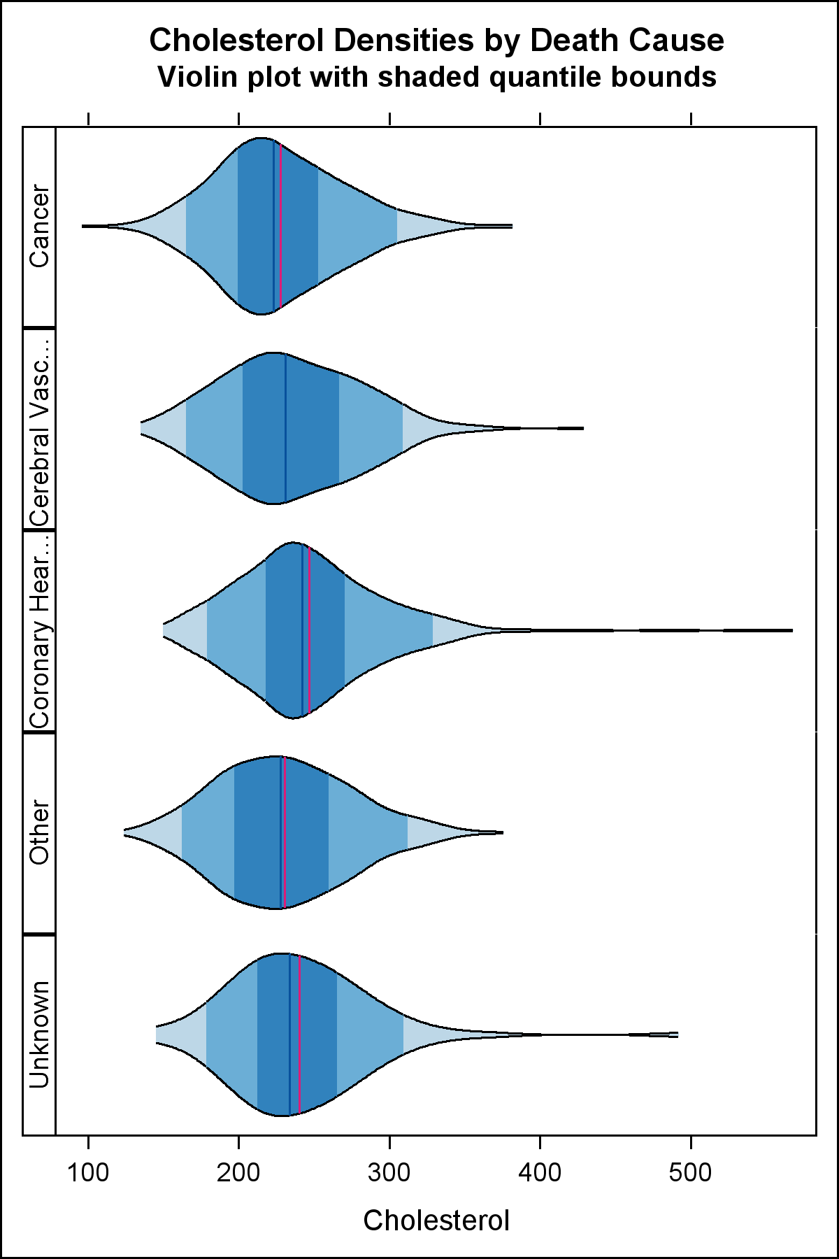
In this article, I will cover creating a Violin Plot (Hintze and Nelson, 1998). We used the sashelp.heart data set, to create violin plots of the cholesterol densities by death cause. The density values are computed using proc KDE.
Here is the graph created using the SGPANEL procedure. Click on the graph for a bigger image.
The key steps to create this graph are as follows:
- The cholesterol densities are computed by death cause using proc KDE.
- A violin plot essentially "mirrors" the data to create a closed shape.
- Since the classification is discrete, we used the SGPANEL procedure.
- We used various procedure options to get the look above.
SAS 9.2 SGPANEL Code:
title 'Violin Plot of Cholesterol Densities by Death Cause'; proc sgpanel data=chol_den_2 nocycleattrs; panelby deathcause / layout=columnlattice onepanel novarname noborder colheaderpos=bottom; band y=cholesterol upper=density lower=mirror / fill outline; rowaxis label='Cholesterol' grid; colaxis display=none; run; |
Key features of proc SGPANEL used are:
- PanelBy Death cause with LAYOUT=COLUMNLATTICE to create a lattice of columns.
- Suppress display of panel variable name in each cell header (NOVARNAME).
- Suppress display of cell borders (NOBORDER).
- Place column headers at the bottom (COLHEADERPOS).
- A band plot is used to draw the violin shape in each cell.
- Axis display is reduced to focus on the shape of the data.
- Default uniform scaling allows comparison across the panels.
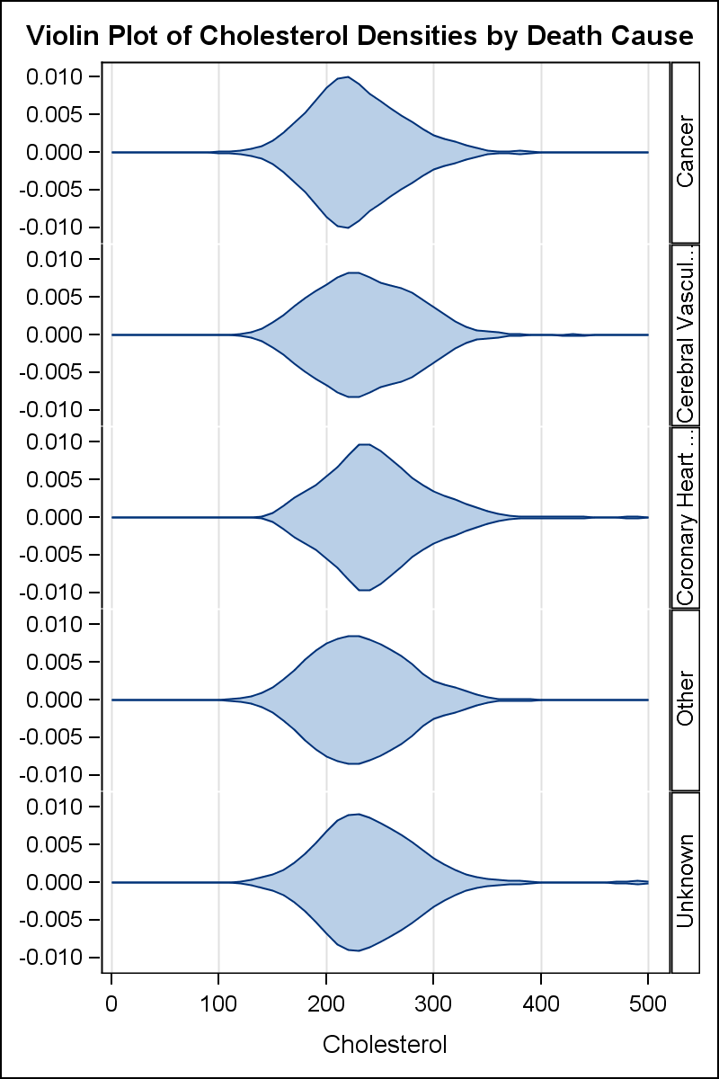
Horizontal violin plots can be also be created using Layout=ROWLATTICE:
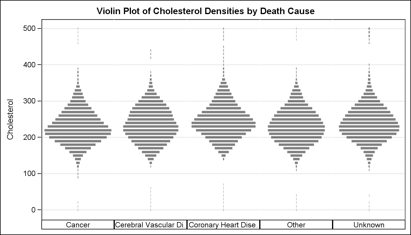
Here is a version using HighLow plots to show the data as histogram bins:
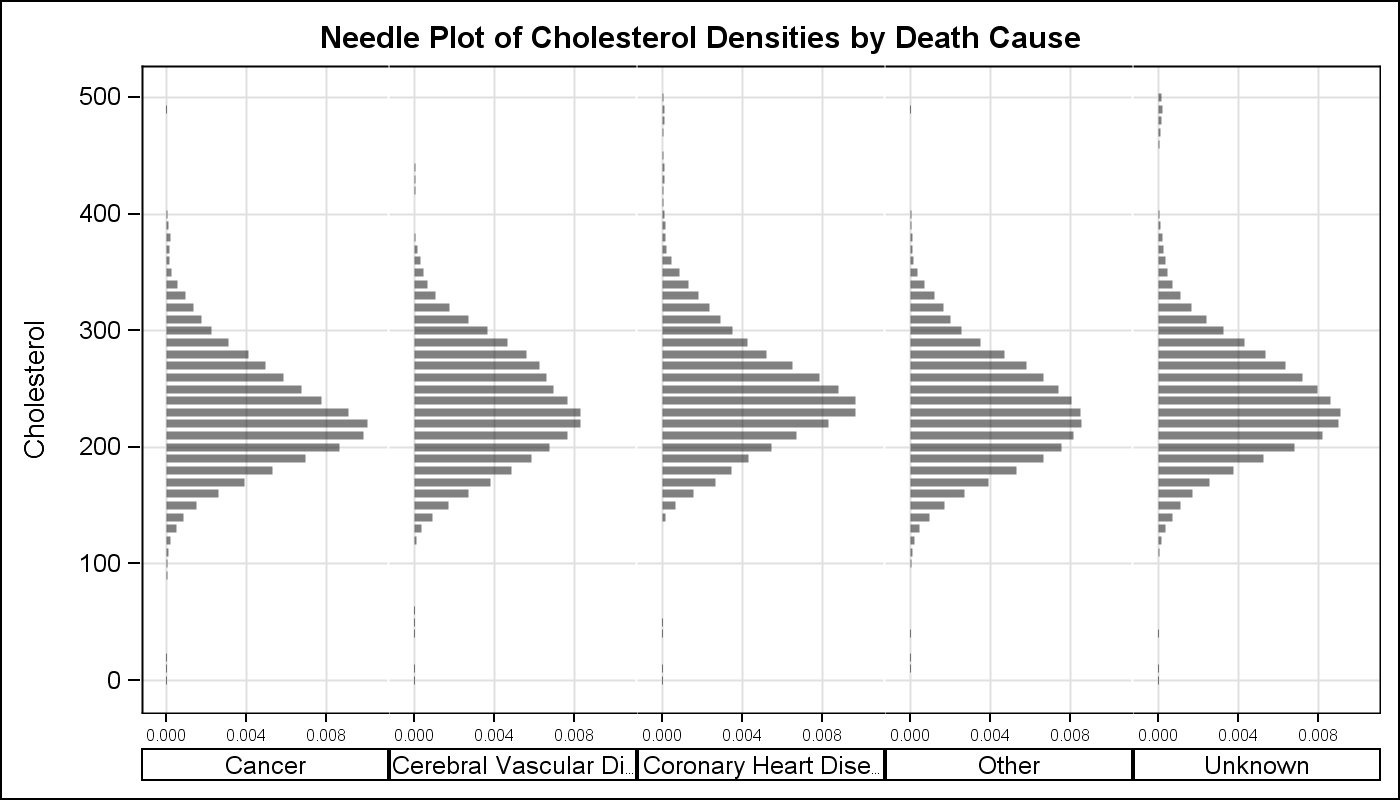
While the closed shape of the violin provides a satisfactory visual by the Gestalt principles, it does use up double the space. A "Half-Violin" graph (essentially band plot or HighLow plot with zero value on one side) can use the space more efficiently:
The full code for the graphs above is attached below.
SAS 9.2 Program for Violin Plot: Full SAS Code_92
James has further enhanced the graph to include quantile ranges and mean or median markers as shown below:
Full SAS 9.2 Code from James Marcus: Violin_Overlay_92


16 Comments
The first four plots are incorrect in the tails. The violin plots should never go past the min and max values of the data for each category. Get rid of the "(gridl=0 gridu=500)" option on the UNIVAR statement, which is forcing PROC KDE to extend the density to min=0 and max=500. The very last plot does not have that error, and is correct.
Pingback: Density Strip Plot - Graphically Speaking
I managed to create the first graph without the error mentioned by Rick Wicklin; however, I do need to create a graph similar to the last one, including the median and the inter quartiles. I tried the code provided, but it does not work properly, below is the part of the code that is not running. Could you please give me some advice?
Thanks!!
proc sgpanel data=vap_den_6 nocycleattrs noautolegend;
panelby fish / layout=rowlattice ROWHEADERPOS= LEFT onepanel novarname noborder;
band x=vap upper=density lower=mirror / group=group2 fill outline
lineattrs=(pattern=solid color=black) ; *transparency=0.5;
highlow x=vap high=density_median low=mirror_median / LINEATTRS=(color=cx08519C);
highlow x=vap high=density_mean low=mirror_mean / LINEATTRS=(color=cxDD1C77);
colaxis label='VAP' refticks; *grid;
rowaxis display=none; *(nolabel);
run;
Partly my fault. As you can see in the code snippet, this graph uses the HIGHLOW plot which is first included with SAS 9.3.
Hi -
thanks for posting this, very useful! I'd love to be able to "stack" multiple of these for many different Y values. I can do this using a macro and GTL for boxplots (see:http://www.soc.duke.edu/~jmoody77/slev_grpinvl1.png ). The goal would be to get the same plot, but using violin charts rather than boxplots, but I can't figure out how to get the multiple density plots to work.
I've tried various versions of a datapanel and datalatice statement, stacking the KDE output from multiple runs and generating a variable-level classification variable, but that ends up equating the density & value axes, which can be nonsensicle. Any ideas?
It will be easier to understand if you can post your code and data. There is a UNISCALE option in the PANELBY statement that will allow you to control how the scales are equated. Check that out.
Thanks for helping to think this through!
The simplest code (ignoring for now overlaying median markers or some such) woudl be something like the code below, which creates an impage like this :
http://www.soc.duke.edu/~jmoody77/misshapenpanels.png
Goal is to re-scale the x/y axis to optimize for each row in this panel.
/* create some example data -- key bit is widely variable ranges across
the vars */
data dum (index=(wave));
do wave = 1 to 5;
do obs = 1 to 100;
y1=.25*rannor(0);
y2=3*rannor(0);
output;
end;
end;
run;
/* Estimate kernel density */
proc kde
data = dum;
by wave;
univar y1 y2/ noprint
/* unistats
percentiles */
plots=none
out = size_density;
run;
/* Create mirror of density */
data densities;
set size_density;
mirror = -density;
run;
/* Create a violin plot for several variables */
*ods html close;
*ods pdf file = plotout;
proc sgpanel
data = densities;
panelby wave var/
layout = lattice
onepanel;
band y = value upper = density lower = mirror /
fill outline;
run;
*ods pdf close;
Hi - just FYI
After some poking around, one can do this in the SGPanel by:
(1) specifying multiple varialbes in the univar statement of proc KDE, so you get a dataset with the densities stacked by "var"
(2) Re-normalizing these so they have similar ranges (else the plots get all whacky)
(3) then using sgpanel to run a panelby "var" & then use the "group" value to capture the common within-panel x-axis.
(4) if you want to add other info bits (labels, means, modes, etc., construct them in the dataset so you have a single value by var & within-panel x "group", then use serries/scatter.
The code for 1-3 above is below, building on the madeup data I posted in the last bit.
/* Standardize the densities */
proc sort
data = _kdeout;
by var;
run;
proc stdize
data = _kdeout
out = _rescaled
method = maxabs;
var density;
by var;
run;
/* Create mirror of density & rescale so we can plot by xvar*/
data _densities;
set _rescaled;
density = density/4;
mirror = -density;
density = density+wave; /* rescales it */
mirror = mirror+wave;
run;
/* Create a violin plot for several variables */
proc sgpanel
data = _densities;
panelby var /
layout = rowlattice
onepanel
uniscale = column novarname ;
band y = value upper = density lower = mirror /
group = wave fill nooutline fillattrs=(color=vpab);
rowaxis grid display=(nolabel);
run;
I could not run this program as some steps are missing.
Pingback: Comparative Histograms - Graphically Speaking
Is it possible to generate the above plot using proc template rendered with sgrender?
Absolutely! Use a LAYOUT DATALATTICE in GTL to create the layout, and use a BANDPLOT in the LAYOUT PROTOTYPE. Your code might look something like the following:
proc template;
define statgraph violin_gpanel;
begingraph / collation=binary subpixel=on designwidth=480 designheight=640;
EntryTitle "Cholesterol Densities by Death Cause" /;
EntryTitle "Violin plot with shaded quantile bounds" / textattrs=(size=GraphLabelText:fontsize);
layout datalattice rowvar=DeathCause / includeMissingClass=false headerLabelDisplay=Value rowHeaders=left rowDataRange=unionall columnDataRange=unionallcolumns=1 rowAxisOpts=( display=none altdisplay=none) columnAxisOpts=( display=all altdisplay=all displaysecondary=(line ticks) altdisplaysecondary=(line ticks) Label="Cholesterol");
layout prototype / wallDisplay=(fill);
BandPlot X=cholesterol LimitUpper=density LimitLower=mirror / Group=group2 OutLineAttrs=( Color=CX000000 Pattern=1) Display=( Outline Fill );
HighLowPlot X=cholesterol High=density_median Low=mirror_median / primary=true Lineattrs=( Color=CX08519C);
HighLowPlot X=cholesterol High=density_mean Low=mirror_mean / Lineattrs=( Color=CXDD1C77);
endlayout;
endlayout;
endgraph;
end;
run;
Using the above GTL code, if you add a group variable, how can you get the output clustered instead of overlapping?
Your best option, in that case, is to put the "group" variable on the COLUMNVAR option instead of the GROUP option of the BANDPLOT. For example:
layout datalattice rowvar=DeathCause columnvar=group2 / ...
Give that a try and see if that works for you.
Pingback: Remaking a panel of dynamite plots - The DO Loop
Pingback: Creating a Microsoft Excel report using SAS, Python and SQL! - SAS Users