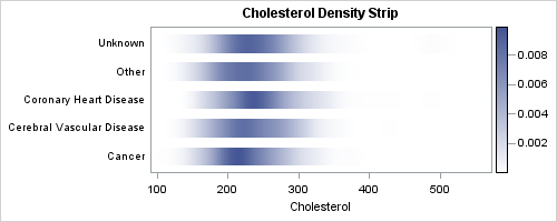
In the previous post on Violin Plots, we discussed the process to create custom density plots. This work was done in collaboration with SAS user James Marcus. This is the second installment on the same topic - Creating Density Strip Plots. We will use the same data and process to compute densities over the range of the data by death cause. Then, we will use the HEATMAPPARM statement to plot the densities using a RANGEATTRIMAP to map specific density values to color.
Here is the graph and the GTL template code:
SAS 9.3 GTL code:
proc template; define statgraph DensityStrip; begingraph; rangeattrmap name='map'; range min-max / rangecolormodel=(white cx445694); endrangeattrmap; rangeattrvar var=density attrvar=density attrmap='map'; entrytitle 'Cholesterol Density Strip'; layout overlay / xaxisopts=(label='Cholesterol' linearopts= (tickvaluesequence=(start=0 end=500 increment=100))) yaxisopts=(display=(tickvalues)); heatmapparm x=cholesterol y=deathcause colorresponse=density / xbinaxis=false ygap=5px colormodel=TWOCOLORRAMP name="heatmapparm"; continuouslegend "heatmapparm" / location=outside; endlayout; endgraph; end; run; |
Full SAS 9.3 code for Density Strips: Density_Strip
The Heat Map takes parameterized data, meaning it does not do the binning of the data. User provides the data per bin on X and Y. X and or Y axes can be character or numeric, and here we have character data for Y and numeric data for X.
The HeatMapParm plot created colored blocks that fill the entire space for the variables on each axis. For character data, this is the full mid point spacing. For numeric data, the size is the smallest interval in the data. So, to make sure the plot does not leave gaps, we have to ensure all the numeric data intervals are of equal space. We have used a YGAP of 5 pixels to separate the strips.
By default, the KDE procedure computes bins that are based on the data extent for each category separately. Since the data range is different for each category, the bin intervals for each category are different. With such data, the HeatMapParm (or the HighLow plot) does not fill the blocks evenly. This was the reason I used the GRIDL and GRIDU options to ensure all the data is binned evenly.
Responding to Rick's comment on the Violin Plot article, this time I used the actual min and max values from the data on the GRIDL and GRIDU options instead of hard coded values. But that still may not be fully rigorous, and there is likely a better way to do this, which I will leave to the reader.
This would be a good point to repeat my previous disclaimer: My focus here is on creation of the graph using ODS Graphics given the correct data. I am not a statistician by profession or training, so I will leave the task of ensuring data correctness to the reader.
James has taken this to the next step to overlay mean, median and quantile values on the strips using the BoxPlot overlays. Here is his graph with the overlays:
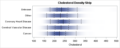
I am sure this can be further customized by using different types of markers and addition of a legend.
Full SAS 9.3 code for Density Strip with overlays: Density_Strip_Overlay


