The addition of the PYTHON procedure and Python editor in SAS Viya enables users to execute Python code in SAS Studio. This new capability in SAS Viya adds another tool to SAS's existing collection. With this addition I thought, how can I utilize this new found power?
In this example, I'll keep it simple. I want to create a Microsoft Excel report using a combination of SAS, Python and SQL. I'll use data that's stored in a SAS library; however, the library could be using data stored anywhere, like a path, database or in the cloud. I'll write a program that executes the following:
- the SAS ODS EXCEL statement to create and Excel workbook
- the PRINT procedure and to print the detailed data
- the PYTHON procedure to create violin plots using the matplotlib package
- the SQL procedure for a simple aggregation
- the ODSTEXT procedure to write text in Excel
All code used in this post is located on GitHub, here.
Set folder path and file name
To begin, I'll create a macro variable to specify the output folder path and Microsoft Excel workbook name.
%let path=/*Enter your output folder path*/; %let xlFileName = myExcelReport.xlsx; |
Prepare data
Further, I'll prepare the data using the SAS DATA step. I'll use the available sashelp.cars table, create a new column named MPG_Avg, and drop unnecessary columns. Instead of using the DATA step you can use Python or SQL to prepare the data. Whatever tool works best for you.
data work.cars; set sashelp.cars; MPG_Avg=mean(MPG_City, MPG_Highway); drop Wheelbase Weight Length; run; |
Create the Microsoft Excel workbook
After the data is ready, I'll use the ODS EXCEL statement to create the Excel spreadsheet. The following ODS options are used:
- FILE - specifies the file path and name.
- STYLE - modifies the appearance of the SAS output
- EMBEDDED_TITLES - specifies titles should appear in the worksheet
- SHEET_INTERVAL - enables manual control when to create a new worksheet
ods excel file="&path./&xlFileName" style=ExcelMidnight options(embedded_titles="on"); |
Worksheet 1
Print the data using SAS
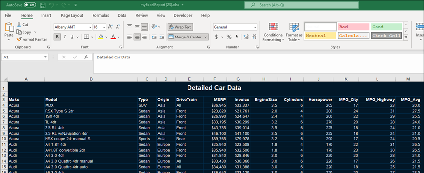
With the ODS EXCEL destination open I'll name the first worksheet Data, and manually specify when a new sheet is created. Next, I'll use the PRINT procedure to print the detailed data to Excel. The PRINT procedure will print the entire SAS data set with the associated formats and styles to Excel.
* Sheet 1 - Print the data using SAS *; ods excel options(sheet_name='Data' sheet_interval='none'); title height=16pt color=white "Detailed Car Data"; proc print data=work.cars noobs; run; |
Worksheet 2
Create violin plots using Python
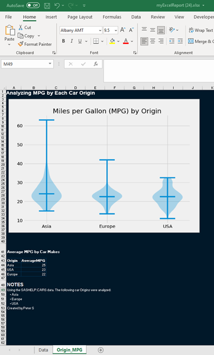
Next, I want to create violin plots on a new worksheet named Origin_MPG. Now, these can be created in SAS, but I personally found the matplotlib package in Python a bit easier to use . With the PYTHON procedure, I can include the Python code within the SAS program (or you can reference a .py file) to create the visualization. Then I'll use the SAS.pyplot method to save and render the visualization. Since the pyplot callback renders the image in the results tab, it exports the image to the Excel workbook by default.
First I'll use ODS EXCEL to create the new worksheet and the TITLE statement to add a title to the Excel worksheet.
ods excel options(sheet_name='Origin_MPG' sheet_interval='now'); title justify=left height=16pt color=white "Analyzing MPG by Each Car Origin"; |
Then I'll execute the PYTHON procedure to execute my Python code to create the violin plot.
* Create violin plots using Python *; proc python; submit; ## ## Import packages and options ## import pandas as pd import matplotlib.pyplot as plt plt.style.use('fivethirtyeight') outpath = SAS.symget('path') ## ## Data prep for the visualization ## ## Load the SAS table as a DataFrame df = (SAS .sd2df('work.cars') ## SAS callback method to load the SAS data set as a DataFrame .loc[:,['Origin','MPG_Avg']] ## Keep the necessary columns ) ## Create a series of MPG_Avg for each distinct origin for the violin plots listOfUniqueOrigins = df.Origin.unique().tolist() mpg_by_origin = {} for origin in listOfUniqueOrigins: mpg_by_origin[origin] = df.query(f'Origin == @origin ').MPG_Avg ## ## Create the violin plots ## ## Violin plot fig, ax = plt.subplots(figsize = (8,6)) ax.violinplot(mpg_by_origin.values(), showmedians=True) ## Plot appearance ax.set_title('Miles per Gallon (MPG) by Origin') rename_x_axis = {'position': [1,2,3], 'labels':listOfUniqueOrigins} ax.set_xticks(rename_x_axis['position']) ax.set_xticklabels(rename_x_axis['labels']) ## Save and render the image file SAS.pyplot(plt, filename='violinPlot',filepath=outpath) endsubmit; quit; title; |
SQL Aggregation
SQL is an extremely common and useful language for data analysts and scientists. I find using SQL for aggregation easy, so I will create a simple aggregation and add it below the visualization on the same worksheet in the the Excel report.
* SQL Aggregation *; title justify=left "Average MPG by Car Makes"; proc sql; select Origin, round(mean(MPG_Avg)) as AverageMPG from work.cars group by Origin order by AverageMPG desc; quit; title; |
Add text
At the end of the same worksheet I'll add some simple text using the ODSTEXT procedure to give some information about the data.
proc odstext; heading 'NOTES'; p 'Using the SASHELP.CARS data. The following car Origins were analyzed:'; list ; item 'Asia'; item 'Europe'; item 'USA'; end; p 'Created by Peter S'; quit; |
Close the Excel workbook
Lastly, I'll close the ODS EXCEL destination since I am done writing out to Excel.
ods excel close; |
Results
That's it! Now I'll execute the entire program and view the Excel workbook.
Summary
With the capabilities of SAS and the new ability to execute Python code in SAS Studio, teams have a variety of tools in SAS Viya for their analytic needs.
Additional resources
PYTHON Procedure documentation
SAS opens its code editor interface to Python users
Using PROC PYTHON to augment your SAS programs
ODS Excel Statement

3 Comments
Hi Peter, thank you! Wonderful article.
Not to nitpick, but I identified this unnecessary semicolon (within the Python block) when trying out.
ax.set_xticklabels(rename_x_axis['labels']);
Thanks Sundaresh!
Yes, you are correct, that semicolon is unnecessary. I forgot to remove it. I created my original plot in Jupyter Lab prior to bringing the code to the PYTHON procedure. In Jupyter Lab if you add a semicolon after the last plotting statement, it removes unnecessary text above the plot. That semicolon does not do anything outside Jupyter or cause any issues. I will remove it to clean up the code. Thanks!
- Peter
OK - this is truly awesome! Nice work, amigo.