Graphing data is almost always more informative than displaying a table of summary statistics. In a recent article about "dynamite plots," I briefly mentioned that graphs such as box plots and strip plots are better at showing data than graphs that merely show the mean and standard deviation. This article expands on that idea.
It is well known that summary statistics (means, standard deviations, ...) do not uniquely define a data distribution. You might be familiar with Anscombe Quartet, which is a collection of four bivariate data sets for which the variables have the same means, standard deviations, regression lines, and correlation. However, when you graph the data, you see that the four data sets are radically different from each other.
This article shows a similar (but simpler) idea. The article presents multiple examples of two groups. In each case, the mean of one group of 5 units higher than the mean of the other group. By graphing the data, you can see HOW the groups differ. Knowing HOW two groups differ can be important to decision-makers who base their decisions on data.
Example: An enrichment program leads to higher test scores
Suppose that a school district is considering a new educational enrichment program. Advocates for the program claim that it increases the mean standardized test scores of students by five points. Sounds great, right? However, the mean statistic uses one number to summarize a distribution. If the school board looks only at the mean scores, they might miss important details in the data. For example:
- Do most or all students benefit from the program?
- Is the program biased against gender? Do boys and girls benefit equally?
- Is the program biased against socioeconomic factors? Do students in high-performing schools benefit more than students in low-performing schools?
This article uses an artificial set of hypothetical scores (N=20) to discuss and visualize these ideas. In each example, the mean scores after the enrichment are five points higher than before. But the way that the scores increase is different for each example.
The data
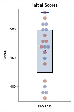
Let's create some fake data. Assume that a set of students take a test, then take the enrichment program, then retake the test. The following SAS DATA step defines the data. A call to PROC SGPLOT visualizes the distribution of the test scores before the enrichment program. I use a strip plot overlayed on a box plot to visualize these data.
data Pre(drop=i); Test = "Pre-Test "; retain ID; input School Sex $ @; do i = 1 to 5; input Score @; ID + 1; output; end; datalines; 1 M 510 510 500 500 450 1 F 530 520 490 480 480 2 M 470 470 400 390 390 2 F 470 460 440 410 380 ; /* see https://blogs.sas.com/content/iml/2016/06/13/overlay-box-plot-in-sas-discrete.html */ ods graphics / width=240px height=360px; title "Initial Scores"; proc sgplot data=Pre noautolegend ; vbox Score / category=Test; scatter y=Score x=Test / jitter transparency=0.5 group=Sex markerattrs=(symbol=CircleFilled size=12); xaxis discreteorder=data display=(nolabel); run; |
These example data are not realistic. In practice, there would probably be a control group and an experimental group. Also, N=20 is a very small sample. Nevertheless, these data suffice to illustrate some important facts about visualizing the differences between two groups.
Scenario 1: All students benefit
One possible scenario is that all students benefit equally by participating in the enrichment program. In reality, there will be individual variations among the students, with some benefitting more than others. However, let's assume that every student scores exactly 5 points higher on the post-program test:
title "Distribution of Scores"; title2 "All Students Benefit"; data Post; set Pre; Test = "Post-Test"; Score = Score + 5; run; |
The following SAS statements combine the pre- and post-program scores and use a box plot to visualize the distribution of the scores. Because this is a matched-pair study, you can draw lines that connect the scores of the same student. I encapsulate the visualization code into a macro so that I can easily reuse it for other scenarios.
%macro CombineAndViz(); data PrePost; set Pre Post; run; proc sgplot data=PrePost noautolegend ; vbox Score / category=Test; series y=Score x=Test / group=ID break lineattrs=GraphData1 grouplc=Sex transparency=0.7; scatter y=Score x=Test / jitter transparency=0.5 group=Sex markerattrs=(symbol=CircleFilled size=12); xaxis discreteorder=data display=(nolabel); run; %mend; ods graphics / width=360px height=360px; %CombineAndViz; |
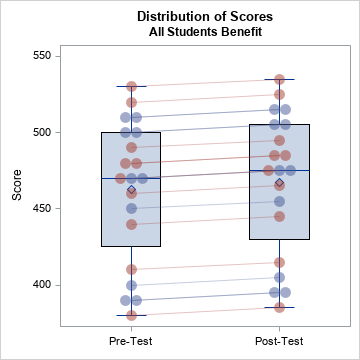
The graph shows how student scores change after the enrichment program. In this case, every student benefits. Light red lines connect the scores of girls; light blue lines connect the scores of boys.
Statisticians know that "an average increase of five points" does not mean that all students increase their scores by five points. However, news articles sometimes forget to use the words "on average," especially in headlines. Consciously or unconsciously, many people think of this scenario when they read that "a program increases tests scores by five points."
Scenario 2: Only some schools benefit
Another mathematical way to obtain an average increase of five points is if half the scores increase by 10 points and the other half do not change. In this example, half the students are from a high-performing school. Perhaps that school has more resources and more college-bound students. Does the enrichment program benefit only those students? If so, the pre/post scores could look like the following:
title2 "Only Some Students Benefit"; data Post; set Pre; Test = "Post-Test"; if School=1 then Score = Score + 10; run; %CombineAndViz; |
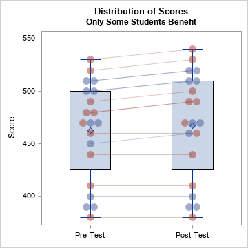
The box plot alone does not do an adequate job of showing the bias in the program. Only by connecting the pre- and post-program scores is it apparent that half the students benefit. And you can see in the graph that the students who benefit are those who already had high test scores before the program.
Scenario 3: Only boys benefit
In a similar way, half the students are boys and half are girls. Does the enrichment program only benefit one gender and not the other? If so, the pre/post scores could look like the following:
title2 "Only Boys Benefit"; data Post; set Pre; Test = "Post-Test"; if Sex='M' then Score = Score + 10; run; %CombineAndViz; |
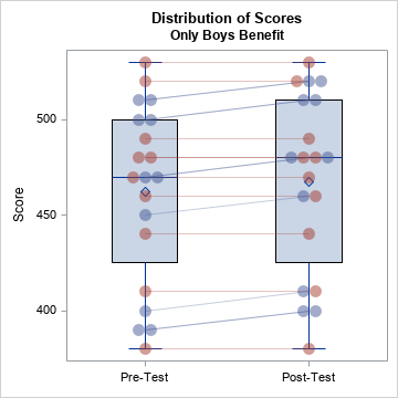
In the graph, the light red lines (girls) are flat whereas the light blue lines (boys) show a positive slope. The post-program scores are, on average, five points higher, but not all students benefit from the program.
Scenario 4: Some students benefit, others fall behind
An even worse scenario is a program that actually hinders student learning for a group of students even as it benefits others. For example, a program that relies on technology might work well in a school that has the infrastructure (laptops, wireless connectivity) to support the program, but might fail in a school that lacks the infrastructure. Such a scenario might look like the following:
title2 "Some Students Benefit, Others Fall Further Behind"; data Post; set Pre; Test = "Post-Test"; if School=1 then Score = Score + 15; else Score = Score - 5; run; %CombineAndViz; |
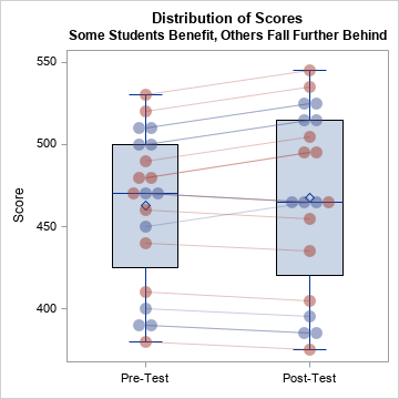
In this scenario, students in the first school benefit from the program whereas students in the second school fall further behind their peers.
Summary
A graph of the distribution of data can illustrate nuances in the data that a table of statistics cannot. This article shows four examples where the mean difference between group scores is five points. However, that statistic does not indicate HOW the groups differ. This article shows how to overlay a strip plot on a box plot in order to visualize the differences between the groups. For another strip plot example, see "Create a strip plot in SAS."

5 Comments
Rick,
This graph remind me the random effect of PROC MIXED .
Yes. In addition, it reminds me of some of the "interaction plots" that you can create by using the EFFECTPLOT statement in PROC PLM.
Can BOX plots handle WEIGHT statements?
Sure. You can use the VBOX or HBOX statement in PROC SGPLOT. A box plot show quantiles, so you can use PROC UNIVARIATE to display the values of the weighted quantiles. For an example, see "Weighted Percentiles."
Pingback: Nine ways to visualize a continuous univariate distribution in SAS - The DO Loop