My colleague, Mike Drutar, recently showed how to create a "strip plot" that shows the distribution of temperatures for each calendar month at a particular location. Mike created the strip plot in SAS Visual Analytics by using a point-and-click interface. This article shows how to create a similar graph by using SAS programming statements and the SGPLOT procedure in Base SAS. Along the way, I'll point out some tips and best practices for creating a strip plot.
Daily temperature data for Albany, NY
The data in this article is 25 years of daily temperatures in Albany, NY, from 1995 to 2019. I have analyzed this data previously when discussing how to model periodic data. The following DATA step downloads the data from the internet and adds a SAS date variable:
/* Read the data directly from the Internet */ filename webfile url "http://academic.udayton.edu/kissock/http/Weather/gsod95-current/NYALBANY.txt" /* some corporate users might need to add proxy='http://...:80' */; data TempData; infile webfile; input month day year Temperature; format Date date9.; Date = MDY(month, day, year); if Temperature=-99 then delete; /* -99 is used for missing values */ run; |
A basic strip plot
In a basic strip plot, a continuous variable is plotted against levels of a categorical variable. If the values of the continuous variable are distinct, this technique theoretically can show all data values. In practice, however, there will be overplotting of markers, especially for large data sets. You can use a jittering and semi-transparent markers to reduce the effect of overplotting. The SCATTER statement in PROC SGPLOT supports the JITTER option and the TRANSPARENCY= option.
Drutar's strip plot displays temperatures for each month of the year. For the Albany temperature data, you might assume that you need to create a new categorical variable that has the values 'Jan', 'Feb', ..., 'Dec'. However, you do not need to create a new variable. You can use the FORMAT statement and the MONNAMEw. format to convert the Date variable into discrete values "on the fly." This technique is described in the article "Use SAS formats to bin numerical variables." If you use the TYPE=DISCRETE option on the XAXIS statement, you obtain a basic strip plot of temperature versus each calendar month.
/* Create a strip plot. Use a format to bin dates into months: https://blogs.sas.com/content/iml/2016/08/08/sas-formats-bin-numerical-variables.html */ proc sgplot data=TempData; format Date MONNAME3.; /* bin Date into 12 months */ scatter x=Date y=Temperature / jitter transparency=0.85 /* handle overplotting */ markerattrs=(symbol=CircleFilled) legendlabel="Daily Temperature"; xaxis type=discrete display=(nolabel); /* create categorical axis */ yaxis grid label="Temperature (F)"; run; |
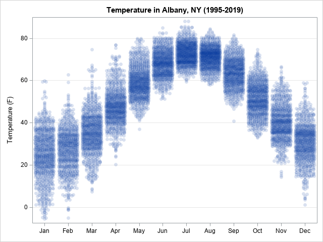
You can see dark areas in the graph. These indicate high-density regions where the daily temperatures are similar. For some applications, it is useful to further emphasize these regions by overlaying statistical estimates that show the average and range of each strip, as shown in the next section.
Of course, if your data already contains a categorical variable, you can create a strip plot directly. You will not need to use the FORMAT trick.
Overlay a visualization of the center and variation
To indicate the center of each month's temperature distribution, Drutar displays the median value for each month. He also overlays a line segment that shows the data range (min to max). In my strip plot, I will overlay the median but will use the interquartile range (Q1 to Q3) to display the variation in the data. You can use PROC MEANS to create a SAS data set that contains the statistics for each month:
/* write statistics for each month to a data set */ proc means data=Tempdata noprint; format Date MONNAME3.; /* bin Date into 12 months */ class Date; /* output the statistics for each month */ var Temperature; output out=MeanOut(where=(_TYPE_=1)) median=Median Q1=Q1 Q3=Q3; run; |
To create a new graph that overlays the statistics, append the statistics and the data. You can then use a high-low plot to show the variation in the data and a second SCATTER statement to overlay the median values, as follows:
data StripPlot; set TempData MeanOut; /* append statistics to data */ run; proc sgplot data=StripPlot; format Date MONNAME3.; /* bin Date into 12 months */ scatter x=Date y=Temperature / jitter transparency=0.85 /* handle overplotting */ markerattrs=(symbol=CircleFilled) legendlabel="Daily Temperature"; highlow x=date low=Q1 high=Q3 / /* use high-low plot to display range of data */ legendlabel="IQR" lineattrs=GraphData3(thickness=5); scatter x=date y=Median / /* plot the median value for each strip */ markerattrs=GraphData2(size=12 symbol=CircleFilled); xaxis type=discrete display=(nolabel); /* create categorical axis */ yaxis grid label="Temperature (F)"; run; |
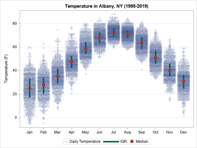
In summary, you can use the SCATTER statement in the SGPLOT procedure to create a basic strip plot. One axis will be the continuous variable, the other will be a discrete (categorical) variable. You can use the JITTER option to reduce overplotting. For data that contain thousands of observations, you might also want to use the TRANSPARENCY= option to display semi-transparent markers. Typically, you will use higher transparency values for larger data. Finally, you can use PROC MEANS to create an output data set that contains summary statistics for each strip. This article computes and displays the median and interquartile range for each strip, but you could also use the mean and standard deviation.

4 Comments
Very cool, as usual.
One thing - what if there is no X variable? That is, you want a strip plot of a single variable?
Well, I figured out one way (maybe there is a better one). I created a dummy X variable that is a constant with some jitter. E.g. suppose we have a variable called pop08millions in a dataset called HAVE. We can then do something like this:
data want;
set have;
x = pop08/pop08+ranuni(1020101);
run;
proc sgplot data = want;
scatter x = x y = pop08millions;
xaxis values = (100000) label = " ";
run;
It's easier: Just define a DATA step view and define x=0.
Pingback: 10 tips for creating effective statistical graphics - The DO Loop
Pingback: Improve the Federal Reserve's dot plot - The DO Loop