A dot plot is a standard statistical graphic that displays a statistic (often a mean) and the uncertainty of the statistic for one or more groups. Statisticians and data scientists use it in the analysis of group data. In late 2023, I started noticing headlines about "dot plots" in the national news media such as Bloomberg's article, "What is the Fed's dot plot and why does it matter?" (A. Bull, Mar 19, 2024), and the New York Times article, "How to Read the Fed's 'Dot Plot' Like a Pro" (J. Smialek, Dec 13, 2023). Can it be that the statistical dot plot has gone mainstream?
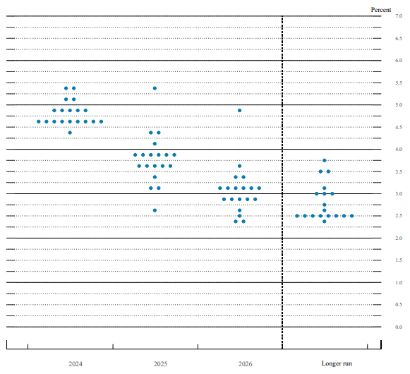
The "Fed" is the Federal Reserve Bank of the United States, which is the central bank responsible for setting monetary policy, including the federal funds rate, which is the interest rate that commercial banks charge each other for overnight lending. That rate affects other interest rates, such as corporate loans, credit cards, and mortgages. The New York Times article states, "When the central bank releases its Summary of Economic Projections each quarter, Fed watchers focus obsessively on one part in particular: the so-called dot plot." An example of the Fed dot plot from the Fed's report on March 20, 2024, is shown to the right.
I usually call this kind of plot a strip plot, but to avoid confusion I will call it a dot plot in this article. This article discusses how to interpret a statistical dot plot and how to create it in SAS. I also suggest an improvement to the Fed's dot plot.
The importance of the Fed's dot plot
Economists and corporations look at the Fed's dot plot to try to predict whether interest rates will be rising or falling. There are 19 members of the Federal Open Market Committee (FOMC). Each member can contribute a dot anonymously, so the dot plot has up to 19 points for each year and for the "longer run." In March 2024, one member did not supply a forecast for the "longer run," so there are only 18 dots for that category.
How do you interpret a dot plot that has a discrete X axis and a continuous Y axis? The first feature to notice is the vertical spread within each category. Within each year, are the forecasts close together or are they spread far apart? A small spread indicates consensus among the FOMC members; a large spread indicates uncertainty and disagreement of opinion. Readers are more confident in the forecasts when they see a small spread. For the March 2024 dot plot, there is general agreement for 2024, but less agreement for 2025 and 2026.
In the Fed's dot plot, the X axis represents time. Consequently, the second feature to notice is the trend of the forecasts. It is easier to visualize the trend if you estimate the median forecast for each time period. For the March 2024 dot plot, the trend indicates a consensus that interest rates will decrease in 2025 and 2026.
Visualize the FOMC data in SAS
The dot plot from the Fed rounds the member's forecasts to the nearest eighth of a percentage point. This means that we don't know the true forecasts. For example, a member who forecasts a rate of 4.1 is represented by a dot a 4.125 (=4 1/8). Surprisingly, most forecasts from March 2024 are rounded to 1/8, 3/8, 5/8, or 7/8 ("eighths") rather than "fourths" such as 1/4, 1/2, and 3/4. To save typing, the following SAS DATA step use the ROUND function to round hypothetical forecasts to the values shown on the dot plot:
data FedRates; length TimePeriod $11; input TimePeriod 1-11 @; do i = 1 to 19; input TargetRate @; TargetRate = round(TargetRate, 1/8); /* round to nearest 1/8 */ output; end; drop i; /* TimePeriod Rate1-Rate19 */ datalines; 2024 4.4 4.6 4.6 4.6 4.6 4.6 4.6 4.6 4.6 4.6 4.9 4.9 4.9 4.9 4.9 5.1 5.1 5.4 5.4 2025 2.6 3.1 3.1 3.3 3.6 3.6 3.6 3.6 3.6 3.9 3.9 3.9 3.9 3.9 3.9 4.1 4.4 4.4 5.4 2026 2.4 2.4 2.5 2.6 2.9 2.9 2.9 2.9 2.9 3.1 3.1 3.1 3.1 3.1 3.1 3.4 3.4 3.6 4.9 Longer Run 2.4 2.5 2.5 2.5 2.5 2.5 2.5 2.5 2.5 2.6 2.75 3.0 3.0 3.0 3.1 3.5 3.5 3.75 . ; |
Let's use PROC SGPLOT in SAS to visualize the data by using default attributes for the markers and axes. You can use the JITTER option on the SCATTER statement to avoid overplotting repeated values. This ensures that all members' forecasts are visible.
title 'Federal Open Market Committee''s "Dot Plot"'; title2 "First View"; proc sgplot data=FedRates noautolegend; scatter x=TimePeriod y=TargetRate / jitter; yaxis values=(0 to 7 by 0.5) grid; run; |
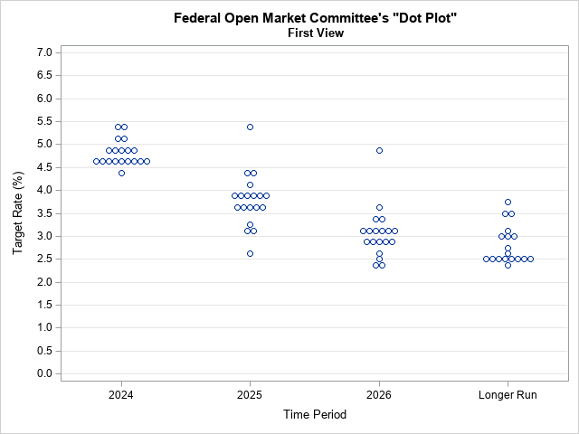
The graph shows the default visualization of the Fed's forecasts. The next sections modify the plot to mimic the Fed's layout and attributes.
Recreate the Fed's dot plot in SAS
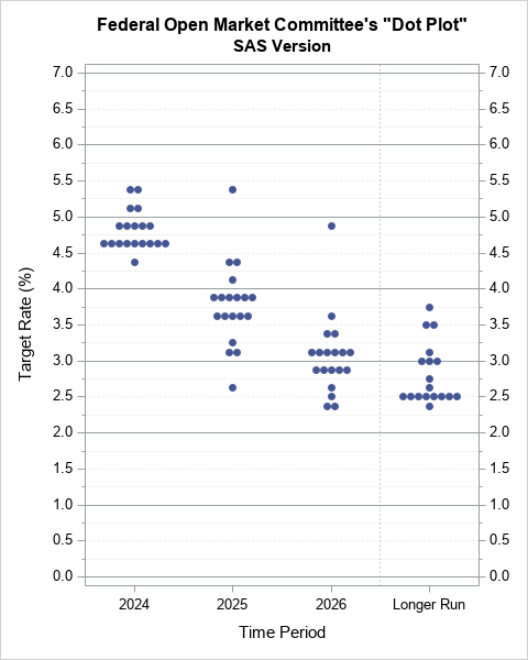
The default scatter plot is sufficient for visualizing the Fed's forecasts, but let's see how closely we can mimic the Fed's version of this graph. Here are a few things that I noticed in the Fed's dot plot:
- The plot is taller than it is wide. You can change the shape of a SAS graph by using the ODS GRAPHICS statement.
- Most horizontal grid lines are dotted. Furthermore, there are minor ticks on the axes that are unlabeled. You can control grid lines by using the YAXIS statement. You can add one minor tick mark between major ticks by using the MINOR MINORCOUNT=1 options.
- The reference lines at integer values are solid. You can use the REFLINE statement to add these horizontal reference lines.
- There is a vertical reference lines that divides the "longer run" forecasts from the near-term forecasts. You can use the REFLINE statement to add this vertical reference line. You need to use the DISCRETEOFFSET option to specify that the line should be offset from its associated tick mark.
- The vertical axis on the left is not labeled. Instead, there is an axis on the right. You can use the Y2AXIS option to mimic the Fed's design, but I prefer to display axes on both the left and the right sides. You can display a second axis by adding a second SCATTER statement and, to prevent overplotting, you can use the SIZE=0 option to make the second plot invisible.
- The Fed's dot plot uses filled markers. You can use the MARKERATTRS= option to set the attributes of markers.
The following SAS statements use PROC SGPLOT to emulate the Fed's design for the dot plot:
ods graphics / width=480px height=600px; title 'Federal Open Market Committee''s "Dot Plot"'; %let axisOpts = values=(0 to 7 by 0.5) minor minorcount=1 grid minorgrid gridattrs=(pattern=dot); proc sgplot data=FedRates noautolegend; refline 0 to 7 / axis=y; /* reflines at integers */ refline 'Longer Run' / axis=x discreteoffset=-0.5 lineattrs=(pattern=dot); /* divider before "longer run" */ scatter x=TimePeriod y=TargetRate / jitter markerattrs=(symbol=circlefilled); /* main plot */ scatter x=TimePeriod y=TargetRate / markerattrs=(size=0) y2axis; /* invisible: adds Y2 axis */ yaxis &axisOpts; /* Y axis options */ y2axis &axisOpts display=(nolabel); /* Y2 axis options */ run; |
Modify the Fed's dot plot
As Jeanna Smialek wrote in her NYT article, economists "fixate most intently on the middle dot.... That middle, or median, ... is the clearest estimate of where the central bank sees policy heading." The median value is not shown explicitly on the dot plot, but it is shown in a table on a separate page. Let's add median information to the dot plot.
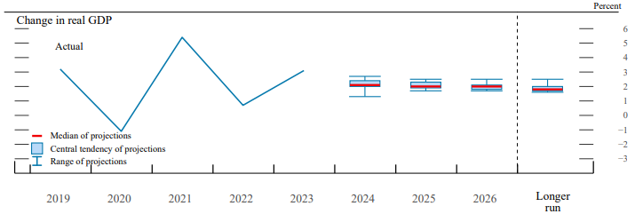
Some of the other graphs in the same report display medians. For example, the following graph is from page 3 of the report for March 20, 2024. It shows the change in real GDP for five previous years and forecasts for the next three years and for the "longer run." Notice that this graph uses box plots to show the distribution of the FOMC forecasts, including the median. This shows that the Fed thinks that its target audience is sophisticated enough to understand and interpret a box plot.
One possible modification is to add a box plot to the Fed's dot plot. If you use the VBOX statement, you can also use the DISPLAYSTAT=(MEDIAN) option to automatically add a table to the plot that displays the median value for each year. Furthermore, you can use the CONNECT=MEDIAN option to overlay a line that connects the median values for each category, as follows:
title 'Federal Open Market Committee''s "Dot Plot"'; title2 'Overlay a Box Plot'; %let axisOpts = values=(0 to 7 by 0.5) minor minorcount=1 grid minorgrid gridattrs=(pattern=dot); proc sgplot data=FedRates noautolegend; refline 0 to 7 / axis=y; refline 'Longer Run' / axis=x discreteoffset=-0.5 lineattrs=(pattern=dot); vbox TargetRate / category=TimePeriod boxwidth=0.8 fillattrs=(transparency=0.5) medianattrs=(thickness=2) displaystats=(Median) nomean nooutliers nocaps connect=median; /* box plot */ scatter x=TimePeriod y=TargetRate / jitter markerattrs=(symbol=circle); /* main plot */ scatter x=TimePeriod y=TargetRate / markerattrs=(size=0) y2axis; /* invisible: add Y2 axis */ yaxis &axisOpts; y2axis &axisOpts display=(nolabel); run; |
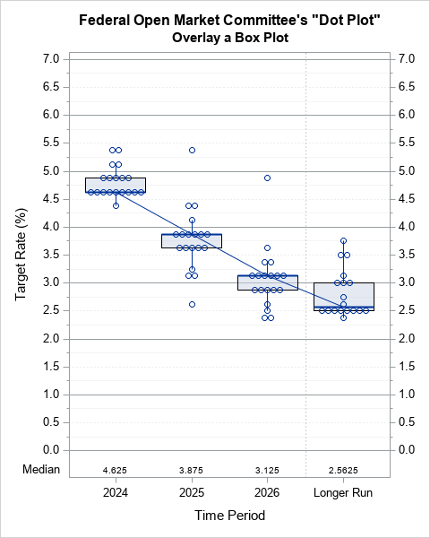
I like the table at the bottom of the plot that displays the median forecast. However, I don't think that the trend line is strictly necessary. In general, I think this plot is a little too "busy" for a public audience. The box plots obscure the individual forecasts. Furthermore, the sample medians often equal the first or third quartiles (because of tied values), which correspond to the lower or upper edges of the boxes.
It might be better to omit the boxes but keep the median indicator. There are a few ways to do that. The simplest is to use PROC MEANS to compute the median for each category, then use a high-low plot to display the median. The following statements write the medians to a SAS data set, merge them into the data set, and then use the HIGHLOW statement to overlay the medians on the dot plot. To make the medians more visible, you can display the markers as open circles instead of filled circles, as follows:
title 'Federal Open Market Committee''s "Dot Plot"'; title2 'Overlay a Median'; %let axisOpts = values=(0 to 7 by 0.5) minor minorcount=1 grid minorgrid gridattrs=(pattern=dot); proc sgplot data=All noautolegend; refline 0 to 7 / axis=y; refline 'Longer Run' / axis=x discreteoffset=-0.5 lineattrs=(pattern=dot); /* https://blogs.sas.com/content/graphicallyspeaking/2017/06/16/scatter-mean-value/ */ highlow x=TimePeriod low=Median high=Median / nofill type=bar barwidth=0.8 lineattrs=GraphData1(thickness=2 color=CxEC1D26); /* display medians */ scatter x=TimePeriod y=TargetRate / jitter markerattrs=(symbol=circle); /* main plot */ scatter x=TimePeriod y=TargetRate / markerattrs=(size=0) y2axis; /* invisible: add Y2 axis */ /* make an invisible boxplot, but add the median as an XAXISTABLE */ vbox TargetRate / category=TimePeriod displaystats=(Median) transparency=1; yaxis &axisOpts label="Target Rate (%)"; y2axis &axisOpts display=(nolabel); run; |
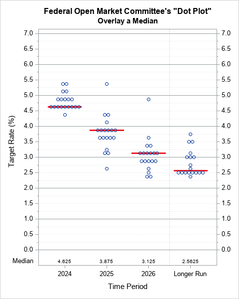
This is my favorite version of the Fed's dot plot. It enables the reader to quickly understand the median values, observe trends, and see the distribution of the FOMC forecasts.
Summary
The US Federal Reserve regularly releases a dot plot that communicates information about the possible future direction of interest rates. I have shown how to interpret the Fed's dot plot and how to create a similar plot by using SAS. I have also suggested a simple but effective modification to the Fed's dot plot: Add a graphical indicator of the median and a tabular display of the median for each time period.

1 Comment
Rick,
Here is my version of Fed's dot plot.