A frequently requested statistical graph is the scatter plot by with discrete categories along with mean value for each category. Searching for a "Scatter with Mean" will return a lot of requests for such a graph in SAS, Stata, R and other statistical software.
Such a graph is very easy to make using 9.4 (TS1M3) (or later) version of SAS. Starting with this version, SGPLOT procedure allows the overlay of basic plot types like Scatter or Series with the VBOX statement. So, you can use the VBOX statement to draw the mean marker, and then overlay the scatter markers. You have to turn off the display of the other features of the box plot. The display of the median, outliers and caps can be disabled by option. However, you have to hide the box and whiskers by setting their color to the wall color. Not very elegant, but it works for most cases. So, here is the Quick solution with code.

title 'Cholesterol by Death Cause with Mean'; proc sgplot data=sashelp.heart noborder noautolegend; vbox cholesterol / category=deathcause nofill nooutliers meanattrs=(size=9 color=red) nomedian nocaps lineattrs=(color=white) whiskerattrs=(color=white); scatter x=deathcause y=cholesterol / jitter jitterwidth=0.8 markerattrs=(symbol=plus size=5) transparency=0.8; xaxis type=discrete labelattrs=(size=9) display=(noline noticks nolabel); yaxis labelattrs=(size=9) display=(noline noticks) grid label='Cholesterol'; run; |
Most examples I have seen display the mean value using a horizontal line segment. Also, hiding the box and whiskers by setting their color to the same color as the wall is not very robust. If background changes or has another plot behind it can be a problem. Add to this the fact that Scatter + VBox overlay is not supported prior to SAS 9.40M3 leads me to look into what we need to do to create this graph with SAS 9.4.
The solution is to use a HighLow plot to draw the line at the mean value. We don't want to use the VBOX statement which computes the mean value along with other statistics. So, we have to first compute the mean values by category and merge that data into the original detailed data set. This can be easily done using the MEANS procedure as shown in the full code in the linked program at the bottom of this article. The combined data set, the graph and the SGPLOT code is shown below. The view of the data shows first 10 observations that include the merged mean data, and some of the detailed observations.

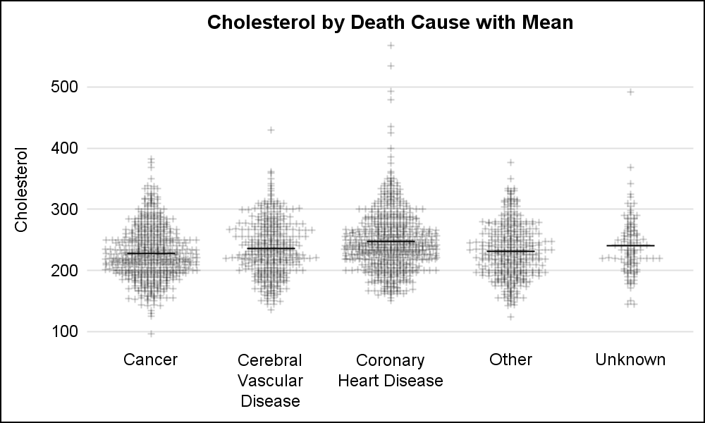
title 'Cholesterol by Death Cause with Mean'; proc sgplot data=combined noborder noautolegend; scatter x=deathcause y=cholesterol / jitter jitterwidth=0.8 markerattrs=(symbol=plus size=5) transparency=0.8; highlow x=cause low=mean high=mean / nofill type=bar barwidth=0.4; xaxis type=discrete labelattrs=(size=9) display=(noline noticks nolabel); yaxis labelattrs=(size=9) display=(noline noticks) grid label='Cholesterol'; run; |
Alternate color bands can be useful especially when the data are far from the x-axis. These can be easily added using the COLORBANDS option. The x-axis tick values can be included in the bands by using an XAXISTABLE to display the values. The x-axis display can be turned off as shown below.
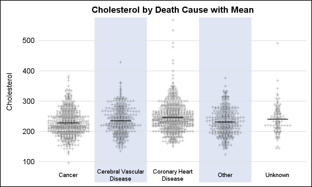
title 'Cholesterol by Death Cause with Statistics';
proc sgplot data=sashelp.heart noborder noautolegend;
  scatter x=deathcause y=cholesterol / jitter
          markerattrs=(symbol=plus size=5) transparency=0.8;
  vbox cholesterol / category=deathcause nofill nooutliers nocap;
  xaxistable deathcause / nolabel location=inside;
  xaxis type=discrete labelattrs=(size=9) display=none
        colorbands=even colorbandsattrs=(transparency=0.2);
  yaxis labelattrs=(size=9) display=(noline noticks) grid label='Cholesterol';
run;
Note: The program above will work with SAS 9.40.
SGPLOT code : Scatter_With_Mean


5 Comments
Pingback: Basic ODS Graphics: Axis Options - Graphically Speaking
What if I only want to add color band for the first column "Cancer" other than using "colorbands=even" for even columns. How to modify your code here?
Thanks,
You can do that by using a REFLINE behind "Cancer" only, and set the thickness of the refline using DISCRETETHICKNESS=1 option with SAS 9.40M5. For earlier versions, you will have to set the thickness in pixels to approximately cover the width of the "Cancer" category.
what if I want to do display the mean values on this plot?
Starting with 9.4m5, we added support for the DISPLAYSTATS option on the VBOX/HBOX statement. That is the easiest way to display the mean values in this example. Prior to that, you would need to calculate the means separately, merge them into your data, and display them using an XAXISTABLE.