Box plots are a great way to compare the distributions of several subpopulations of your data. For example, box plots are often used in clinical studies to visualize the response of patients in various cohorts. This article describes three techniques to visualize responses when the cohorts have a nested or hierarchical structure, such as experimental treatments nested inside of clinics. The techniques are:
- Use PROC SGPLOT (or PROC SGPANEL): Use the VBOX statement to visualize the nested structure. You can use the CATEGORY= option to specify the "outer" variable and the GROUP= option to specify the "inner" (nested) variable.
- Use PROC GLM: For a model that has exactly two categorical variables, one nested in the other, PROC GLM automatically creates a nested box plot.
- Use PROC BOXPLOT: You can use PROC BOXPLOT to create a nested box plot. The procedure supports several options that can enhance the visualization.
An example of nested data: Leaves on plants
Did you know that turnip greens are an excellent source of calcium? The following example is from the PROC NESTED documentation and is based on data analyzed in Snedecor and Cochran (Statistical Methods, 6th ed., 1967, p. 286). The original data is from an experiment in which four random turnip green plants are selected, then three leaves are randomly selected on each plant. From each leaf, two 100-mg samples were selected and used to determine the amount of calcium. (The units for calcium are percentage of dry weight.) Because the box plot for a two-element sample is trivial, I made up four additional fake measurements of calcium for each leaf, as shown in the following DATA step:
/* PROC NESTED example. First two measurements are real data. The last four are fake. */ data Turnip; do Plant=1 to 4; do Leaf=1 to 3; do Sample=1 to 6; input Calcium @@; output; end; end; end; /* |--REAL--| |----- FAKE ------| */ datalines; 3.28 3.09 3.26 3.19 3.27 3.01 3.52 3.48 3.53 3.47 3.50 3.49 2.88 2.80 2.98 2.70 2.28 2.81 2.46 2.44 2.58 2.30 2.61 2.48 1.87 1.92 1.97 1.90 1.86 1.90 2.19 2.19 2.21 2.17 2.23 2.19 2.77 2.66 2.79 2.63 2.72 2.69 3.74 3.44 3.75 3.45 3.73 3.34 2.55 2.55 2.59 2.51 2.49 2.61 3.78 3.87 3.79 3.81 3.88 3.76 4.07 4.12 4.23 4.27 4.01 4.08 3.31 3.31 3.30 3.34 3.33 3.30 ; title 'Calcium Concentration in Turnip Leaves'; title2 'Leaves Nested Within Plants'; footnote J=L 'Based on Snedecor and Cochran (1967, p. 286)'; proc sgplot data=Turnip; vbox Calcium / Group=Leaf category=Plant; xaxis discreteorder=data; run; |
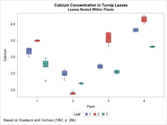
This simple visualization uses the VBOX statement in PROC SGPLOT. As I explained previously, you can use the CATEGORY= and GROUP= options to display the distribution of calcium for the joint levels of the two categorical variables. The CATEGORY= option specifies the horizontal variable; the GROUP= option specifies the levels of a second variable. In this case, the levels of the LEAF variable are nested inside the levels of the PLANT variable. The result is shown. Colors are used to identify the level of the GROUP= variable.
If there were additional levels of nesting (for examples, multiple farms), you could use the SGPANEL procedure and include the additional variables on the PANELBY statement.
Visualize a nested ANOVA model
You can improve the previous graph by visually dividing the leaves in one plant from the leaves in another. You can use PROC GLM to automatically display the divisions when you analyze a model for which the explanatory categorical variables are nested. The following call to PROC GLM specifies a nested mode. The "NestPlot" graph is created automatically when you use ODS GRAPHICS:
ods graphics on; proc glm data=Turnip; class Plant Leaf; model Calcium = Leaf(Plant); /* Leaf nested in Plant */ quit; |
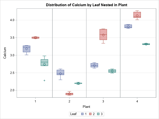
As you can see, the graph is the same except that it contains vertical lines that divide one plant from another. I like this version of the graph better.
Box plots for independent units
If you think about it, the color in the previous plot is not necessary. You might even consider it misleading because the leaf values are unrelated across plants. "Leaf 1" for "Plant 1" has no relationship to "Leaf 1" for the other plants. To emphasize that fact, you could relabel the leaves by using the values 1 through 12, where leaves 1–3 are from Plant=1, leaves 4–6 are from Plant=2, and so forth.
Labeling the leaves that way is necessary if you want to use to BOXPLOT procedure to visualize the data. The BOXPLOT procedure supports nested categories and the syntax is similar to the GLM syntax:
data Turnip2; set Turnip; LeafID = Leaf + (Plant-1)*3; /* label samples 1, 2, 3, ..., 12 */ run; proc boxplot data=Turnip2; plot Calcium*LeafID(Plant) / odstitle=title odstitle2=title2 odsfootnote=footnote; run; |
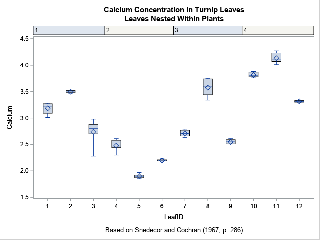
The output from the BOXPLOT procedure uses column headers to indicate the plants. This is similar to the visualization that I used to label categories for tropical storms and hurricanes.
You can use three features of SAS/STAT 15.1 (SAS 9.4M6) to add vertical reference lines, to color the background, and to center the plant labels in the column headers. The options are the BLOCKREF option, the BLOCKREFFILL option, and the BLOCKVALUEPOS= option, respectively.
/* Options for extending the column headers into the plot region. These options require SAS/STAT 15.1 */ proc boxplot data=Turnip2; plot Calcium*LeafID(Plant) / odstitle=title odstitle2=title2 odsfootnote=footnote blockref blockreffill blockvaluepos=center; run; |
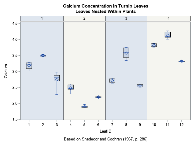
I like this graph because it uses colors sparingly and does not require a legend. Also, if the number of samples is large (such as 30 or 50), PROC BOXPLOT will automatically produce a series of graphs, each displaying a portion of the data.
In summary, this article shows three ways to create box plots of responses for nested categorical data. The simplest is to use the VBOX statement in PROC SGPLOT, although if there are additional categorical variables in the model, you can create a lattice of box plots by using the PANELBY statement in PROC SGPANEL. The GLM procedure enables you to perform an ANOVA analysis for the data and also create a visualization. The BOXPLOT procedure provides nice headers and (in SAS/STAT 15.1) colored strips for each level of the "outer" categories.

4 Comments
Hi Dr. Wicklin,
I am using SAS university edition. I am using 'ODS graphics on;', because I would really like to have that division between the categories (as I have as many as 15 different categories on the bottom each containing 5 boxplots), but it is not working for me. Is there another way to perform this in SAS University?
As far as I know, all these methods will work in SAS UE. Post your code and sample data to the SAS Support Communities (Graphics Community) and specify which boxplot you are trying to create.
Hi Dr. Wicklin,
I done these graph with my data, but how to increase the size of letters and numbers in axes and legend and how to put letters from Anova Tukey test into a graph
Thank you
Girmantė
You can ask questions like this on the SAS Support Communities. Post the code you are using and explain what you want.
You can use the XAXIS and YAXIS statements to adjust the legend. Use the LABELATTS= and VALUEATTRS= options. You can use the INSET statement to add text and statistics to a graph.