Recently Sanjay Matange blogged about how to color the bars of a histogram according to a gradient color ramp. Using the fact that bar charts and histograms look similar, he showed how to use PROC SGPLOT in SAS to plot a bar chart in which each bar is colored according to a gradient color ramp. Essentially, Sanjay used a bar chart to simulate a histogram.
This article discusses a different, but related, issue: overlay a sequence of discrete colored blocks on a histogram. The typical use case is to display categories that are derived from the histogram's variable.
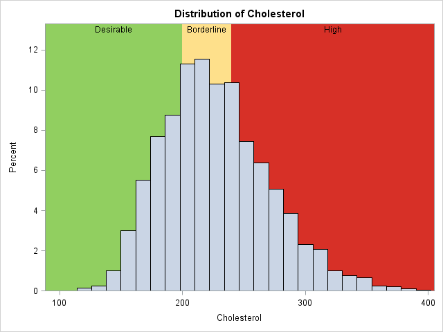
For example, the histogram at the left shows the distribution of cholesterol levels for more than 5,000 patients in the Framingham Heart Study, as recorded in the data set Sashelp.heart. Behind the histogram are three colored regions that indicate three medically significant intervals: desirable levels of cholesterol (less than 200 mg/dL), borderline levels (up to 240 mg/dL), and high levels (240 mg/dL or greater). A sequence of colored blocks (green, yellow, and red) are drawn to visually indicate the cholesterol ranges that are of interest.
This same technique applies to many other examples. For example, you can graph the distribution of student grades and display the intervals for the categories for "A," "B", "C," "D," and "F." Or you can plot the wind speeds of a tropical cyclone and display the Saffir-Simpson categories for wind speed such as "Tropical Depression," "Tropical Storm", "Category 1," and so forth.
Visualizing discrete categories
How can you create a histogram with colored blocks? In SAS, you can use the BLOCK statement in PROC SGPLOT or use the BLOCKPLOT statement in the SAS Graph Template Language (GTL) to create the colored regions. Unfortunately, PROC SGPLOT does not allow you to overlay a histogram and a block plot, so this article uses the GTL.
To create a block plot you need two variables: the continuous variable (Cholesterol) and a discrete variable that associates each cholesterol value with a category. The Sashelp.Heart data contains a discrete variable named Chol_Status which has the value "Desirable" if a patient's cholesterol is less than 200 mg/dL. It has the value "Borderline" if the cholesterol is 200 or more, but less than 240 mg/dL. It has the value "High" if the patient's cholesterol is 240 or more. You can create a block plot by using Cholesterol as the X variable and by using Chol_Status as the "Block" variable. In order to create a block plot in SAS, the data must be sorted in ascending order by the continuous variable (Cholesterol).
Notice that I am not attempting to color the histogram bars. In general, the cut points that determine the categories are not evenly spaced, so it is not always possibly to align the cut points with the endpoints of the histogram bins.
I used this technique in Wicklin (2009) to visualize the distribution of a response variable that is used to color a heat map or choropleth map. In that paper, quantiles of a response variable are used to color a heat map. Each heat map is accompanied by a histogram of a response variable and a colored bar that shows quantiles of the response. I did not originate the idea; it was used very effectively in Pickle et al. (1996) Atlas of United States Mortality.
Overlay the histogram and block plot
The easiest way to overlay a histogram and block plot is to use the LAYOUT OVERLAY statement in the GTL. If you do not specify any colors, then each regions is colored by using the GraphData1, GraphData2,..., colors of the current ODS style. In most cases you will want to specify the colors by using a sequential or diverging palette of colors. For this example, I have hard-coded the colors to be a traffic-light scheme, which many people use to convey the idea that low values of cholesterol are good (green), intermediate values should cause an alert (yellow), and high values are dangerous (red).
The following GTL statements create a template called BlockHist. The template uses dynamic variables so that at run time you can specify the title and the names of the continuous and block variables. The height of the vertical axis is extended by 10% to make room for the labels of the block variable. If you use this template to display k categories, you should replace the DATACOLORS= option with a color palette that has k colors.
/* overlay histogram on block plot */ proc template; define statgraph BlockHist; /* name of template */ dynamic _X _Block _Title; /* dynamic variables */ begingraph / datacolors=(CX91CF60 CXFEE08B CXD73027); /* green, yellow, red for this example */ entrytitle _Title; /* specify title at run time (optional) */ layout overlay / yaxisopts=(offsetmax=0.1); /* add 10% space at top for labels */ blockplot x=_X block=_Block / display=(fill values) /* categories */ valuehalign=center valuevalign=top; histogram _X; /* optional: fillattrs=(color=white transparency=0.25) */ endlayout; endgraph; end; run; /* sort data to use BLOCKPLOT statement */ proc sort data=sashelp.heart out=heartSorted; by Cholesterol; run; proc sgrender data=heartSorted template=BlockHist; where Cholesterol <= 400; dynamic _X='Cholesterol' _Block='Chol_Status' _Title="Distribution of Cholesterol"; run; |
The graph is shown at the top of this article.
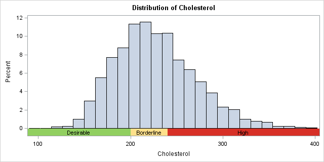
An alternative design: Adding a colored strip
To my eye, the previous graph has too much color. The eye is drawn to the background rather than to the histogram of the data. An alternative design is to display a narrow strip of color underneath the histogram, which is the method used by Pickle et al. The following GTL template uses the INNERMARGIN statement to create a block plot underneath a histogram. Again, you should modify the DATACOLORS= option if your block variable has more than three colors.
/* put narrow strip that shows categories below the histogram */ proc template; define statgraph BlockHistStrip; /* name of template */ dynamic _X _Block _Title; /* dynamic variables */ begingraph / datacolors=(CX91CF60 CXFEE08B CXD73027); /* green, yellow, red for this example */ entrytitle _Title; /* specify title at run time (optional) */ layout overlay; histogram _X / binaxis=false; innermargin / pad=(top=2); /* place BLOCKPLOT in the INNERMARGIN */ blockplot x=_X block=_Block / display=(fill values) valuehalign=center valuevalign=top; endinnermargin; endlayout; endgraph; end; run; ods graphics / width=640px height=320px; proc sgrender data=heartSorted template=BlockHistStrip; where Cholesterol <= 400; dynamic _X='Cholesterol' _Block='Chol_Status' _Title="Distribution of Cholesterol"; run; |
In summary, you can use the BLOCKPLOT statement in the GTL to visualize categories that are derived from a continuous variable. You can create a block plot behind the histogram, or you can display a narrow strip of color below the histogram. In either case, the bars of the block plot indicate intervals of a continuous variable that define discrete medical or scientific categories. You can specify the colors of the block plot by using a sequential or diverging color palette, thereby linking the histogram variable to a heat map or choropleth map that is colored by discrete categories.

2 Comments
Pingback: Highlight forecast regions in graphs - The DO Loop
Pingback: 3 ways to create nested box plots in SAS - The DO Loop