Recently a user posted a query on the SAS Communities page asking on how to create a histogram where the bins of the histogram are colored by the analysis variable using a three color ramp. Essentially, he wanted the bins to be colored from "Low" to "High" along the horizontal axis.
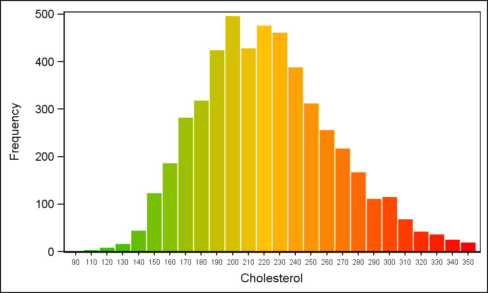 The benefit of coloring the bins of the histogram in this manner was not immediately clear to me, but i assume the user had a good reason. So I gave some thought to how we might create such a graph using the SAS 9.3 SGPLOT procedure. The result user wanted is shown on the right.
Clearly, the SGPLOT Histogram statement does not support gradient coloring at any release, including SAS 9.40M3. So, one way to do this is to use the VBAR statement with the GROUP option, where the group colors are obtained from the Discrete Attributes Map. There may be other ways too, and I would be happy to hear your ideas.
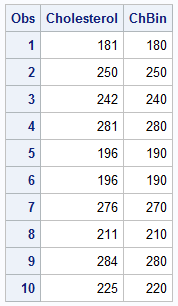 Step 1 is to bin the data, in this case the Cholesterol column in the sashelp.heart data set. I have selected a bin interval of 10 and computed another variable ChBin whose values is between 90 and 360. The min and max value of bin are saved in the macro variables.
/*--Bin the data by cholesterol--*/
data ChBin;
label ChBin='Cholesterol';
retain BinInt 10 maxbin 0 minbin 1e6;
set sashelp.heart(where=(cholesterol > 80 and cholesterol < 360)
keep=Cholesterol Systolic) end=last;
if cholesterol ne . then ChBin=BinInt*floor(cholesterol/BinInt);
minbin=min(minbin, chbin);
maxbin=max(maxbin, chbin);
if last then do;
call symput("MinBin", minbin);
call symput("MaxBin", maxbin);
call symput("BinInt", BinInt);
end;
run;
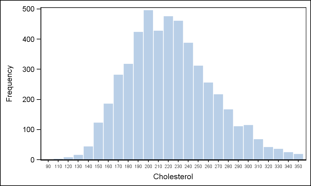 Now, we can plot a histogram of this data by using the VBAR statement as follows. Since this is really a bar chart, the x axis is discrete, and each tick value is displayed. I reduced the font to prevent the rotation of each value. Click on the graph for a higher resolution image.
/*--Histogram using Bar Chart SAS 9.3--*/
proc sgplot data=ChBin noautolegend;
vbar chbin / barwidth=0.9 nooutline;
xaxis valueattrs=(size=6);
run;
Now we will color the bars using GROUP=ChBin option, so each bar will be colored individually. We need to compute a color for each bin value using the "Green" to "Yellow" to "Red" ramp. We will compute these values and load the Discrete Attributes Map programmatically as follows.
/*--Define attributes map data set--*/
data AttrMap;
length FillColor $8 LineColor $8;
id='Hist';
ghigh=192; /*--High value for Green--*/
rhigh=255; /*--High value for Red--*/
mid=(&minbin + &maxbin) / 2;
LineColor='CX000000';
do val=&minbin to &maxbin by &BinInt;
value=put(val, 5.0);
if val < mid then do;
g=ghigh; b=0; r=rhigh*(val-&minbin)/ (mid-&minbin);
end;
else do;
r=rhigh; b=0; g=ghigh*(1-((val-&minbin) - (mid-&minbin))/ (mid-&minbin));
end;
fillcolor='CX' || put(r, hex2.) || put(g, hex2.) || put(b, hex2.);
output;
end;
run;
The color starts at green (CX00C000) and ends at red (CXFF0000). Each "Value" and "FillColor" is saved into the AttrMap data set. Then, we use this with the VBAR with GROUP=ChBin and AttrId=Hist.
/*--Histogram using Bar Chart group colors SAS 9.3--*/
proc sgplot data=ChBin dattrmap=AttrMap noautolegend;
vbar chbin / barwidth=0.9 group=chbin attrid=Hist nooutline;
xaxis valueattrs=(size=6);
run;
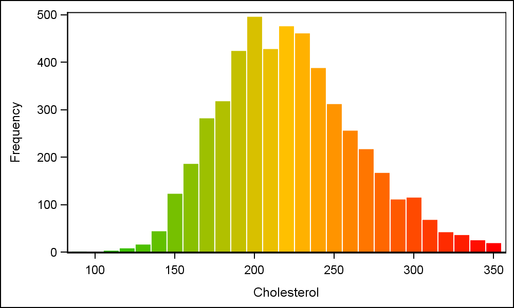 How easy is this with SAS 9.40M3? One still need to do the binning, but after that, we can just use the ColorResponse=ChBin option with Stat=Mean. The ColorModel can be easily set using the same three colors.
Note also the added benefit of setting a "Linear" x-axis with the VBAR. This is now supported with SAS 9.40M3, providing us a nice interval axis without the clutter of a "Bin" axis with all values.
/*--Histogram using Bar Chart response colors SAS 9.40M3--*/
proc sgplot data=ChBin noautolegend;
vbar chbin / barwidth=0.9 colorresponse=chbin colorstat=mean
colormodel=(cx00C000 cxFFC000 cxff0000) nooutline;
xaxis type=linear;
run;
Full program: Resp_Color_Histogram


11 Comments
I guess a reason for such coloring can be desirability: the less a number the better (green) and risk (the higher a number the higher risk).
I can see that, but that is already represented in the left to right position of the bar. Left is lower, right is higher in the Western Locales. So this is an overloading of the same measure in two ways, sometimes avoided.
But lower does not say it is better - green color does. By the same token, higher does not say it is risky - red color does.
OK. One must be careful when interpreting colors without a legend. In some cultures, red represents good fortune and joy (China).
Agree. Legend would be helpful.
When I saw the title, I thought you might be getting a gradient color on each bar, with the base starting at a particular color and extending to the ending color - sort of like the KPI charts.
SG and GTL do support a "visual" alpha gradient for bars and bins, where the color goes from opaque at the top to more transparent at the bottom. We have talked of extending this so color can be varied with alpha too, but did not see a pressing need.
Nice techniques. To make it look more like a histogram, use the BARWIDTH=1 option to eliminate the gaps between bars. Personally, I'd also leave in the bar outlines.
VA actually double encodes the bin position with a color ramp (from light to dark of a single hue though instead of green to red) for the histogram in regression decision trees. The reason is that when you zoom out far enough there is no room for the full histogram in the nodes and so they nodes are colored to match the bin that contained the average for that node. Gives you a high level view of how the tree is dividing low/high/mid values when you zoom all the way out.
Pingback: Overlay categories on a histogram - The DO Loop
Hi,
I have a couple of queries on the above code:Hope you can help me .
1. What are these and how to assighn these numbers?
ghigh=192; /*--High value for Green--*/
rhigh=255; /*--High value for Red--*/
2. I would need a display with yellow shades to red shades. How to get rid of the green and start with sahdes of yellows?
3. I used the code as below for my stacked barcharts. I get same colour for couple of the stacks. how do I manage to get the individual sahded os yellow and red?
My code below:
data AttrMap;
set avlx;
length FillColor $8 LineColor $8;
id='MyId';
ghigh=192; /*--High value for Green--*/
rhigh=255; /*--High value for Red--*/
%if &trtcd eq 1 %then %do;
minbin=0;maxbin=48;
mid=12;
LineColor='CX000000';
do val=minbin to maxbin by 2;
value=avalx;
if val < mid then do;
g=ghigh; b=0; r=rhigh*(val-minbin)/ (mid-minbin);
end;
else do;
r=rhigh; b=0; g=ghigh*(1-((val-minbin) - (mid-minbin))/ (mid-minbin));
end;
fillcolor='CX' || put(r, hex2.) || put(g, hex2.) || put(b, hex2.);
output;
end;
%end;
%if &trtcd eq 2 %then %do;
minbin=0;maxbin=42000;
mid=10000;
LineColor='CX000000';
do val=minbin to maxbin by 1000;
value=avalx;
if val < mid then do;
g=ghigh; b=0; r=rhigh*(val-minbin)/ (mid-minbin);
end;
else do;
r=rhigh; b=0; g=ghigh*(1-((val-minbin) - (mid-minbin))/ (mid-minbin));
end;
fillcolor='CX' || put(r, hex2.) || put(g, hex2.) || put(b, hex2.);
output;
end;
%end;
run;
proc template;
define statgraph bar100;
begingraph ;
layout overlay/ xaxisopts=(display=standard label=" "
discreteopts=(tickdisplaylist=(&xticks) tickvaluefitpolicy=split tickvaluesplitchar="~") )
yaxisopts=(display=standard label='Percentage of Patients' linearopts=(viewmin=0 viewmax=100 tickvaluesequence=(start=0 end=100 increment=10) viewmin=0 viewmax=100 tickvalueformat =pct.));
BARCHARTPARM X = avisn y=percent / group=avalx name="lgnd1" ;
discretelegend "lgnd1" /halign=right across=1 sortorder=DESCENDINGFORMATTED ;
endlayout;
endgraph;
end;
run;
proc sgrender data=all template=bar100 dattrmap=attrmap;
dattrvar avalx="MyId";
run;