On Friday before the conference, I presented a 1 day "developer led" seminar on SG Procedures and GTL, along with a discussion of new features for SAS 9.3. The experience was very gratifying as all users were now using SAS 9.2, and some were using SAS 9.3. We had a lively session, with very high level participation by the attendees discussing SAS 9.2 and SAS 9.3 features.
At 2pm today (Monday), I presented some key noteworthy new SAS 9.3 features in SG Procedures at the "Tales of SAS 9.3: A Collection of Users" led by David Shamlin. I was honored to be in the company of some well known SAS names such as Rick Langston, Scott Huntley, Howard Plemmons, Jason Secosky and Margaret Crevar. I discussed new plot options, new plot statements, Annotate and Attribute Maps.
Let us start with new options:
Box Plots with Groups:
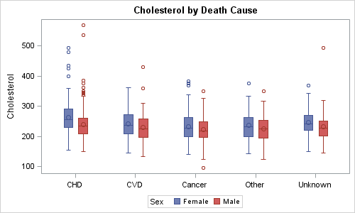
SAS 9.3 Code:
title 'Cholesterol by Death Cause'; proc sgplot data=heart; vbox cholesterol / category=deathcause group=sex clusterwidth=0.5; xaxis display=(nolabel); run; run; |
Box plot on Interval Axis:
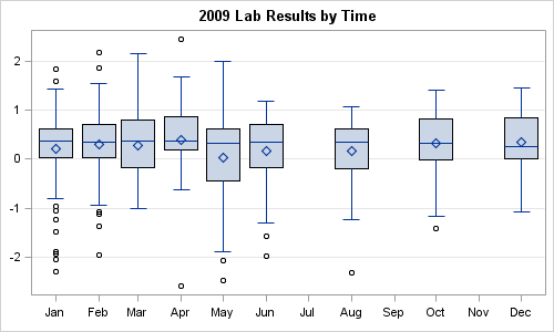
SAS 9.3 Code:
title '2009 Lab Results by Time'; proc sgplot data=intervalBoxGroup; format date monname3.; vbox response / category=date; xaxis type=time display=(nolabel) values=('01jan09'd to '01dec09'd by month); yaxis grid display=(nolabel); run; |
Box Plot on Interval Axis with Cluster Groups:

SAS 9.3 code:
title '2009 Lab Results by Time and Treatment'; proc sgplot data=intervalBoxGroup; format date monname3.; vbox response / category=date group=drug groupdisplay=cluster; xaxis type=linear display=(nolabel) values=('01jan09'd to '01dec09'd by month); yaxis grid display=(nolabel); run; |
Scatter and Series Plot with Cluster Groups:
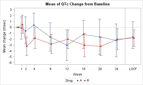
SAS 9.3 code:
title 'Mean of QTc Change from Baseline'; proc sgplot data=QTc_Mean_Group; format week qtcmean.; scatter x=week y=mean / yerrorupper=high yerrorlower=low group=drug groupdisplay=cluster clusterwidth=0.5 markerattrs=(size=7 symbol=circlefilled); series x=week y=mean / group=drug groupdisplay=cluster clusterwidth=0.5; refline 26 / axis=x; refline 0 / axis=y lineattrs=(pattern=shortdash); xaxis type=linear values=(1 2 4 8 12 16 20 24 28) max=29 valueshint; yaxis label='Mean change (msec)' values=(-6 to 3 by 1); run; |
Full SAS 9.3 Code: NewPlotFeatures


4 Comments
Pingback: Report from SESUG 2012 - Graphically Speaking
Question on Box Plot on Interval Axis with Cluster Groups:
Hi Sanjay,
I have a question regarding the options on the vbox statement in sgplot(SAS 9.3).
I am producing a box plot with cluster groups (2 groups - T1 & T2) for 9 categories, The nine categories have scores for around 40 subjects. I want to compare the T1 Vs T2 score distributions. The thing I would like to do is, highlight a datapoint that indicates where each subject lies within the boxplot. Something similar to what we get when we use datalable option, but datalabel option only shows the outliers.
Is there a way I can select and highlight only a specific datapoint for one particular subject on a boxplot?
Please let me know if you know any solution to this issue.
Thanks,
Parag Kunte.
The way to do this would be to overlay a SCATTERPLOT for the subjects of interest on top of the BOXPLOT. Unfortunately, you cannot overlay a SCATTER statement on a VBOX using SGPLOT procedure. However, you can do this using the underlying GTL. So, user a LAYOUT BOXPLOT statement in a LAYOUT OVERLAY, and place a SCATTERPLOT on top. Only include Y values for the scatter plot for the observations you want to highlight. You could even label them for identification. If there are many, they may overlap. This may make for a good topic to write about in Graphuically Speaking blog.
Hi Sanjay,
I have a question with histogram in SAS. I want to make a graph in which x axis has to be splitted to gender male and female against a variable in Y axis. I have an another question about how to introduce geometric mean in to the histogram for male and female in the X-axis in the same histogram. The y-axis variable should be constant all the time. Could you please explain me with SAS code? Thankíng you, Shakthi