Plot rates, not counts. This maxim is often stated by data visualization experts, but often ignored by practitioners. You might also hear the related phrases "plot proportions" or "plot percentages," which mean the same thing but expresses the idea alliteratively.
An example in a previous article about avoiding alphabetical ordering for categorical variables reminded me of the "plots rates, not counts" tip. When the categories differ greatly in size, it is better to visualize proportions instead of raw counts. When you report a statistic that is standardized to a population, the statistic is often called a "per capita" statistic. Other standardized statistics are stated in terms of events per million or per 100,000 residents.
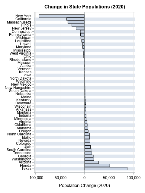
Let's look at an example from the previous article to see why proportions (or rates) can be more illuminating than raw numbers. The graph to the right shows the net change in population for 50 US states in 2020, sorted by the net change. Regardless of any underlying trends, you will often see the most populous states at the top and bottom of lists like this, just because of the size of their population. Notice that the most populous states (NY, FL, TX, and CA) dominate the graph and determine the scale. This will often be the case for other measures, such as the most deaths, the most births, the highest GDP, and so forth.
To understand the underlying trends, it is better to divide the number of counts by the population of the state. This results in a proportion (or percentage). Let's see how the graph looks if we plot the change in each state's population as a proportion rather than as a raw count. The following DATA step view computes the change as a proportion of the 2020 population in each state. The following statements use the data from a previous article. You can download the data and this SAS program from GitHub.
/* Tip: plot a rate or proportion rather than raw counts Use a VIEW to compute the proportion of the population that changed. See https://blogs.sas.com/content/iml/2016/05/09/data-step-view.html */ data StateRate / view=StateRate; set StatePop; ChangeProportion = PopChange2020 / Pop2020; /* format a proportion as a percentage by using the PERCENTw.d or PERCENTNw.d format. See https://blogs.sas.com/content/iml/2015/08/10/percent-formats.html */ format ChangeProportion PERCENTN7.; run; title "Relative Change in State Population (2020)"; proc sgplot data=StateRate; hbar StateName / response=ChangeProportion categoryorder=respasc; yaxis display=(nolabel) colorbands=even /* faint alternating bands */ valueattrs=(size=8) /* small font for values */ fitpolicy=none; /* do not thin labels */ xaxis grid label="Relative Change in State Population"; run; |
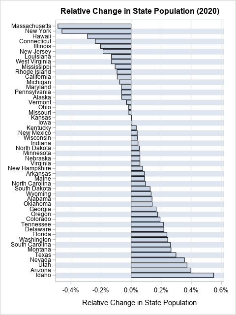
This graph shows the relative proportion (or percentage) of population change for each state. The most populous states no longer dominate both ends of the graph. Instead, you can see that states such as Hawaii and Louisiana experienced relatively large outflux, and Idaho and Montana experienced a relatively a large influx. These facts were not apparent from the original graph.
The original graph indicates that a huge number of people moved into Texas in 2020. However, on a relative basis, the influx is only 0.3% of the population of Texas. A similar analysis holds for the outflux from New York. Furthermore, the original graph is useless for about 15 states whose absolute population change is low. By showing proportions, you can visualize the relative population change in low-population states such as Alaska and Montana.
Summary
"Plot proportions, not counts," is a good design principle for data visualization. This article illustrates the principle by visualizing the net change in populations of US states in 2020. On an absolute basis, the largest states dominate both ends of the chart of population change. However, plotting the relative change of population is often a more reasonable way to understand changing demographics.
This article used the population of US states as an example, but the same ideas apply to countries, companies, school districts, and other entities that can vary in size. The ideas also apply to other quantities, such as relative mortality, rates of diseases, rates of students who pass standardized tests, unemployment rates, and so forth.

3 Comments
Pingback: 10 tips for creating effective statistical graphics - The DO Loop
Hi Rick,
Thank you very much for an excellent post. I found it is helpful for me.
I have created a similar your plot. One issue I would like to learn is how to fill different colors in different bars.
Indeed, I use a function 'Colorresponse" in SAS to fill. It works, but I cannot be able to change a color.
Therefore, I do appreciate if could you please give me some advice.
Thank you very much
The VBAR and HBAR statements both support the COLORRESPONS= option. See https://blogs.sas.com/content/graphicallyspeaking/2017/09/10/bar-charts-color-response/
There is an interaction if you are using a GROUP= variable. For a GROUP= option, so you might need to use the STAT= and COLORSTAT= options. For example:
If this doesn't answer your question, you can post your questions and sample program to the SAS Support Communities.