Howard Wainer, who used to write the "Visual Revelations" column in Chance magazine, often reminded his readers that "we are almost never interested in seeing Alabama first" (2005, Graphic Discovery, p. 72). His comment is a reminder that when we plot data for a large number of categories (states, countries, hospitals, school districts,...), it usually better to order the categories according to some statistic of interest. Often the statistic is a count, a mean, or a rate. A graph that orders the categories by the statistic is usually more informative than a graph that relies on the default alphabetical ordering.
A common way to visualize a quantity for each category is to use a bar chart such as the graph to the right. By default, SAS displays the categories in alphabetical order (Alabama first!), which results in a hodgepodge arrangement of the bar heights. Fortunately, SAS provides an easy way to sort the categories of a bar chart in ascending or descending order: use the CATEGORYORDER= option. This article uses a bar chart to demonstrate the technique, but the CATEGORYORDER= option is supported by the following statements: DOT, HBAR, HLINE, VBAR, and VLINE.
For more sophisticated orderings, you can use the VALUES= option on the XAXIS or YAXIS statement to specify the order of the categories. You can also sort the observations in the data set by using any criterion, then use the DISCRETEORDER=DATA option on the XAXIS or YAXIS statement to display the categories in the data-set order. This option enables you to set the order for box plots, scatter plots, and other graphs.
In this article, I assume that the categories are nominal, which means that they do not have an intrinsic order. If your categories are ordinal, then you should use the natural ordering of the categories. For example, if the categories are "Strongly Disagree", "Disagree", "Neutral", "Agree", and "Strongly Agree", then use the VALUES= option on an axis statement to force that ordering.
Is alphabetical order bad?
Is alphabetical order really such a bad thing? No, it's not that alphabetical ordering is bad, it's just that a different ordering is often better. You should choose an ordering that enables the reader to view important features in the data. If you have two or three categories, it probably doesn't matter how you order the categories. A bar chart of males and females will be easy to view no matter which group is displayed first. Similarly, a graph of mortality rates for patients in three hospitals is easy to understand regardless of the categorical ordering.
However, with four or more categories, you should consider ordering the categories by using the heights of the bars or some other statistic. The next section compares a graph in alphabetical order to a similar graph that sorts the bars by height.
Example: Population of US states
Wainer railed against always plotting Alabama first, so let's consider a bar chart that shows the 2020 population of the 50 US states. If you do not specify an order, PROC SGPLOT will order the categories alphabetically, regardless of the order in the data set. You can download the data (and the SAS program) from GitHub.
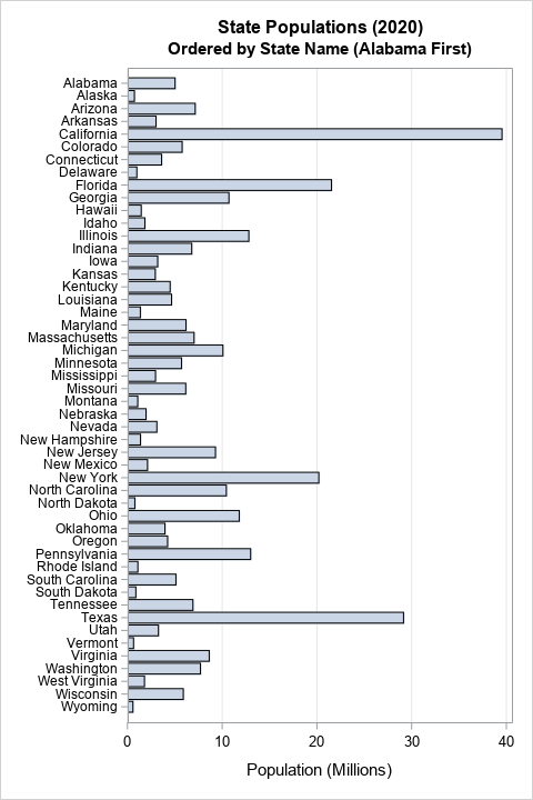
title "State Populations (2020)"; title2 "Ordered by State Name (Alabama First)"; proc sgplot data=StatePop; hbar StateName / response=PopM; yaxis display=(nolabel) valueattrs=(size=8) /* small font for values */ fitpolicy=none; /* do not thin labels */ xaxis grid; run; |
The graph is shown at the top of this article. It has one redeeming characteristic: If you know the name of a state, you can easily find it in the chart and determine its approximate population. However, this graph is less useful for answering questions such as:
- What are the five most populous states?
- What are the five least populous states?
- How does the population of Arizona compare to the population of Wisconsin?
For those and other comparison-related questions, it is better to sort the categories by the length of the bars. You can change the order of the bars by using the CATEGORYORDER=RESPDESC (response descending) or CATEGORYORDER=RESPASC (response ascending) option, as follows:
title2 "Ordered by Population"; proc sgplot data=StatePop; hbar StateName / response=PopM categoryorder=respdesc; /* or respasc */ yaxis display=(nolabel) valueattrs=(size=8) /* small font for values */ fitpolicy=none; /* do not thin labels */ xaxis grid; run; |
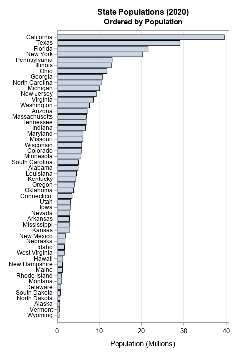
With this new graph, you can easily determine the most populous and least populous states. By scanning the vertical axis, you can discover which states have larger/smaller populations than other states.
Displaying positive and negative quantities
Often, a bar chart is used to display positive quantities like population. However, sometimes we need to display a change from a baseline value. In that case, the baseline is in the middle of the chart. Bars that represent negative changes are below or to the left of the baseline; bars that represent positive changes are above or to the right of the baseline. The category labels can be far from the bars. It is therefore useful to use a series of alternating color bands to help the reader associate the categories with the deviation from the baseline. In SAS, you can use the COLORBANDS= option on the XAXIS or YAXIS statements to display alternating bands. For example, the next graph shows the change in each state's 2020 population as compared with the previous year. Again, the CATEGORYORDER= option is used to sort the states in terms of the population change. This time, the bars are sorted in ascending order:
title "Change in State Populations (2020)"; proc sgplot data=StatePop; hbar StateName / response=PopChange2020 categoryorder=respasc; /* or respdesc */ yaxis display=(nolabel) colorbands=even /* faint alternating bands */ valueattrs=(size=8) /* small font for values */ fitpolicy=none; /* do not thin labels */ xaxis grid; run; |
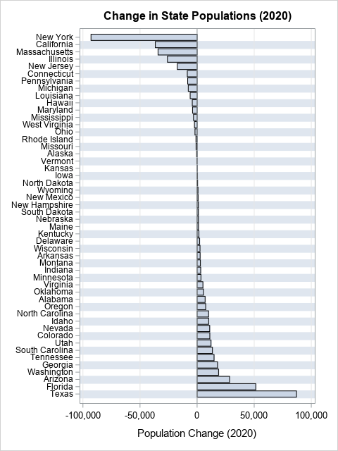
This is an informative graph and is easy to read. You can easily find the states that lost or gain the most people in the preceding year. Furthermore, the alternating color bands enable the viewer to find the bar that corresponds to each state.
Display in data order
Often, the CATEGORYORDER= option is all you need to create an informative bar chart. But there is a second way to order categories, and that is to use the DISCRETEORDER=DATA option on the XAXIS or YAXIS statement. This gives you absolute control over the order of the categories/bars.
For example, suppose you want to combine the two previous graphs. You want to sort the bars by the size of the state's population, but you want to display the change in population in 2020. The following SAS statements create the graph:
/* Sort by any variable */ proc sort data=StatePop out=State2; by PopM; run; /* display bars in that order by using DISCRETEORDER=DATA */ title2 "States Ordered by Population Size"; proc sgplot data=State2; hbar StateName / response=PopChange2020; yaxis display=(nolabel) discreteorder=data /* display in data order */ colorbands=even /* faint alternating bands */ valueattrs=(size=8) /* small font for values */ fitpolicy=none; /* do not thin labels */ xaxis grid; run; |
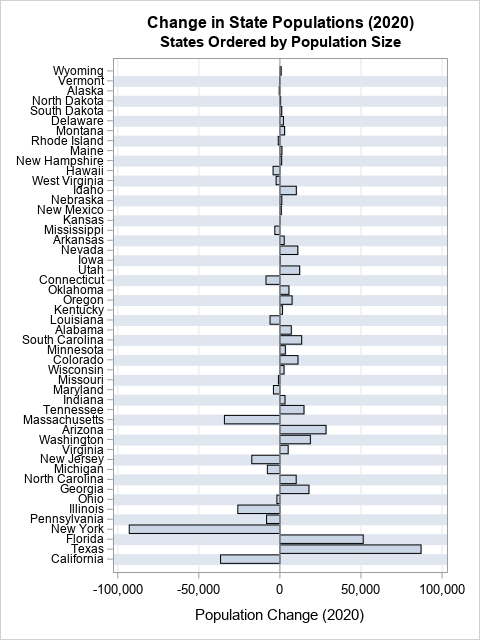
This graph shows that less populous states tend to have small changes and populous states tend to have larger changes. You can see some small states (such as Idaho) that had population changes that stand out. Similarly, some large states (such as Ohio) were relatively stable in population.
Summary
Although software packages usually order the categories for a bar chart alphabetically ("Alabama first") that is not always the most insightful ordering. In PROC SGPLOT in SAS, you can use the CATEGORYORDER=RESPASC option on the VBAR or HBAR statement to sort the categories according to the heights of the bars. The same option is supported by the DOT, HLINE, and VLINE statements. For more sophisticated orderings, you can also sort the observations in the data set, then use the DISCRETEORDER=DATA option on the XAXIS or YAXIS statement to display the categories in the data-set order. You can also use this option to set the order for box plots, scatter plots, and other graphs.

3 Comments
Pingback: Data visualization tip: Plot rates, not counts - The DO Loop
Pingback: 10 tips for creating effective statistical graphics - The DO Loop
Pingback: Using colors to visualize groups in a bar chart in SAS - The DO Loop