
I sometimes see analysts overuse colors in statistical graphics. My rule of thumb is that you do not need to use color to represent a variable that is already represented in a graph. For example, it is redundant to use a continuous color ramp to represent the lengths of bars in a bar chart. The lengths already indicate the value, so the colors do not add additional information.
However, I sometimes bend the rule when the color represents cutoff values (or binning values) that divide the bar lengths into groups. A canonical example comes from elementary school where teachers assign a letter grade (A, B, C, D, or F) to a student's test score based on some cutoff values. The example in this article uses a 10-point scale to assign letter grades. That is, 90% or above is an "A", 80%-89.9% is a "B", and so forth. Grades below 60% receive a failing grade, "F".
The bar chart to the right shows test scores for 14 students. The bars are colored according to the corresponding letter grades. This article shows how to create a bar chart like this in SAS by using PROC SGPLOT. Along the way, we'll discuss the following data visualization topics:
- How to create and use a user-defined format that bins a continuous variable into discrete ordinal groups.
- How to create and DATA view to avoid creating a new data set that contains the formatted values.
- How to create a color ramp that contains perceptually balanced colors.
- How to create a discrete attribute map that assigns colors to group levels.
A bar chart for student test scores
You can use the HBAR or VBAR statement in PROC SGPLOT to create a bar chart that shows the scores a set of students. The following program defines some example test scores and displays a bar chart. I'll point out a few data visualization techniques in this example:
- I represent the scores as decimal values (0 ≤ score ≤ 1) so that I can use the PERCENTw.d format to display the scores as percentages.
- I prefer to use horizontal bar charts for this task.
- I use the CATEGORYORDER= option on the HBAR statement to sort the bars in the bar chart.
- For now, I use the REFLINE statement to overlay the cut points for the letter grades. In the next section, I remove the reference lines and color the bars instead.
data Tests; format Name $15. score percent6.4; input Name score; datalines; Abbott 0.75 Beth 0.59 Carol 0.90 Derek 0.61 Ed 0.93 Felix 0.70 Garry 0.71 Harry 0.80 Izzy 0.33 Jacob 0.20 Ken 0.60 Lenora 0.69 Mike 0.99 Nancy 0.86 ; title "Bar Chart of Test Grades"; title2 "No Bar Colors"; proc sgplot data=Tests; hbar Name / response=score categoryorder=respdesc; /* or respasc */ refline 0.6 0.7 0.8 0.9 / axis=x; xaxis max=1; /* make sure 100% is max value */ run; |
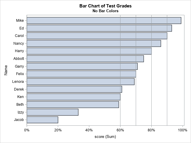
Because the chart is sorted by bar length, you can easily discern which students performed well on the test and which students are struggling. However, some people might prefer to assign colors to the bars to represent the letter grades.
Color bars by a group variable
You can define a custom format that associates a letter to each test score. You can then use the GROUP= option on the HBAR statement to color the bars that share the same letter grade. The following call to PROC FORMAT defines the range for each letter grade by using a 10-point scale. You can create a DATA step view to create a new variable to use for the grouping variable, as follows:
/* use format to bin scores into letter grades https://blogs.sas.com/content/iml/2019/07/15/create-discrete-heat-map-sgplot.html */ proc format; value GradeFmt 0 -< .60 = "F" /* [ 0%, 60%) */ .60 -< .70 = "D" /* [60%, 70%) */ .70 -< .80 = "C" /* [70%, 80%) */ .80 -< .90 = "B" /* [80%, 90%) */ .90 - 1.00 = "A"; /* [90%, 100%] */ run; /* define a DATA step VIEW that creates 'Grade' as a formatted version of the score */ data Tests2 / view=Tests2; set Tests; Grade = score; /* <== new variable */ format Grade GradeFmt.; run; title "Bar Chart of Test Grades"; title2 "Bar Colors"; proc sgplot data=Tests2; hbar Name / response=score categoryorder=respdesc group=Grade; xaxis label="Score" grid max=1 values=(.1 to .9 by .1) valueshint; /* make sure 100% is max value */ run; |
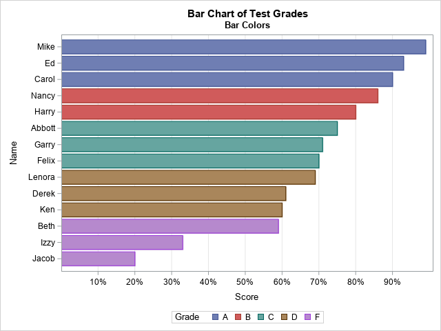
The Grade variable is computed in the DATA step view by applying the GRADEFMT. format to a copy of the Score variable. I make a copy because I want to use the raw score variable for the length of the bars.
At this point, the task is complete. Each bar has a length that indicates the student's test score. Each bar has a color that indicates the letter grade. However, notice that the colors are assigned automatically by cycling through the colors in the current ODS style. The colors do not convey any meaning. If you want to specify a meaningful color for each letter grade, then read on.
Colors are not created equal
Sometimes programmers use a "traffic light" color scheme to encode ordinal categories such as letter grades. In a traffic light encoding, low values are assigned a red color, moderate values are assigned orange or yellow, and high values are assigned green.
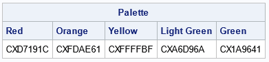
SAS enables you to specify colors by using several methods. For example, you can specify colors by using pre-defined color names such as Red, Orange, Yellow, Light Green, and Green. However, recall that the human eye perceives colors in complex ways. Some colors appear brighter—and therefore more important—than other colors. To reduce the bias caused by color-perception, I recommend using colors from palettes that have been carefully designed so that no one color dominates the others. One way to do is to use a palette from the ColorBrewer system of palettes. You can use the PALETTE function in SAS IML to generate color palettes from the ColorBrewer system. For example, the following statements create a five-color palette from the "RdYlGn" family:
/* Use a ColorBrewer 5-color diverging palette */ proc iml; Palette = palette("RdYlGn", 5); print Palette[c={'Red' 'Orange' 'Yellow' 'Light Green' 'Green'}]; QUIT; |
Create a discrete attribute map to assign colors to groups
I have previously written about how to create a discrete attribute map that assigns colors to group. In this case, I want to use cutpoints and a SAS format to bin a continuous variable into letter grades. I like to specify the cutpoints and then apply the SAS format to obtain the formatted values. The following DATA step specifies the cutpoints for the left-hand side of the intervals that determine letter grades from test scores. The colors are specified by using the hexadecimal ColorBrewer values from the previous section, but you could specify color names (for example, "Red") if you prefer. The result is a data set that defines a mapping from formatted values ("A", "B", .., "F") to colors.
To use the attribute map, specify the DATTRMAP option on the PROC SGPLOT statement. On the HBAR statement, specify the name of the ID variable that associates values and fill colors. The result is a bar chart in which the colors are red, orange, yellow, and greens.
/* Create a discrete data map that assigns a color to a grade range */ /* https://blogs.sas.com/content/iml/2012/10/17/specify-the-colors-of-groups-in-sas-statistical-graphics.html */ data GradeAttrs; /* create discrete attribute map */ length Value $11 FillColor $15; retain ID 'GradeColors' /* name of map */ Show 'AttrMap'; /* always show all groups in legend */ array cutpts{5} _temporary_(0.0 0.6 0.7 0.8 0.9); /* ('Red' 'Orange' 'Yellow' 'Light Green' 'Green') */ array colors{5} $15 _temporary_("CXD7191C" "CXFDAE61" "CXFFFFBF" "CXA6D96A" "CX1A9641"); do i = 1 to dim(cutpts); Value = put(cutpts[i], GradeFmt.); /* use format to assign values */ FillColor = colors[i]; /* color for this interval */ output; end; drop i; run; title "Bar Chart of Test Grades"; title2 "Discrete Attribute Map"; proc sgplot data=Tests2 dattrmap=GradeAttrs; hbar Name / response=score categoryorder=respdesc group=Grade attrid=GradeColors; xaxis label="Score" grid max=1 values=(.1 to .9 by .1) valueshint; /* make sure 100% is max value */ run; |
The graph is shown at the top of this article. The bars are colored red, orange, yellow, and green, according to the result of applying the GRADEFMT. format to the test score.
Summary
Is this example useful if you are not a teacher? Yes, the ideas apply to any bar chart in which you want to use a variable for the length and then use a formatted value to specify bar colors. In this example, the length of the bar and the color were related, but that does not have to be the case in general.
And this example gave us an opportunity to review several important data visualization tricks in SAS, many of which are not restricted to bar charts:
- How to create and use a user-defined format to bin a continuous variable.
- How to create and DATA view to avoid creating a new data set.
- How to use a ColorBrewer system to create a color ramp that is perceptually balanced.
- How to create a discrete attribute map that assigns colors to groups.
