Missing values present challenges for the statistical analyst and data scientist. Many modeling techniques (such as regression) exclude observations that contain missing values, which can reduce the sample size and reduce the power of a statistical analysis. Before you try to deal with missing values in an analysis (for example, by using multiple imputation), you need to understand which variables contain the missing values and to examine the patterns of missing values. I have previously written about how to use SAS to do the following:
- Count the number of missing values for each variable
- Summarize patterns of missing data by using the "Missing Data Patterns" table from PROC MI.
- Visualize patterns of missing data by using graphics such as bar charts, histograms, and heat maps.
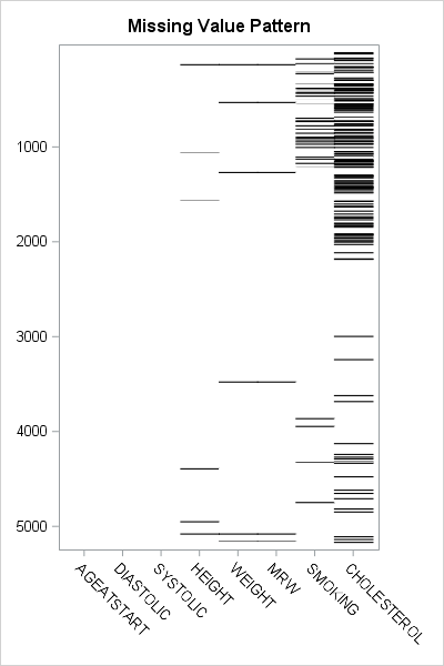
An example of a visualization of a missing value pattern is shown to the right. The heat map shows the missing data for eight variables and 5209 observations in the Sashelp.Heart data set. It is essentially the heat map of a binary matrix where 1 indicates nonmissing values (white) and 0 indicates missing values (black).
In this article, I present a bar chart that helps to visualize the "Missing Data Patterns" table from PROC MI in SAS/STAT software. I also show two SAS tricks:
- The DISPLAYPATTERN= option in PROC MI (requires SAS 9.4M5)
- How to create a bar chart that displays counts on a logarithmic scale
The pattern of missing data
The MI procedure can perform multiple imputation of missing data, but it also can be used as a diagnostic tool to group observations according to the pattern of missing data. You can use the NIMPUTE=0 option to display the pattern of missing value. By default, the "Missing Data Patterns" table is very wide because it includes the group means for each variable. However, you can use the DISPLAYPATTERN=NOMEANS option (SAS9.4M5) to suppress the group means, as follows:
%let Vars = AgeAtStart Height Weight Diastolic Systolic MRW Smoking Cholesterol; %let numVars = %sysfunc(countw(&Vars)); /* &numVars = 8 for this example */ proc mi data=Sashelp.Heart nimpute=0 displaypattern=nomeans; /* SAS 9.4M5 option */ var &Vars; ods output MissPattern=Pattern; /* output missing value pattern to data set */ run; |

In the table, an X indicates that a variable does not contain any missing values, whereas a dot (.) indicates that a variable contains missing values. The table shows that Group 1 consists of about 5000 observations that are complete. Groups 2, 3, and 6 contains observations for which exactly one variable contains missing values. Groups 4 and 5 contain observations for which two variables are jointly missing. Group 7 contains observations for which three variables are missing. You can see that the size of the groups vary widely. Some patterns of missing value appear only a few times, whereas others appear much more often.
By inspecting the table, you can determine which combinations of variables are missing for each group. However, imagine a dataset that has 20 variables. The "Missing Data Patterns" table for 20 variables would be very wide, and it would be cumbersome to determine which combination of variables are jointly missing. The next section condenses the table into a smaller format and then creates a graph to summarize the pattern of missing values.
Shorten the labels for the missing data patterns
The information in the "Missing Data Patterns" table can be condensed. I saw the following idea in Chapter 10 of Gerhard Svolba's Data Quality for Analytics Using SAS, who credits the idea to a display that appears in JMP software. (Svolba does not use PROC MI, but defines a macro that you can download from the book's website.)
The table is wide because there is a column for every variable in the analysis. But the information in those columns is binary: for the i_th group does the j_th variable have a missing value? If the analysis involves k variables, you can replace the k columns by a single binary string that has k digits. The j_th digit in the string indicates whether the j_th variable has a missing value.
In the preceding analysis, the ODS OUTPUT statement wrote the "Missing Data Patterns" table to a data set. The following SAS DATA step reads the data and constructs a binary string of length k from the k character variables in the data. The binary string is formed by using the CATT function to concatenate the 'X' and '.' values in the table. The TRANSLATE function then converts those characters to '0' and '1' characters. The DATA step also computes the NumMiss variable, which counts the number of variables that have missing values for each row:
data Miss; set Pattern; array vars[*] _CHARACTER_; /* or use &Vars */ length Pattern $&numVars.; /* length = number of variables in array */ Pattern = translate(catt(of vars[*]), '01', 'X.'); /* Ex: 00100100 */ NumMiss = countc(pattern, '1'); run; proc print data=Miss noobs; var Group Pattern NumMiss Freq; run; |
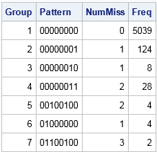
The table shows that the eight columns for the analysis variables have been replaced by a single column that displays an eight-character binary string. For Group 1, the string is all zeros, which indicates that no variable has missing values. For Group 2, the binary string contains all zeros except for a 1 in the last position. This means that Group 1 is the set of observations for which the last variable contains a missing value. Similarly, Group 7 is the set of observations for which the second, third, and sixth variables contain a missing value. Notice that this table does not provide the names of the variables. If you cannot remember the name of the second, third, and sixth variables, you need to look them up in the VARS macro variable.
Create a bar chart that has a logarithmic scale
The condensed version of the "Missing Data Patterns" table is suitable to graph as a bar chart. However, for these data the size of the groups vary widely. Consequently, you might want to plot the frequencies of the groups on a logarithmic scale. (Or you might not! There is considerable debate about whether you should display a bar chart that has a logarithmic axis. For a discussion and alternatives, see Sanjay's article "Graphs with log axis." My opinion is that a log axis is fine to use for a technical audience such as statisticians.)
By default, you cannot use a logarithmic scale on a bar chart because the baseline for the vertical axis (the frequency or count axis) starts at 0 and the LOG function is not defined at 0. If you have count data and no category has zero counts, then you can set the baseline of the graph to 1. The bars then indicate the log-frequency of the counts. The following call to PROC SGPLOT creates the bar chart and a marginal table:
title "Pattern of Missing Values"; proc sgplot data=Miss; hbar Pattern /response=Freq datalabel baseline=1; /* set BASELINE=1 for log scale */ yaxistable NumMiss / valuejustify=left label="Num Miss" valueattrs=GraphValueText labelattrs=GraphLabelText; /* use same attributes as axis */ yaxis labelposition=top; xaxis grid type=log logbase=10 label="Frequency (log10 scale)"; run; |
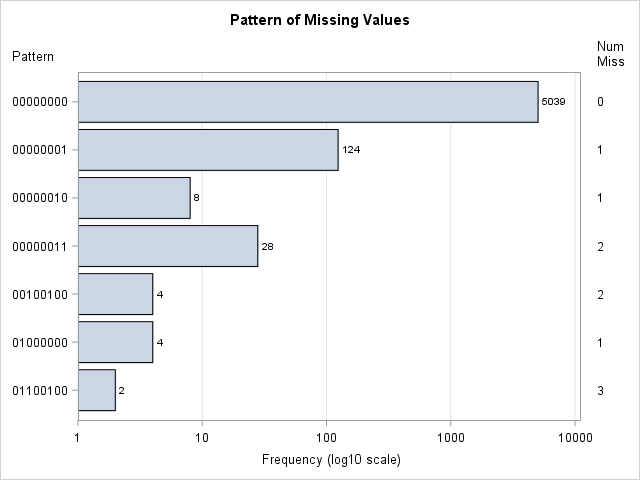
This graph displays the counts of the number of observations in each pattern group. The labels on the Y axis indicate which variables have missing data. The values in the right margin indicate how many variables have missing data. If you are opposed to drawing bar charts on a logarithmic axis, you can use one of Sanjay's alternative visualizations.
In summary, you can create a bar chart that visualizes the number of observations that have a similar pattern of missing values. The summarization comes from PROC MI in SAS, which has a new DISPLAYPATTERN=NOMEANS option. A short DATA step can create a binary string for each group. That string can be used to indicate the missing data pattern in each group. If the groups vary widely in size, you can use a logarithmic axis to display the data. To create a bar chart on a logarithmic scale in SAS, set BASELINE=1 in the HBAR statement and use TYPE=LOG on the XAXIS statement in PROC SGPLOT.

1 Comment
Thank you Dr. Wicklin for yet another very useful tip!