You can visualize missing data. It sounds like an oxymoron, but it is true.
How can you draw graphs of something that is missing? In a previous article, I showed how you can use PROC MI in SAS/STAT software to create a table that shows patterns of missing data in SAS. In addition to tables, you can use graphics to visualize patterns of missing data.
It's not an oxymoron: Visualize missing data #Statistics #SAStip Share on XCounts of observations that contain missing values
As shown in the previous post, it is useful to be able to count missing values across rows as well as down columns. These row and column operations are easily accomplished in a matrix language such as SAS/IML. For example, the following SAS/IML statement read in data from the Sashelp.Heart data set. A single call to the COUNTMISS function counts the number of missing values in each row. The BAR subroutine creates a bar chart of the results:
proc iml;
varNames = {AgeAtStart Height Weight Diastolic
            Systolic MRW Smoking Cholesterol};
use Sashelp.Heart;                         /* open data set */
read all var varNames into X;              /* create numeric data matrix, X */
close Sashelp.Heart;

title "Counts of Rows That Contain 0, 1, 2, or 3 Missing Values";
title2 "Sashelp.Heart Data";
Count = countmiss(X,"row");            /* count missing values for each obs */
call Bar(Count); /* create bar chart */ |
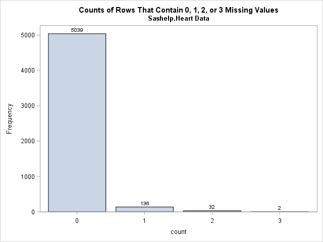
The bar chart clearly shows that most observations do not contain any missing values among the specified variables. A small percentage of observations contain one missing value. Even fewer contain two or three missing values.
Which observations contain missing values?
It can be useful to visualize the locations of observations that contain missing values. Are missing values spread uniformly at random throughout the data? Or do missing values appear in clumps, which might indicate a systematic issue with the data collection?
The previous section computed the Count variable, which is a vector that has the same number of elements as there are rows in the data. To visualize the locations (rows) of missing values, use the LOC function to find the rows that have at least one missing value and plot the row indices:
missRows = loc(Count > 0);                  /* which rows are missing? */
title "Location of Rows That Contain Missing Values";
call histogram( missRows ) scale="count"    /* plot distribution */
     rebin={125, 250}                       /* bin width = 250 */
label="Row Number"; /* label for X axis */ |
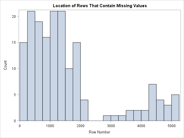
This histogram is very revealing. The bin width is 250, which means that each bar includes 250 observations. For the first 2000 observations, about 15 of every 250 observations contain a missing value. Then there is a series of about 500 observations that do not contain any missing observations. For the remaining observations, only about three of every 250 observations contain missing values. It appears that the prevalence of missing values changed after the first 2000 observations. Perhaps the patients in this data set were entered according to the date in which they entered the program. Perhaps after the first 2000 patients were recruited, there was a change in data collection that resulted in many fewer missing values.
A heat map of the missing values
The ultimate visualization of missing data is to use a heat map to plot the entire data matrix. You can use one color (such as white) to represent nonmissing elements and another color (such as black) to represent missing values.
For many data sets (such as Sashelp.Heart), missing observations represent a small percentage of all rows. For data like that, the heat map is primarily white. Therefore, to save memory and computing time, it makes sense to visualize only the rows that have missing values. In the Sashelp.Heart data (which has 5209 rows), only 170 rows have missing values. For each of the 170 rows, you can plot which variables are missing.
The following statements implement this visualization of missing data in SAS. The matrix Y contains only the rows of the data matrix for which there is at least one missing value. You can call the CMISS function in Base SAS to obtain a binary matrix with values 0/1. The HEATMAPDISC subroutine in SAS/IML enables you to create a heat map of a matrix that has discrete values.
ods graphics / width=600px height=200px;
Y = X[missRows,];              /* extract missing rows   */
Y = Y`;                        /* transpose so we can use a short/wide display */
call HeatmapDisc( cmiss(Y) )   /* CMISS returns 0/1 matrix */
     displayoutlines=0
     colorramp={white black}
     yvalues=VarNames          /* variable names along side */
     xvalues=missRows          /* use nonmissing rows numbers as labels */
showlegend=0 title="Missing Value Pattern"; |
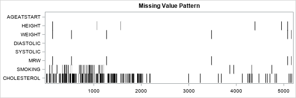
The black line segments represent missing values. This heat map summarizes almost all of the information about missing values in the data. You can see which variables have no missing values, which have a few, and which have many. You can see that the MRW variable is always missing when the Weight variable is missing. You can see that the first 2250 observations have relatively many missing values, that there is a set of observations that are complete, and that the missing values occur less frequently for the last 2000 rows.
If you do not have SAS/IML software, you can still create a discrete heat map by using the Graph Template Language (GTL).
Be aware that this heat map visualization is limited to data for which the number of rows that have missing values is somewhat small. (About 1000 rows or less.) In general, a heat map should contain at least one pixel for each data row that you want to visualize. For the Sashelp.Heart data, there are 170 rows that have missing data, and the heat map in this example has 600 horizontal pixels. If you have thousands of rows and try to construct a heat map that has only hundreds of pixels, then multiple data rows must be mapped onto a single row of pixels. The result is not defined, but certainly not optimal.
Do you ever visualize missing data in SAS? What techniques do you use? Has visualization revealed something about your data that you hadn't known before? Leave a comment.

7 Comments
Pingback: Examine patterns of missing data in SAS - The DO Loop
It's nice to see the almost 70-year old intake data from the Framingham Heart Study original cohort being put to new use.
:-) It's actually hard to find example data that has a substantial number of missing values! Many people artificially "insert" missing values into complete data, but I wanted to use real data.
Thank you, Prof Larson, for your 20+ years of service to the Framingham study. The investigation of major risk factors that contribute to cardiovascular disease is ranked by the CDC as one of the 10 greatest public health achievements of the 20th century.
Pingback: The top 10 posts from The DO Loop in 2016 - The DO Loop
Pingback: Create patterns of missing data - The DO Loop
Pingback: 10 tips for creating effective statistical graphics - The DO Loop
Pingback: Visualize patterns of missing values - The DO Loop