Last week I showed how to use the SUBMIT and ENDSUBMIT statements in the SAS/IML language to call the SGPLOT procedure to create ODS graphs of data that are in SAS/IML vectors and matrices. I also showed how to create a SAS/IML module that hides the details and enables you to create a plot by using a single statement.
Wouldn't it be great if someone used these ideas to write SAS/IML modules that enable you to create frequently used statistical graphics like bar charts, histograms, and scatter plots?
Someone did! SAS/IML 12.3 (which shipped with SAS 9.4) includes five modules that enable you to create basic statistical graphs. The modules are named for a corresponding SGPLOT statement, as follow:
- The BAR subroutine creates a bar chart of a categorical variable. If you specify a grouping variable, you can create stacked or clustered bar charts. You can control the ordering of the categories in the bar chart.
- The BOX subroutine creates a box plot of a continuous variable or multiple box plots when you also specify a categorical variable. You can control the ordering of the categories in the box plot.
- The HISTOGRAM subroutine creates a histogram of a continuous variable. You can overlay a normal density or kernel density estimate. You can control the arrangement of bins in the histogram.
- The SCATTER subroutine creates a scatter plot of two continuous variables. You can color markers according to a third grouping variable, and you can specify labels for markers.
- The SERIES subroutine creates a series plot, which is sometimes called a line plot. You can specify a grouping variable to overlay multiple line plots.
You can watch a seven-minute video that shows examples of statistical graphs that you can create by using these subroutines. The SAS/IML documentation also contains a new chapter on these statistical graphs.
Examples of creating statistical graphs
Because the video does not enable you to copy and paste, the rest of this article shows SAS/IML statements that create some of the graphs in the video. You can modify these statements to display new data, add or delete options, and so forth.
The video examples use data from the Sashelp.Cars data set, which contains information about 428 cars, trucks, and SUVs. The following statements read the data and create five SAS/IML vectors: three categorical variables (Model, Type, and Origin) and two continuous variables (MPG_City and Weight):
proc iml;
use Sashelp.Cars where(type ? {"SUV" "Truck" "Sedan"});
read all var {Model Type Origin MPG_City Weight};
close Sashelp.Cars; |
The following statement creates a clustered bar chart of the Origin variable, grouped by the Type variable:
title "Clustered Bar Chart"; call Bar(Origin) group=Type groupopt="Cluster" grid="Y"; |
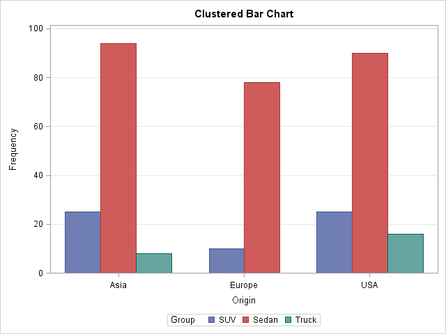
The graph shows the number of vehicles in the data that are manufactured in Asia, Europe, and the US. The graph shows that there are no European trucks in the data and that each region produces more than 75 sedans.
You can create a box plot that shows the relative fuel economy for vehicles that are manufactured in each of the three regions:
title "Box Plot with Data Labels"; call Box(MPG_City) category=Origin option="spread" datalabel=putc(Model,"$10."); |
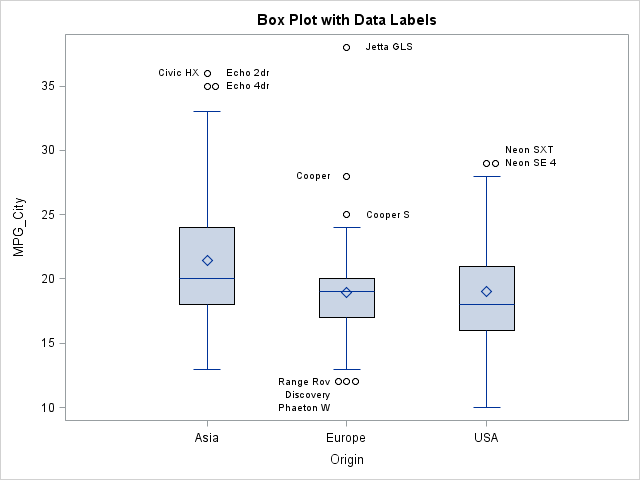
The box plots show that the average and median fuel economy of Asian vehicles is greater than for European and US-built vehicles. Outliers are labeled by using the first 10 characters of the Model variable. Outliers that would otherwise overlap are spread horizontally.
You can use a histogram to visualize the distribution of the MPG_City variable. The following statement creates a histogram and overlays a normal and kernel density estimate:
title "Histogram with Density Curves";
call Histogram(MPG_City) density={"Normal" "Kernel"} rebin={0 5}; |
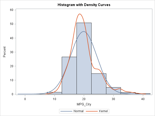
The normal curve does not fit the data well. The kernel density estimate shows three peaks because many vehicles get about 20 mpg, about 25 mpg, and about 30 mpg.
You can create a scatter plot that shows the relationship between fuel economy and the weight of a vehicle. The following statement creates a scatter plot and colors each marker according to whether it represents a sedan, truck, or SUV.
title "Scatter Plot with Groups"; call Scatter(Weight, MPG_City) group=Type; |
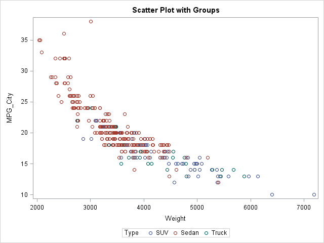
The scatter plot shows that lighter vehicles tend to have better fuel economy. Sedans, which tend to be relatively light, often have better fuel economy than trucks and SUVs.
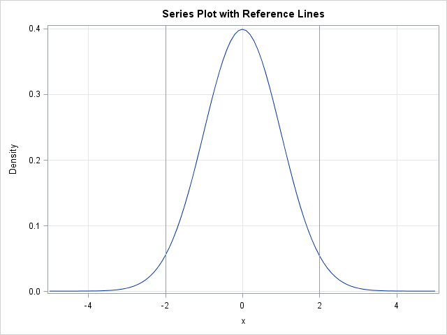
The Sashelp.Cars data set is not appropriate for demonstrating a series plot. The following statements evaluate the standard normal probability density function on the range [-5, 5] and call the SERIES subroutine to visualize the density function. Two vertical reference lines are overlaid on the plot.
x = do(-5, 5, 0.1);
Density = pdf("Normal", x, 0, 1);
title "Series Plot with Reference Lines";
call Series(x, Density) other="refline -2 2 / axis=x" grid={X Y}; |
This article has briefly described five SAS/IML subroutines in SAS/IML 12.3 that enable you quickly to create ODS statistical graphs from data in vectors or matrices. The routines are not intended to be a complete interface to the SGPLOT procedure. Rather, the routines expose common options for frequently used statistical graphs. If you want to create more complicated graphs that use more esoteric options, you can use the techniques from my previous post to write your own SAS/IML modules that create the exact graph that you need.

4 Comments
Pingback: The frequency of letters in an English corpus - The DO Loop
Pingback: The frequency of bigrams in an English corpus - The DO Loop
Hello Rick,
I want your help to make hydrogen bond occupancy scatter plot for thesis. I have no idea how to make scatter plot of my data. Can you please help me.
Thanks
Sure. Post your data to the SAS Support Community for SAS Graphics and you will get lots of friendly help. Please include your version of SAS.