What is a spaghetti plot? Spaghetti plots are line plots that involve many overlapping lines. Like spaghetti on your plate, they can be hard to unravel, yet for many analysts they are a delicious staple of data visualization. This article presents the good, the bad, and the messy about spaghetti plots and shows how to create basic and advanced spaghetti plots in SAS.
The data set in this article contains World Bank data about the average life expectancy (at birth) for more than 200 countries. The data are for the years 1960–2014. For convenience, I have attached two CSV files, one that contains the life expectancy data and another that contains country information. You can also download the SAS file that creates all the graphs in this article.
Line charts versus spaghetti charts
A line plot displays a continuous response variable at multiple time points. The response variable might be the price of a stock, the temperature in a city, or the blood pressure of a patient. When there are only a handful of stocks, cities, or patients, you can display multiple lines on the same plot and use labels, colors, or patterns to distinguish the individual units. For example, the following call to PROC SGPLOT creates a line plot of the life expectancy at birth for 10 countries, plotted for the years 1960–2014:
title "Life Expectancy at Birth"; proc sgplot data=LE; where country_name in ("China" "Chad" "Croatia" "Israel" "Kosovo" "Kuwait" "India" "Peru" "Sudan" "United States"); series x=Year y=Expected / group=Country_name break curvelabel; run; |
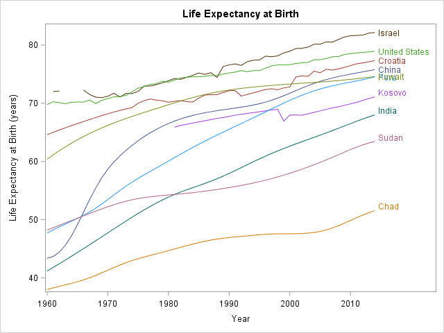
The line plot enables you to easily track the rise and fall of life expectancy over time for each of these 10 countries. The labels for Kuwait and Peru overlap, but otherwise the line plot is easy to read and interpret. You can see the general trend, which is increasing life expectancy for all countries. You can see that richer nations tend to have higher life expectancy than poorer nations. You can also see that Israel is missing several data points in the early 1960s, and that Kosovo is missing data prior to 1981.
The fact that the labels for Peru and Kuwait overlap is sign of that the line plot is starting to transition to a spaghetti plot. As you increase the number of curves in a line plot, more labels will overlap and it becomes harder to distinguish colors and to trace a country's curve from beginning to end. By the time you plot 40 or 50 countries, the time series plot has become a tangled mess that earns the moniker "spaghetti plot."
Serving up a spaghetti plot in #SAS. #DataViz #TimeSeries Share on XServing up a spaghetti plot in SAS
When there are many individual countries (or stocks or patients), the line plot no longer reveals the behavior of each individual unit, but still can reveal trends. If the units can be classified into a small number of categories, colors can be used to visualize whether trends differ between groups. For example, patients might be grouped into cohorts, such as males versus females or control versus experimental groups.
For the life expectancy data, an Income variable records the relative wealth of each country. The following call to PROC SGPLOT creates a spaghetti plot that contains lines for 207 countries.
title "Life Expectancy at Birth for 207 Countries"; proc sgplot data=LE; series x=Year y=Expected / group=Country_Name grouplc=Income break transparency=0.7 lineattrs=(pattern=solid) tip=(Country_Name Income Region); xaxis display=(nolabel); keylegend / type=linecolor title=""; run; |

The 207 countries are classified into five groups according to economic factors. Thirty-two nations are wealthy and belong to the Organization for Economic Co-operation and Development (OECD). Forty-two wealthy countries are not OECD members. Fifty-one countries are upper-middle income, 51 are lower-middle income, and 31 are low income. Those categories are used to assign colors to the curves. The GROUPLC= option (available in SAS 9.4M2) is used to color the lines by the five levels of the Income variable.
Transparency is used to reduce overplotting. The TIP= option is used to add tooltips that display information about a country when you hover the mouse pointer over the HTML version of the graph in SAS. Notice also that BREAK option is used to break a line if there is a missing value; otherwise the line segments will connect across missing values.
Although the spaghetti plot contains about 207*54 ≈ 11,000 line segments, you can still deduce certain trends. You can see that the highest life expectancy belongs to OECD nations whereas the lowest belongs to low-income nations. You can see that the average trend is increasing, and that the slope looks greater for the low-income nations. You can see that some curves had negative slopes in the 1980s and 1990s, and that several had precarious dips. By using the tool tips, you can identify Cambodia (1970s) and Rwanda (1990s) as two countries whose life expectancy dipped to alarmingly low levels.
Paneled spaghetti plots
In spite of revealing general trends, it is hard to identify individual countries. The problem is that there are too many overlapping curves. This is a weakness of spaghetti plots: they do not reveal the identity of individuals, except for extreme outliers. If you see an interesting feature of some curve in the middle of the plot, you will have a hard time figuring out which country it is.
One possible alternative is draw the curves for each category in a separate panel rather than overlaying the categories. This reduces the number of curves in any one plot. For the World Bank data, you can use the BY statement in PROC SGPLOT to create full-sized plots of each Income level, or you can use the SGPANEL procedure to create five cells, each with 30 to 50 curves. Again, you can use transparency and tool tips to help discern individual "noodles" among the five spaghetti plots. If the data has additional categories, you can color the line segments in each panel. The following statement create a panel of spaghetti plots where each plot is now colored by a categorical variable (Region) that encodes the country's geographic region.
proc sgpanel data=LE; panelby Income / columns=3 onepanel sparse; series x=Year y=Expected / group=Country_Name break transparency=0.5 grouplc=region lineattrs=(pattern=solid) tip=(Country_Name Region); colaxis grid display=(nolabel) offsetmin=0.05 fitpolicy=stagger; keylegend / type=linecolor title=""; run; |
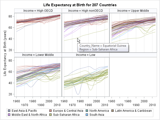
The panels show that the "High OECD" countries are primarily European countries. The upper- and lower-middle income panels are a mixture of countries from diverse geographic locations. The "Low Income" countries are primarily in sub-Saharan Africa, with a few in South Asia.
Because each panel contains fewer curves, it is easier to identify the outliers. For example, the life expectancy in Equatorial Guinea is low relative to other high-income non-OECD countries. Angola has a low life expectancy relative to other upper-middle-income countries. North Korea reports high life expectancy relative to other low-income countries.
By using the tool tips, you can discover the names of countries that experienced drops in life expectancy due to conflict or environmental disasters. You can display additional variables in the tool tips.
Alternative displays
In summary, the spaghetti plot shows major trends over time. If you color by a categorical variable, you can visually compare cohorts. However, the spaghetti plot has some problems. When the number of curves becomes large (typically more than 20 or 30), it becomes difficult to distinguish individual curves. Although using semi-transparent lines helps to reduce overplotting, the plot becomes virtually unreadable when you have 200 or more curves.
There are some modifications that you use to handle overplotting. This article shows a paneling approach, in which cohorts are plotted in separate panels.
Another option is to increase the interactivity of the plot. The Flowing Data website has a nice interactive version of these data. In SAS you could use interactive software such as JMP or SAS/IML Studio to create a similar interactive plot for exploratory data analysis.
Some visualization experts choose a different visualization for multiple time series. Instead of plotting a response versus time, you can show changes in time by using an animation. For example, Hans Rosling famously used an animated bubble plot to show the relationship between life expectancy and average income over time. Sanjay Matange showed how to use PROC SGPLOT to create Rosling's animated bubble plot in SAS.
For an alternative visualization of this time series data, you might consider lasagna plots.

8 Comments
Nice! I've bookmarked this for future use.
Very nice, as usual, Rick.
One issue that comes up a lot in longitudinal data is missing data. I've written a program that combines PROC MI with the spaghetti plots and another that uses "by hand" imputation to avoid imputing too much.
Maybe that will be a good presentation somewhere.
Rick,
I would like to use heat map if there are too many lines need to draw, that could messed up .
Hi, this looks like a good question for the SAS Community. I suggest submitting it there to get responses from fellow users.
The article "Lasagna plot in SAS" provides details, discussion, and complete programs.
Pingback: Lasagna plots in SAS: When spaghetti plots don't suffice - The DO Loop
Pingback: Overlay plots on a box plot in SAS: Continuous X axis - The DO Loop
One additional technique that helps with spaghetti plots at this scale is to overlay a smoothed group trend (for example, LOESS or spline by income group) on top of the individual country lines. That keeps the individual trajectories visible while giving a statistically clearer cohort signal. You can also pre-cluster countries by trajectory shape and panel by cluster instead of income group to reveal pattern families rather than just economic tiers. This often surfaces structural differences that color grouping alone misses.