Often we want to visualize the relationship between variables over time. The understanding of such data can be improved by viewing the animated graph over time. With SAS 9.4, you can create animated graphs using the new animation options on the OPTIONS statement and the PRINTER destination.
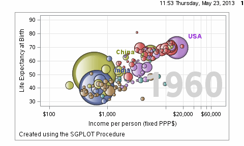
A popular example an animated graph is the GapMinder demo presented by Hans Rosling. Using the data from the web site, Pratik has created a SAS data set for life expectancy, income and population by country and year. Here is a bubble plot animation created using the SGPLOT procedure, stepping through the data for each year from 1960 to 2007.
Here is the graph:
The key options used are the following:
options papersize=('5 in', '3 in') printerpath=gif animation=start animduration=0.1 animloop=yes noanimoverlay; ods printer file='GapMinder.gif'; ods graphics / width=5in height=3in imagefmt=GIF; Create multiple graphs using SGPLOT procedure; options printerpath=gif animation=stop; ods printer close; |
In this example, I wrote a macro that loops through all the values for "Year", from 1960 to 2006. To maintain the axis ranges, it is important to set these so they will be consistent over all the frames. The resulting GIF file can quickly get too large to include in a blog article. So to keep the size within the limits allowed for a blog article, I used a step of 2 years, and a smaller image size. The bubbles are colored by region of the world, but I dropped the legend to save space.
The full code is attached below. Along with animations, bubble skins are supported in SAS 9.4 SGPLOT procedure.
SAS 9.4 Code: GapMinder
The animation can likely be improved by generating intermediate frames by interpolating the data from one year to the next. That will smooth out the "jerkiness" of the animation where there are large changes from year to year. Here is an example of data interpolation with the SASHELP.CLASS data set.
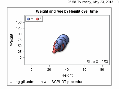
SAS 9.4 code: ClassBubble


14 Comments
Nice... Flashy graphs with no Adobe Flash!
This is very cool. Has there been a discussion of adding a BY statement to the SGPLOT procedure? (Or adapting the PANELBY statement in SGPANEL?) That would eliminate the need for the macro that calls SGPLOT with a WHERE clause.
There is already a BY option on the SGPLOT procedure, and one could have used that.
Great idea! These animations are great!
Animations look cool but I prefer to be able to control the graphic myself so I can understand at my own pace and look at details. A slider / stepper / button control would be the solution for this.
This is amazing! I remember doing this within JMP, but I'm so pleased that it is also in SAS 9.4 🙂
Pingback: How to create a bubble plot in SAS University Edition | SAS Training
Pingback: Create spaghetti plots in SAS - The DO Loop
Pingback: Compute highest density regions in SAS - The DO Loop
Pingback: Create an animation with the BY statement in PROC SGPLOT - The DO Loop
Try GROUPORDER=descending. Or, make sure your data has dummy observations with group values in the order you want at the start of the data. The response values of these dummy observations can be made missing.
Appreciate the work! Can you provide the dataset used?
Can you provide the raw data file for the GapMinder bubble chart? I am not sure how to format the raw data first before importing into SAS.
Thanks!
Pingback: Moire patterns: Or why you shouldn't wear a striped shirt on a video - The DO Loop