In a scatter plot, the regions where observations are packed tightly are areas of high density. A contour plot or heat map of a bivariate kernel density estimate (KDE) is one way to visualize regions of high density.
A SAS customer asked whether it is possible to use SAS to approximate regions that enclose the highest density for a KDE. He also wanted the areas of these regions. I don't know the customer's application, but I can imagine this computation might be useful for ecology. For example, if you count the locations of some endangered species of plant, you might want to estimate a region that contains the highest density and compute the area of that region.
There have been several papers about computing highest density regions (HDRs) for data. Rob Hyndman (1996, TAS), argues that HDRs "are often the most appropriate subset to use to summarize a probability distribution." Hyndman creates "HDR boxplots," which use contours of a KDE to summarize a distribution. A 2011 thesis by A. Fadallah presents the one-dimensional algorithm (p. 6) for finding intervals that contain the highest density.
Hyndman provides a formal definition of an HDR (p. 120) in terms of random variables and probability. For this article, an intuitive definition is sufficient: Given a probability 0 < p < 1 and a density function f, the p100% HDR is the interior of the level set of f that contains probability p.
Recall the intimate connection between densities and probability. For any region, the probability is the integral of the density function over that region. Thus to compute HDRs we need to consider integrals inside a region defined by a level set of the density.
Density contours and regions of high density. #Statistics #SASTip Share on XBivariate kernel density estimates
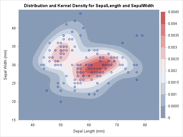
Recall that the KDE procedure can estimate the density of bivariate data. For example, the following statements estimate the bivariate density of the SepalLength and SepalWidth variables in the Sashelp.Iris data set, which contain the dimensions of sepals for 150 iris flowers:
/* define rectangular area on which to estimate density */ %let xmin = 35; %let xmax = 85; /* horizontal range */ %let ymin = 15; %let ymax = 45; /* vertical range */ title "Bivariate Kernel Density Estimate"; proc kde data=sashelp.iris; bivar SepalLength(gridL=&xmin gridU=&xmax) /* optional: bwm=0.8 ngrid=100 */ SepalWidth(gridL=&ymin gridU=&ymax) / /* optional: bwm=0.8 ngrid=100 */ out=KDEOut plots=ContourScatter; ods output Controls=Controls; run; |
The KDE is shown at the top of this article. The regions of high density are shown in red. The highest contours of the density function are the boundaries of the roughly elliptical red regions. Contours of lower density values are peanut-shaped (the whitish color), and the lowest density contours are amoeba-shaped (light blue in color).
These colored regions are level sets of a density function, and they enclose the highest density regions. The rest of this article shows how to compute quantities that are associated with the region enclosed by a density contour.
An algorithm for approximating highest density regions
The KDE procedure computes the density estimate on a regular grid of points. (By default, the grid is 60 x 60.) The area of each grid cell is some value, A. If h is the height of the density function at, say, the bottom right corner of the cell, then you can estimate the probability in the cell as the volume of the rectangular prism with volume V = A h. For the union of many cells, you can approximate the probability (the volume under the density surface) by the Riemann sum of rectangular prisms. Consequently, given a probability p, the following algorithm provides a rough "pixelated" approximation to the density contour that contains probability p:
- Sort the grid points in decreasing order by the value of the density function. Let h1 ≥ h2 ≥ ... ≥ hm be the sorted density values, where m is the number of grid points.
- Start with h1, the highest value of the density. Let V1 = A h1 be the approximate volume under the density surface for this cell.
- If V1 < p, compute the volume over the cell with the next highest density value. Define V2 = V1 + A h2.
- Repeat this accumulation process until you find the first k that Vk ≥ p. The union of the first k cells is an approximation to the p100% HDR.
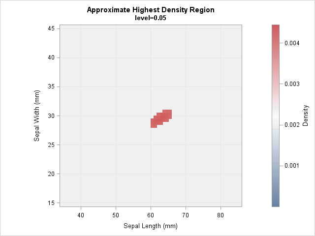
It is worth noting that you can also use this algorithm to visualize the region inside level sets: simply approximate the region for which the density exceeds some specified value. For this second scenario, there is no need to keep track of the probability.
Compute HDRs in SAS
Let's implement this algorithm in SAS. The previous call to the KDE procedure evaluates the density estimate at a 60 x 60 grid of points. By default, the horizontal points are evenly spaced in the interval [min(x), max(x)], but you can (and should) use the GRIDL= and GRIDU= options to expand the lower and upper bounds, as shown previously. Similarly, you can expand the grid range in the vertical direction. You should choose the upper and lower bounds so that the estimated density is essentially zero on the border of the specified region.
The number of points in each direction and the range of each variable are shown in the "Controls" table:
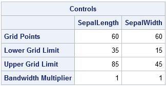
Notice that the call to PROC KDE used the OUT= option to write the 3600 density values to a SAS data set called KDEOut. The ODS OUTPUT statement was used to write the "Control" table to a SAS data set.
You can use SAS or a hand computation to calculate the area of each cell in the regular grid. I will skip the computation and merely store the result in a macro variable:
%let CellArea = 0.43091; /* area of each cell in the grid */ |
With that definition, the following SAS statement accumulate the probability and area for the estimated density. To help with the visualization, a fake observation that has density=0 is added to the output of PROC KDE. This ensures that gradient color ramps always use zero as the base of the color scale:
proc sort data=KDEOut; by descending density; run; /* ensure that 0 is the lower limit of the density scale */ data FakeObs; value1=.; value2=.; density=0; run; /* accumulate probability and area */ data KDEOut; set FakeObs KDEOut; /* add fake observation */ Area + &CellArea; /* accumulate area */ prob + &CellArea * Density; /* accumulate probability */ run; |
You can use a WHERE clause to visualize the region that contains the highest density and for which the region contains a specified probability mass. For example, the following call to SGPLOT uses a scatter plot to approximate the 50% HDR. The scatter plot colors markers by the value of the density variable.
title "Approximate 50% HDR"; proc sgplot data=KDEOut aspect=1; where prob <= 0.5; label value1="Sepal Length (mm)" value2="Sepal Width (mm)"; styleattrs wallcolor=CXF0F0F0; /* light gray background */ scatter x=Value1 y=Value2 / markerattrs=(symbol=SquareFilled size=7) colorresponse=Density colormodel=ThreeColorRamp; xaxis min=&xmin max=&xmax grid; yaxis min=&ymin max=&ymax grid; run; |
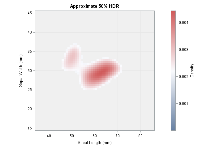
The 50% HDR is a peanut-shaped region that contains two regions of highest density. In this graph I used the ThreeColorRamp as the gradient color ramp because that is the ramp used by PROC KDE. However, the whitish region does not show up very well, so you might prefer the ThreeColorAltRamp, which uses black instead of white.
In a similar way you can compute an 80% or 95% HDR. You can download the SAS program that computes the results in this article. The program contains statements that compute a 95% HDR.
Animating the highest density regions
You can compute an HDR for any specified probability. The following image shows an animation that was created by using PROC SGPLOT. The animation visualizes the HDRS, starting at a low probability level and ending at a high probability level.
Compute the area of an HDR
The previous DATA step also computed the area of the HDR. The following PROC MEANS statement computes the area of the 50% HRD for the sepal widths and lengths. The region covers about 169 square units. If you want to compute the area for a 90% or 95% HDR, just change the value in the WHERE clause. This computation is valid regardless of the number of components in the region.
proc means data=KDEOut max; where prob <= 0.5; /* 0.5 is for the 50% HDR */ var Area; run; |
Closing comments
This article started with data, generated a KDE, and then found HDRs as the interior of level sets of the KDE. However, the level set computations never look at the data, so the computations are valid for any density function. The approximation is rough because it only uses the density values on a uniform grid of points.
For fun, the attached program also uses this method to compute HDRs for bivariate normal data. I wanted to see how the HDRs compare with the elliptical prediction regions. For the examples that I looked at the HDRS are slightly bigger, with a relative error in the 10-15% range.
I do not have any practical experience using HDRs, but I wanted to share this computation in case someone finds it useful. I had never heard of HDRs before last week, so I'd be interested in hearing about how they might be used. I welcome any comments about this approximation.

5 Comments
Rick,
I got an error message below by running your code in "proc IML...package load polygon; "
ERROR: Package "polygon" is not installed. I'm currently using SAS version9.4 TS level 1M3
Do you know what happened?
Thanks.
You need to install the polygon package before you can run it.
I did install the polygon package by following the instruction you provided. But how to create the animation file you show in the blog? The idea is to insert the file into my PPT file to display as video. Could you enlighten it?
Thanks.
To copy the animation into PPT, you can left-click on the animation image. It will appear in a separate tab. Then right-click and select Save As to store the GIF to your local computer. Then drag and drop into PPT.
The animation was created by using PROC SGPLOT, using ideas that are explained in a blog post by Sanjay. Because the HDR post was already so long, I did not spend much time explaining it, but I thought it made for a nice visualization.
Pingback: Create an animation with the BY statement in PROC SGPLOT - The DO Loop