One of my favorite new features in PROC SGPLOT in SAS 9.4m2 is addition of the COLORRESPONSE= and COLORMODEL= options to the SCATTER statement. By using these options, it is easy to color markers in a scatter plot so that the colors indicate the values of a continuous third variable.
If you are running an earlier release of SAS, you can use the Graph Template Language (GTL) to create a scatter plot where the markers are colored by a continuous response variable.
If you have a discrete variable (like gender), you can use the GROUP= option to color markers.
Color markers in a scatter plot to indicate values of a continuous response. #DataViz #SASTip Share on XColor markers by a continuous response variable
You can use the COLORRESPONSE= option to visualize the values of a third variable by using colored markers in a scatter plot. For example, the following statements create a scatter plot of weight versus height for 19 students. Each marker is assigned a color that reflects the age of the student.
title "Markers Colored by Age"; proc sgplot data=sashelp.class; scatter x=height y=weight / colorresponse=age markerattrs=(symbol=CircleFilled size=14) /* big filled markers */ datalabel=Name; /* add labels to markers */ run; |
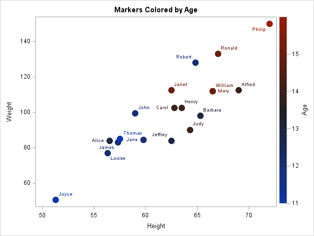
Click on the image for a larger version. By default, the plot uses a three-color gradient ramp. The smallest value of age (Joyce, age 11) is colored blue. The largest color (Phillip, age 16) is colored red. Markers that correspond to ages near the midrange (in this case, 13.5) are colored black. The gradient color ramp is shown on the right side of the plot. The plot shows that shorter and lighter students tend to be younger than taller and heavier students.
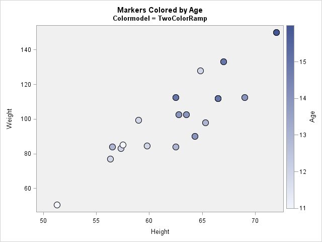
Use a different color ramp
The default color ramp is called ThreeColorAltRamp and is shown above. (The "Alt" version is suitable for use on a light-colored background.) You can change the color ramp by using the COLORMODEL= option in the SCATTER statement. The ODS graphics system provides several other two- and three-color color ramps. One is called the TwoColorRamp color ramp, which uses white as a color for low values and blue as a color for high values. Because the background of the graph is white, some markers will be hard to see unless you take additional actions. The following statements change the background color to a light gray and put a black outline around each marker so that an almost-white marker is still visible against the background:
title2 "Colormodel = TwoColorRamp"; proc sgplot data=sashelp.class; styleattrs wallcolor=CXF0F0F0; /* light gray background */ scatter x=height y=weight / colorresponse=age markerattrs=(symbol=CircleFilled size=14) /* big filled markers */ filledoutlinedmarkers /* add outlines */ colormodel=TwoColorRamp; /* white-blue ramp */ run; |
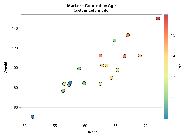
Define a custom color ramp
You can also use the COLORMODEL= option to create a customer color ramp. There are multiple ways to specify colors in SAS, including English words and hexadecimal integers that begin with the prefix 'CX.' For example, you could create a four-color ramp by using the following COLORMODEL= option:
colormodel=(blue green orange red); /* custom 4-color ramp */ |
Be aware that not all color ramps are created equal. If your color ramp contains colors that vary a lot in brightness and intensity, the viewer's eye will be drawn towards certain markers and aware from others. This can bias the way that the viewer perceives the data.
I wrote a previous article that discussed making wise choices when you create a custom color ramp. In the following statements, I use colors from a six-color "spectral" color ramp in which all colors are perceptually equivalent. (I use the PALETTE function in SAS/IML to generate perceptually balanced color ramps.)
title2 "Custom Colormodel"; proc sgplot data=sashelp.class; scatter x=height y=weight / colorresponse=age markerattrs=(symbol=CircleFilled size=14) filledoutlinedmarkers colormodel=(CX3288BD CX99D594 CXE6F598 CXFEE08B CXFC8D59 CXD53E4F); xaxis grid; yaxis grid; |
Change the location of the gradient legend
By default the gradient legend appears on the right side of the plot. You can change the location and a few other attributes of the gradient legend by using the GRADIENTLEGEND statement in SAS 9.4m2. For example, if you want the gradient legend to appear at the bottom of the plot and want to modify the title for the legend, you add the following SGPLOT statement:
gradlegend / position=bottom title="Age (yrs)"; |
In SAS 9.4m3, the COLORRESPONSE= and COLORMODEL= options are not only available in the SCATTER statement, but also are available in other statements, including the DOT, HBAR, HIGHLOW, SERIES, VBAR, VECTOR, and WATERFALL statements.

4 Comments
Pingback: Compute highest density regions in SAS - The DO Loop
Is it possible to fix the range of the response variable? Say I wanted to use SGPANEL to panel these charts by male and female but keep the color scheme the same across the two charts.
Yes, there are several ways to do this. I recommend that you create a "range attribute map."
Pingback: Control the fill and outline colors of scatter plot markers in SAS - The DO Loop