This article shows how to use PROC SGPLOT in SAS to create the scatter plot shown to the right. The scatter plot has the following features:
- The colors of markers are determined by the value of a third variable.
- The outline of each marker is the same color (such as black).
- The X axis is reversed because the X coordinate increases from east to west.
The purpose of this article is twofold. The primary purpose is to show how you can use the FILLEDOUTLINEDMARKERS option to separately control the fill colors and outline colors of markers. A secondary purpose is to remind longtime SAS programmers that a program that was written 10-15 years ago can sometimes benefit from a "facelift" by using more recent features in SAS procedures.
Is your program taking advantage of recent features?
Sometimes, I see an old SAS program and notice that it can be written more compactly by using modern features of the SAS language. I've noticed that there are even examples in the SAS documentation that can be simplified! In most cases, the documentation examples were written for an earlier version of SAS, before the modern features were implemented. These examples persist because some SAS customers are still using older versions of SAS, and because of the maxim, "if it ain't broke, don't fix it!"
When I see an old SAS program that uses the Graph Template Language (GTL), I study it to determine whether it could be rewritten to use PROC SGPLOT. In the early days of ODS graphics, PROC SGPLOT did not support as many statements and options as it does today. It was not uncommon to want to create a graph that required using GTL. As SAS released new versions (especially the early releases of SAS 9.4), many features in GTL made their way into the syntax of PROC SGPLOT.
An example of a feature that once required GTL is coloring scatter plot markers by the values of a third variable. In modern versions of PROC SGPLOT, you can use the COLORRESPONSE= option to specify a variable whose values determine the color of markers. Furthermore, you can use the COLORMODEL= option to specify a palette of colors to use for the markers. In a 2016 article, I wrote that the COLORRESPONSE= option is "one of my favorite new features in PROC SGPLOT in SAS 9.4m2."
Another useful feature is the FILLEDOUTLINEDMARKERS option (introduced in SAS 9.4 [M0]), which enables you to control the fill and outline attributes of markers separately. In this article, the fill colors are determined by using the values of a third variable. The outline color of the markers is specified by using the MARKEROUTLINEATTRS= option.
A remake of a classic scatter plot
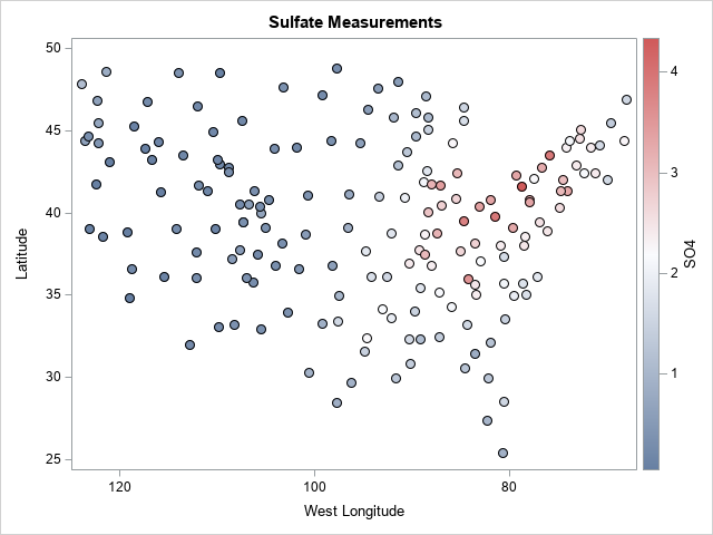
The LOESS procedure in SAS/STAT was released in SAS 8 and was one of the first SAS/STAT procedures to incorporate ODS graphics. An example in the PROC LOESS documentation uses GTL to create a scatter plot of 179 locations and measurements of sulfate (SO4). The SAS 9.3 documentation (circa 2011) was the first to use the red-blue three-color ramp to assign the fill colors of markers based on the S04 values. The filled markers are overlaid with a second scatter plot that uses outline-only markers to create a boundary outline for the filled markers. The graph looks similar to the graph at the top of the page. You can click the documentation link to see the GTL and the 9.3 scatter plot. In contrast, the following call to PROC SGPLOT requires only two statements. (The documentation shows how to generate the SO4 data set.)
title "Sulfate Measurements"; proc sgplot data=SO4; scatter x=longitude y=latitude / colorresponse = SO4 colormodel = ThreeColorRamp filledoutlinedmarkers markerattrs = (symbol=circleFilled size=9) markeroutlineattrs=(color=black); /* omit this option if you want the default color */ xaxis reverse label="West Longitude"; run; |
The graph is shown at the top of the article. The locations of these points are in the 48 contiguous US states. From the scatter plot, you can make out New England, the Great Lakes region, Texas, Florida, and other geographic features. (With more work, you can overlay the points on a map of the 48 states.) The REVERSE option in the XAXIS statement is necessary because the locations of the measurements are "west longitude," which increases from east to west.
Summary
This article shows how to use the FILLEDOUTLINEDMARKERS option in PROC SGPLOT to control the fill color and outline color of markers in a scatter plot. In this example, the COLORRESPONSE= option specifies a variable to use for color-coding. The MARKEROUTLINEATTRS= option specifies the outline color of the markers.
These features are useful, but it is equally useful to recognize that ODS statistical graphics (in particular, PROC SGPLOT) has evolved a lot since SAS 9.2 and 9.3. If you see an old program that uses GTL to create a plot, think about whether you can create the graph by using newer features in PROC SGPLOT. Because PROC SGPLOT code is easier to read and to maintain, it might be worth the effort.
What do you think? Is it a waste of time to rewrite a program that produces the correct output? Or is it beneficial to simplify and modernize old programs? Let me know your opinion in the comments.

2 Comments
Great article! I think, in the comment 'omit this option if you want the GraphData1 color' you meant to say 'GraphDataDefault' instead of 'GraphData1'
You make a good point. I will update the comment. Thanks.