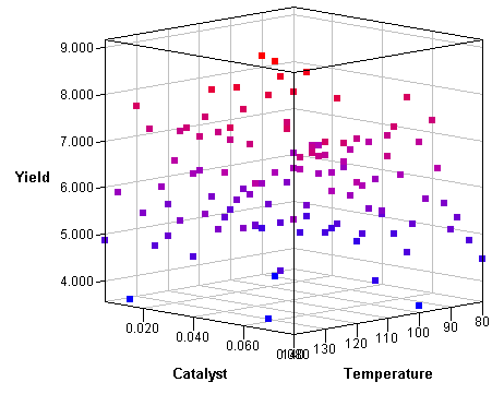
When I visualize three-dimensional data, I prefer to use interactive graphics. For example, I often use the rotating plot in SAS/IML Studio (shown at the left) to create a three-dimensional scatter plot. The interactive plot enables me to rotate the cloud of points and to use a pointer to select and query the values of interesting points.
However, in blog posts, conference proceedings, and slideshow presentations, I often need to display a static visualization of three-dimensional data. Of course I can display a static snapshot of the rotating plot, as I've done here, but there are other options, including using the G3D procedure in SAS/GRAPH software to create a static 3-D scatter plot of the data.
A third option is to draw a two-dimensional scatter plot and color the observations by the value of a third variable. This is a useful technique in many situations, such as visualizing the relationship between two variables while indicating the value of a third variable. The following 2-D scatter plot shows the same data as in the 3-D rotating plot at the top of this article:
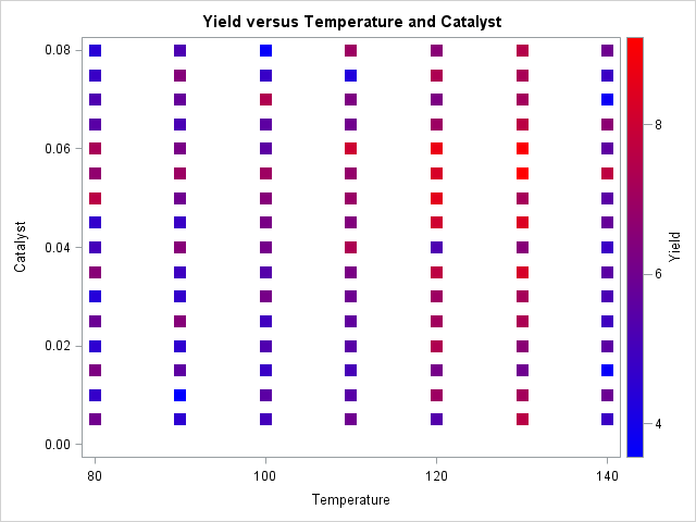
The data are from the documentation for the GAM procedure in SAS/STAT software and depict an experiment in which the yield of a chemical reaction is plotted against two control variables. The temperature of the solution and the amount of catalyst added to the solution were both varied systematically and independently on a uniform grid of values. From this scatter plot you can quickly see that the yield tends to be high when the temperature is in the 120–130 range and the amount of catalyst is between 0.04 and 0.07.
Coloring markers by a continuous variable
It is easy to color markers according to the value of a discrete variable: use the GROUP= option on the SCATTER statement in PROC SGPLOT. But how can you create the previous scatter plot by using the SG procedures in SAS?
As of SAS 9.4, the SGPLOT procedure does not enable you to assign colors to markers based on a continuous variable. However, you can use the Graph Template Language (GTL) to create a template that creates the plot. The trick is to use the MARKERCOLORGRADIENT= and COLORMODEL= options on the SCATTERPLOT statement to associate colors with values of a continuous variable. The following template creates a scatter plot with markers that are colored according to a blue-red color ramp:
/* create a GTL template that displays a scatter plot with markers colored according to values of a continuous variable */ proc template; define statgraph gradientplot; dynamic _X _Y _Z _T; mvar LEGENDTITLE="optional title for legend"; begingraph; entrytitle _T; layout overlay; scatterplot x=_X y=_Y / markercolorgradient=_Z colormodel=(BLUE RED) markerattrs=(symbol=SquareFilled size=12) name="scatter"; continuouslegend "scatter" / title=LEGENDTITLE; endlayout; endgraph; end; run; %let LegendTitle = "Yield"; proc sgrender data=ExperimentA template=gradientplot; dynamic _X='Temperature' _Y='Catalyst' _Z='Yield' _T='Raw Data'; run; |
A few comments on the GTL template:
- The MVAR statement enables you to use macro variables in your graphs. When the SGRENDER procedure is called, the legend title will be set to the value of the LegendTitle macro, if the variable is defined.
- The three variables in the graph are dynamic variables (_X, _Y, and _Z) that are specified when you call PROC SGRENDER. The title of the graph (_T ) is similarly specified.
- The MARKERCOLORGRADIENT= option is used to assign marker colors according to values of the _Z variable.
- The COLORMODEL= option is used to specify a color ramp. I've hard-coded a blue-red color ramp, but other options are possible.
- The CONTINUOUSLEGEND statement is used to display the color ramp on the graph so that the reader can associate colors to values.
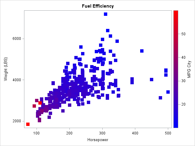
Tip: The plot will suffer from overplotting if there are two or more observations that have the same (x, y) coordinates but different z coordinates. You can still use this technique, but you might want to sort the data by the response variable. This will create a plot where the high values of the response variable are apparent because they are plotted on top of the lower values. For example, if the purpose of your plot is to demonstrate that light cars with small engines are more fuel efficient than larger vehicles, sort the Sashelp.Cars data set by the MPG_City variable before you create the scatter plot, as follows:
proc sort data=Sashelp.Cars out=Cars; by MPG_City; run; %let LegendTitle = "MPG City"; proc sgrender data=Cars template=gradientplot; dynamic _X='Horsepower' _Y='Weight' _Z='MPG_City' _T='Fuel Efficiency'; run; |

14 Comments
Nice trick!
I think you meant to say "when the temperature is in the 120–130 range" not "120-103."
Thanks. Fixed.
Hi,
thanks for providing this useful information!
When I want to draw a 95% confidence ellipse around the points I use:
ellipse x=_X y=_Y / clip=true type=predicted alpha=.05
;
But how can I draw as many ellipses as I have groups (_Z) in the graph? In my example I have only a few groups in my _Z variable. It still draws only one ellipse, if I add more ellipse (...;) statements to my code. To see where these different ellipses overlap would be very helpful.
Kind regards
Heiko
Interesting question. You can use PROC TRANSPOSE or the DATA step to convert the data set from long to wide format. The new variables will be X1, Y1 (which contain only the (X,Y) coordinates for Group=1), X2, Y2, X3, Y3, and X4, Y4. Now overlay four scatter plots and four ellipses for the pairs (X1,Y1), (X2,Y2), (X3,Y3), and (X4,Y4).
Thank you!
So far I solved the problem by removing the "dynamic" statement and replacing _X and _Y with my actual variables in proc template.
I also added the freq=group1 - freq=group4 options to each ellipse statement to have a seperate ellipse for every group.
Unfortunately the proc template has to be rewritten for each variation of the variables with this way. Is there another possibility which allows to keep the "dynamic" statement?
Kind regards
Heiko
This is really helpful. Thanks! Is it possible to add a 45 degree line to this scatter plot (with gradient marker color)?
You can use the LINEPARM statement to add a line in the data coordinate system. If the X and Y ranges are equal, you can use the ASPECT=1 option to make sure that a diagonal line is at 45 degrees.
Thanks a lot! It worked. Do you have any advice how to code the color ramp such as green representing a low value of the continuous variable, then transition to red representing a high value?
Yes. Look in the documentation COLORMODEL= option.
Thanks so much, Rick!
Pingback: Color markers in a scatter plot by a third variable in SAS - The DO Loop
Hey - how do you get point colors in the rotating 3d plot in IML/STUDIO? All I see are options for x,y,z, but no way to select a node coloring variable....
thanks!
Jim
Select Edit --> Plot Area Properties. The Observations tab is how you set colors. See the documentation for setting properties of a Rotating Plot, or the Example of Creating a Rotating Plot.