I've written about how to add a diagonal line to a scatter plot by using the SGPLOT procedure in SAS 9.2. The main idea (use the VECTOR statement) is easy enough, but writing a program that handles a line with any slope requires some additional effort.
But now SAS 9.3 is here, and adding diagonal lines just got a whole lot easier. Why? Because the SGPLOT procedure in SAS 9.3 supports the LINEPARM statement.
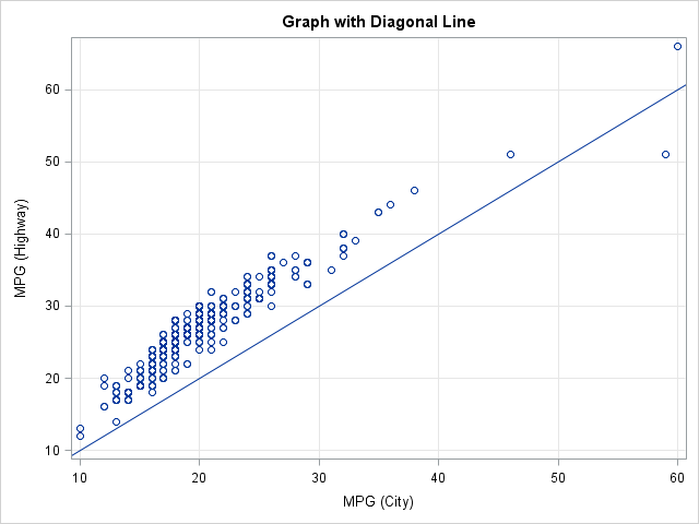
Add a Diagonal Line
Adding a diagonal line is now trivial with the LINEPARM statement: just specify the equation for the line in "point-slope" form. Use the X= and Y= options to specify a point that the line passes through; use the SLOPE= option to specify the slope. For example, the following statements create a scatter plot of variables in the SASHelp.Cars data set, and overlay the identity line, which has unit slope and passes through the origin:
proc sgplot data=sashelp.cars noautolegend; title "Graph with Diagonal Line"; scatter x=MPG_City y=MPG_Highway; lineparm x=0 y=0 slope=1; /** intercept, slope **/ xaxis grid; yaxis grid; run; |
Add Multiple Lines
You can overlay multiple lines on a plot by specifying the name of a variable for the X=, Y=, and SLOPE= options. For example, suppose that you want to plot several lines that represent different linear regression models. The following DATA step creates a SAS data set with parameter estimates for three lines: ordinary least squares regression, robust M-estimation, and robust least trimmed squares (LTS) estimation:
data lines; input Method $ Intercept Slope; datalines; OLS 6.15322 1.03138 M 4.8254 1.1026 LTS 6.2569 1.0514 ; |
The following statements add these variables and observations to the SASHelp.Cars data, and create a plot (click to enlarge) that displays the lines and the data:
data cars; set sashelp.cars lines; run; proc sgplot data=cars noautolegend; title "Three Regression Lines"; scatter x=MPG_City y=MPG_Highway; lineparm x=0 y=Intercept slope=Slope / group=Method curvelabel noextend; xaxis grid offsetmax=0.07; yaxis grid offsetmax=0.05; run; |
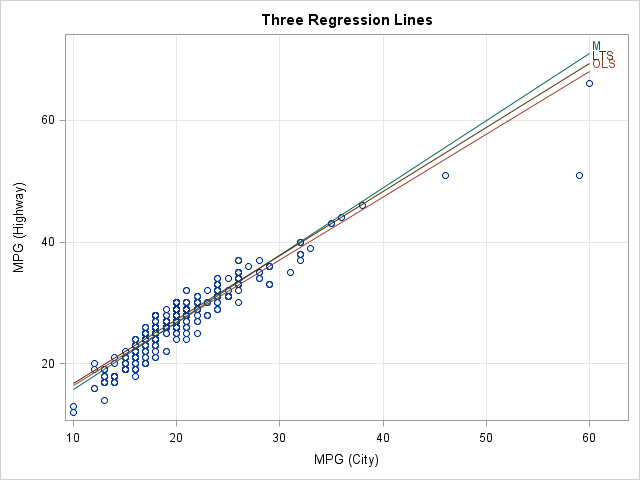
Notice that outliers and high-leverage points "pull down" the OLS line, whereas the robust regression lines are not affected. Also, notice a few techniques used in the PROC SGPLOT call:
- The CARS data set has a block structure: the SASHelp.Cars data occupies the upper left block and the LINES data occupies the lower right block. Missing values occupy the other two blocks.
- The names of the Intercept and Slope variables are used for the Y= and SLOPE= options, respectively.
- The GROUP= option is used so that each line gets different graphical attributes (such as colors).
- The NOEXTEND option is used in conjunction with the OFFSETMAX= option in the XAXIS and YAXIS statements in order to create blank space in the upper right corner of the plot. That area is used to label the lines. The labels come from the Method variable.
Thanks, SAS 9.3. Sometimes a small feature can make a big difference.

10 Comments
Pingback: Welcome SAS 9.3! Five interface and graphics features that everyone can use - The DO Loop
Rick,
thanks for posting this
http://blogs.sas.com/content/iml/2011/07/27/add-a-diagonal-line-to-a-scatter-plot-the-sas-9-3-way/
about adding a sloped line to a scatter plot. For some reason I can't make it work on a plot
where I put both axis on a log10 scale, see code below. The SpititStLouis.csv file is available
at http://www.stat.washington.edu/fritz/Stat302-Winter2013Data.html.
Can you provide a clue on how to do this. In R it is easy enough using abline(a,b)
after doing a plot(..., log="xy")
I have been searching on the web, but can't find anything.
Thanks much
Fritz
data spirit;
infile "U:\data\SpiritStLouis.csv" dsd firstobs=2;
input gas weight headwind TO_distance;
TO_DistL10 = log10(TO_Distance);
weightL10 = log10(weight);
run;
title "Spirit of St. Louis Takeoff Distance L10";
proc print data = spirit;
run;
title "Scatter Plot with Regression Line L10";
proc sgplot data=spirit;
scatter y = weight x=TO_distance;
yaxis type=log logstyle=logexpand logbase=10
min =2000 max=6000;
xaxis type=log logstyle=logexpand logbase=10
min = 100 max=3000;
lineparm x=500 y=3 slope=1.5;
run;
How to do it: Assuming that you want a line in the log-log coordinates, work entirely in the transformed coordinate system:
proc sgplot data=spirit;
scatter y = weightL10 x=TO_DistL10;
lineparm ...; /* specify point-slope in the transformed coordinates */
run;
I don't know why the LINEPARM isn't supported for TYPE=LOG. The convention is to specify points, slope, reference lines, etc., in the DATA coordinate system. But (in general) a line in the data coordinates gets mapped to a nonlinear curve in the transformed coordinates. Maybe that is why the LINEPARM statement is blocked?
HI,
I have a question.I am trying to get slope under sgpanel using lineparm statement, eventually I am getting it,but unfortunately because of default offsetmin and max option I am unable to start it with (0,0).
Could you please suggest.
I think you need to provide more details, so I suggest that you post your question and example code to the SAS Graph Support Community.
Hi Rick, please I have a qusetion. I am using proc plot to find a trend on an expweriment across the years. Proc plot gave me a good graph but is there a way to command proc plot to add trendline to the graph. Thanks
You can us the REG statement in PROC SGPLOT, as follows:
Is there a way to run a regression on a subset of the data (training), then have sas overlay all the data (training and validation) on the regression output?
Sure, lots of ways. Here's an example of using the OUTPUT statement to score the model on the training data:
Pingback: Add a diagonal line to a scatter plot - The DO Loop