The SGPLOT procedure enables you to use the value of a response variable to color markers or areas in a graph. For example, you can use the COLORRESPONSE= option to define a variable whose values will be used to color markers in a scatter plot or cells in a heat map. You can use the COLORMODEL= statement to use a pre-defined color ramp or to define and use a custom color ramp. These options are often used to visualize a "third variable" (Z) in a two-dimensional plot (Y vs X).
However, the SGPLOT procedure is not the only way to create color ramps. Recently, I needed to create a custom color ramp and specify a color for values that were outside of a certain range. I also needed to change the color used for missing values in the response variable. This article shows how to perform these tasks by using the RANGEATTRMAP statement in the SAS Graph Template Language (GTL).
Create a basic color ramp in SAS
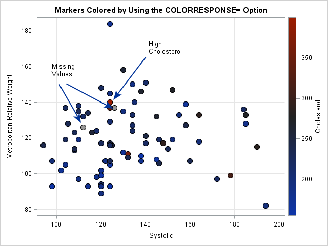
SAS provides several ways to visualize the values of a response variable in scatter plots, contour plots, heat maps, and other graphs. An example is shown to the right. In this scatter plot, the markers represent data for patients in a heart study. The two-dimensional coordinates of the markers represent the systolic blood pressure and the MRW ratio (a body-mass index) of 80 patients. The colors indicate measurements of cholesterol. Three observations are highlighted by using arrows. One point has an extreme value of cholesterol (400). Two others have missing values of cholesterol and are shown in a grey color by default.
The code that generates the graph follows. The COLORRESPONSE= option is used to name the response variable. The values of the response variable determine the color for each marker according to the color ramp that is specified on the COLORMODEL= option.
data Have; /* example data: a subset of the Heart data set */ set Sashelp.Heart(firstobs=5000 rename=(Systolic=X MRW=Y Cholesterol=Z) where=(X < 200 AND Y < 200)); label X="Systolic" Z="Cholesterol"; keep X Y Z; run; title "Markers Colored by Using the COLORRESPONSE= Option"; proc sgplot data=Have; scatter x=X y=Y / colorresponse=Z /* specify response variable */ colormodel=ThreeAltColorRamp /* specify color ramp */ filledoutlinedmarkers markerattrs=(symbol=CircleFilled size=12); xaxis grid; yaxis grid; run; |
Advanced features for custom color ramps
The SGPLOT option provide basic functionality for creating a custom color ramp. For more control, you can use either of the following advanced techniques:
- You can use the RANGEATTRMAP statement in GTL (added in 9.4M3) to define a custom color ramp. Sanjay provides a simple example of a heat map.
- You can use the DATTRMAP= option on the SGPLOT statement to read the attributes (colors, line styles, symbols, etc) from a data set, known as a range attribute data set. Dan Heath provides a simple example and I provide a more complex example that assigns discrete colors to a continuous variable.
The RANGEATTRMAP statement
As shown in the previous example, using a color ramp requires that you specify two pieces of information: a response variable and a color ramp. In GTL, use the RANGEATTRVAR statement to specify the response variable. Use the RANGEATTRMAP statement to define a custom color ramp.
Although the documentation discusses it, I was initially confused about the difference between color ramps and "alt" color ramps. I erroneously assumed that they are functionally equivalent. After all, when I use the COLORMODEL= option in PROC SGPLOT, I can choose any predefined color ramp. For example, the graph at the start of this article is created by using COLORMODEL=ThreeAltColorRamp, which is a blue-black-red color ramp. However, I could just as easily specify COLORMODEL=ThreeColorRamp to use a blue-white-red color ramp.
However, in the RANGEATTRMAP statement, there is a substantive difference between the RANGECOLOR= option and the RANGEALTCOLOR= option:
- Use the RANGECOLOR= and RANGECOLORMODEL= options to define a color ramp for "area plots" that use a fill color, such as bar charts, histograms, mosaic plots, heat maps, and contour plots. Sanjay's example of a heat map and my example of a mosaic plot are both "area plots" that use the RANGECOLORMODEL= option.
- Use the RANGEALTCOLOR= and RANGEALTCOLORMODEL= options to define a color ramp for graphs that use lines and markers, such as scatter plots and series plots. The documentation for the RANGEATTRMAP statement provides an example of a scatter plot whose markers are colored according to a range attribute map.
The following GTL defines a template that creates a scatter plot that is similar to the one at the beginning of this article. Because I want to color markers, I use the RANGEALTCOLOR= and RANGEALTCOLORMODEL= options. The RANGEATTRMAP statement contains three RANGE statements. Each RANGE statement associates a color or colors with ranges of data values:
- A custom yellow-orange-red color ramp is used for cholesterol values less than 350.
- A custom color (black) is used for markers whose Z-value is greater than 350.
- A custom color (lime green) is used for markers whose Z-value is missing.
proc template; define statgraph scatter3Dcol; begingraph; rangeattrmap name="ResponseRange"; range min-350 / rangeAltColorModel=(CXFFFFB2 CXFED976 CXFEB24C CXFD8D3C CXFC4E2A CXE31A1C CXB10026); range OTHER / rangeAltColor=Black; /* or use the OVER or UNDER keyword */ range MISSING / rangeAltColor=Lime; /* color for missing values */ endrangeattrmap; rangeattrvar var=Z /* specify response variable in data set */ attrmap="ResponseRange" /* specify custom color ramp */ attrvar=RangeVar; /* alias for this variable/ramp combination */ entrytitle "Markers Colored by Using the RANGEATTRMAP Statement"; layout overlay; scatterplot x=X y=Y / markercolorgradient=RangeVar /* color by Z and custom color ramp */ filledoutlinedmarkers=true markerattrs=(symbol=circlefilled size=12) name="Scatter"; continuouslegend "Scatter" / title='Cholesterol'; endlayout; endgraph; end; run; proc sgrender data=Have template=scatter3Dcol; run; |

You can do more with the RANGEATTRMAP statement, but I'll stop here. In summary, you can use the RANGEATTRMAP (and RANGEATTRVAR) statement in the Graph Template Language to define a custom color ramp. The RANGEATTRMAP statement supports features that are not surfaced in PROC SGPLOT, such as enabling you to specify a color for out-of-range values and missing values. If you are going to use the color ramp in an "area plot" such as a heat map, use the RANGECOLOR= and RANGECOLORMODEL= options to define the color ramp. If you are going to use the color ramp to color lines and markers, use the RANGEALTCOLOR= and RANGEALTCOLORMODEL= options.
