The mosaic plot is a graphical visualization of a frequency table. In a previous post, I showed how to use the FREQ procedure to create a mosaic plot. This article shows how to create a mosaic plot by using the MOSAICPARM statement in the graph template language (GTL). (The MOSAICPARM statement was added in SAS 9.3m2.) The GTL gives you control over the characteristics of the plot, including how to color each tile.
A basic template for a mosaic plot
The MOSAICPARM statement produces a mosaic plot from pre-summarized categorical data. Therefore, the first step is to specify a set of categories, and the frequencies for each category. I'll use the same Sashelp.Heart data set that I used in my previous post. You can download the program that specifies the order of levels for certain categorical variables. The following statements use PROC FREQ to summarize the table. Several additional statistics are also computed for each cell, such as the expected value (under the hypothesis of no association between blood pressure and weight) and the standardized residual (under the same model). The summary is written to the FreqOut data set, which is used to create the mosaic plot.
/* summarize the data */ proc freq data=heart; tables BP_Cat*Weight_Cat / out=FreqOut(where=(Percent^=.)); run; /* create basic mosaic plot with no tile colors */ proc template; define statgraph BasicMosaicPlot; begingraph; layout region; MosaicPlotParm category=(Weight_Cat BP_Cat) count=Count; endlayout; endgraph; end; run; proc sgrender data=FreqOut template=BasicMosaicPlot; run; |
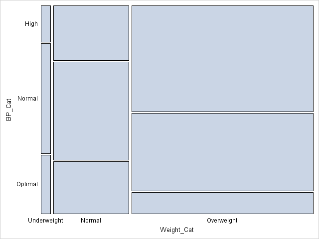
The mosaic plot is the same was produced by PROC FREQ in my previous post, except that no colors are assigned to the cells. Also, PROC FREQ reverses the Y axis so that the mosaic plot is in the same order as the frequency table. See my previous post for how to interpret a mosaic plot.
A template for a mosaic plot with custom cell colors
As I said, the GTL enables you to specify colors for the cells. All you need to do is to include a variable in the summary data set that species the color. You can specify a discrete palette of colors by using the COLORGROUP= option in the MOSAICPLOTPARM statement. Alternatively, you can specify a continuous spectrum of colors by using the COLORRESPONSE= option in the MOSAICPLOTPARM statement.
A clever use of colors is to color each cell in the mosaic plot by the residual (observed count minus expected count) of a hypothesized model (Friendly, 1999, JGCS). The simplest model is the "independence model," in which the expected count for each cell is simply the product of the marginal counts for each variable. (This is the null hypothesis for the chi-square test for independence.) In order to make the residuals comparable across cells, I will generate standardized residuals. The following PROC FREQ call adds standardized residuals and other statistics to the summary of the data. The summary is written to the FreqList data set, which is used to create the mosaic plot.
proc freq data=heart; tables BP_Cat*Weight_Cat / norow cellchi2 expected stdres crosslist; ods output CrossList=FreqList(where=(Expected>0)); run; /* color by response (notice that PROC FREQ reverses Y axis) */ proc template; define statgraph mosaicPlotParm; begingraph; layout region; MosaicPlotParm category=(Weight_Cat BP_Cat) count=Frequency / colorresponse=StdResidual name="mosaic"; continuouslegend "mosaic" / title="StdRes"; endlayout; endgraph; end; run; proc sgrender data=FreqList template=mosaicPlotParm; run; |
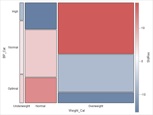
Notice that I used the COLORRESPONSE= option on the MOSAICPLOTPARM statement to specify that each tile be colored according to the range of standardized residuals. The CONTINUOUSLEGEND statement adds a three-color ramp to the plot and automatically shows the association between colors and the standardized residuals.
From the mosaic plot, you can visually see why the null hypothesis (no association) is rejected for these data. Red is used for cells with large positive deviations from the no-association model, which means a higher-than-expected observed count. Blue is used for large negative residuals. Among the overweight patients, more have high blood pressure than would be expected by the no-association model.
A generalized template for a mosaic plot
The previous template can be generalized in two ways:
- The template can use dynamic variables instead of hard-coding the variables for this particular medical study.
- The three-color ramp can be improved by making sure that the range is symmetric and that zero is exactly at the center of the color ramp.
The following improved and generalized template supports these two features. The resulting graph is not shown, since it is similar to the previous graph. However, this template is general enough to be used for a variety of data sets. The template is suitable for handling summaries that are produced by using the CROSSLIST option in the TABLES statement in PROC FREQ.
/* adjust range of values for color ramp; add dynamic variables */ proc template; define statgraph mosaicPlotGen; dynamic _X _Y _Frequency _Response _Title _LegendTitle; /* dynamic vars */ begingraph; entrytitle _Title; /* make sure color ramp is symmetric */ rangeattrmap name="responserange" ; range negmaxabs - maxabs / rangecolormodel=ThreeColorRamp; endrangeattrmap ; rangeattrvar attrvar=rangevar var=_Response attrmap="responserange"; layout region; MosaicPlotParm category=(_X _Y) count=_Frequency / name="mosaic" colorresponse=rangevar; continuouslegend "mosaic" / title=_LegendTitle; endlayout; endgraph; end; run; proc sgrender data=FreqList template=mosaicPlotGen; dynamic _X="Weight_Cat" _Y="BP_Cat" _Frequency="Frequency" _Response="StdResidual" _Title="Blood Pressure versus Weight" _LegendTitle="StdResid"; run; |

3 Comments
Pingback: Create mosaic plots in SAS by using PROC FREQ - The DO Loop
WARNING: The MosaicPlotParm statement named 'mosaic' will not be drawn because one or more of the required arguments were not
supplied.
WARNING: A blank graph is produced.
You can post your code and ask programming questions at the SAS Support Communities. This error message usually indicates that you did not specify a valid variable name, or the data are invalid.